Signage as playful educational interaction

  |   By  |  0 Comments

Whenever lettering is to be used in a school building in order to identify rooms and help orientation, alongside the demands of the signage, a playful game with letters seems a logical option; it in this building that children first learn to read and write correctly. For the new Altenstadt elementary school Atelier Andrea Gassner literally wove the signage design together with the architecture and the tactile materials that are left in their natural state. We see letters cut out of solid ash with laser, in the form of colourful upholstered furniture or glowing yellow plexiglass with magical colour reflections – between the panes of the glazing. The Atelier developed a special typeface that is based on the method of learning how to write. The beautifully shaped upper-case letters are divided into two elements in accordance with the momentum of this method. In the seating in the large courtyard the game played with the shapes of the letters is especially effective when seen from the upper floor. The cushions for lying or sitting on and for exercising are revealed as words formed from the letters of the two words “PAUSE” (break) and “INSEL” (island). The furniture can be moved around and arranged in different ways, creating anagrams and entirely new words. As well as being recognizable from afar on account of their glowing colours the almost wall-height capital letters on the facades are also effective impact protection. The clouds of words beside the entrances to the classrooms are like ornamental wall graphics. The columns of numbers and words stacked above each other at the classrooms doors are a simple plug-in system that can be used to make different room names. This is all serves orientation and direction in and around the building but is also, quite consciously, a playful educational interaction and perception. With this design Atelier Andreas Gassner operates in both a creative and interdisciplinary way: between space and graphics, between systematics and design, between play and teaching.

Understanding the way

  |   By  |  0 Comments

In institutions such as hospitals, care facilities, or kindergartens, where cognitive abilities are limited for a variety of reasons, the emotional level is important. Atelier Andrea Gasser, which always searches for new answers to questions about how good design affects us, is currently working on an exciting approach in the area of signage. There haptics – in product design a must – seem to be a poor relation. But for the designer visual directional systems are more than markings, more than pure positioning in space. There is also an intuitive kind of orientation, which functions on an emotional level. In directional systems this is often underestimated or even ignored, says Andrea Gasser. Working in close collaboration with the architects Cukrowicz Nachbaur, a current project that focuses on the role of signage in care facilities for elderly people suffering from dementia or with poor eyesight, addresses the impact and importance of sensual stimuli in orienting oneself in space: what is left when eyesight, hearing and the ability to recognize begin to fail? How can we offer old people greater safety and orientation? The goal is to develop a new guidance system that uses the sense of touch.

The influence of haptics in signage is underestimated. Through our skin we are in permanent contact with the outside world. In a study undertaken with elderly people, including people with dementia and those with visual disability, we looked at how we can help people by introducing the element of touch to signage.

The goal is not just to show the shortest way, our aim is to understand the way. In order to make the world understandable, in our signage we develop a second level, connecting the cognitive with the emotional level. Nothing emotionalizes and convinces us more than that which we can grasp with our own hands and experience with our fingertips.
Together with the old people in the building we examined various kinds of wood, surfaces, and forms. From this study we developed handrails that help people to find their way around on the different floors and in the various parts of the building. The handrails were made and shaped by hand. The craftmanship brings the structures alive and each linear metre is unique.

For both residents and visitors in the entrance area there is an overview and a description of the different handrails. Accompanied by the text:

UNDERSTANDING THE WAY

“At my age my sight and hearing are no longer what they once were. Therefore, I rely on my hands to support me and to help me find my way around. The different structures and profiles of the handrails in this building are an immense help. I can feel with my hands where I am and therefore understand the route.”

Elegant, massive, atmospheric – exhibitions in the Ofenturm

  |   By  |  0 Comments


Through its proportions and materialization, the architecture of Roger Boltshauser’s Ofenturm (Kiln Tower) is itself an exhibit. In the interior the special atmosphere of the slender, deep space that flows upwards is additionally intensified so that it seems like a narrow ravine. The tall, massive walls are made of rammed earth, the entrance door and the spiral staircase opposite it are of raw steel. The aim is to integrate the dramaturgy of the exhibition elements in the powerful building, while not competing with the ensemble. For temporary exhibitions in this space the design concept envisages thin panels, each consisting of three images, one above the other. The lowest panel leans against the wall, the middle one is fixed vertically, parallel to the wall surface, while the top one is tilted forward. This allows a good view of each of the panels, even from just a short distance away. The texts are placed opposite on smaller, but similarly shaped folded panels. Here, too, the different angles facilitate legibility and respond to the three almost six metre-tall display panels. Carefully, but with their own kind of naturalness and functionality, these design elements engage the space, becoming part of a comprehensive scenography.

Antoniushaus Feldkirch

  |   By  |  0 Comments

The Antoniushaus in Feldkirch has been run by the Kreuzschwestern for more than 120 years. Today it is a house of different generations with a convent for the nuns, kindergarten, old persons home, hostel and nursing home. In 2013 as part of the revitalization and extension of the building, Atelier Andrea Gassner designed the signage and the safety graphics on the glass walls. The Atelier was recently commissioned to design a suitable element to mark the entrance. References for this design were the logo and the mission statement of this international religious order with a Franciscan spirituality. The existing logo is a cross form with narrow openings in a square. The cross is here a symbol of the Kreuzschwestern. The three-dimensional cross form that develops upwards on the plan of the logo conveys a new sculptural expression of the existing symbol. Where the four steel corners meet, openings are made into the vertical interior. At dusk and in the night strips of lighting shine out of these openings, in this way the sculpture extends outwards and on the ground. The founder of the order, P. Theodosius Florentini, once coined the slogan “The needs of the time are God’s will”. This sentence is at eye level in the internal spaces of the cross form. The Antiqua typeface “Swift” with its elongated serifs and emphatic letter forms creates an appropriate contrast to the raw, rusted background of Corten steel. 

Roger Boltshauser – RESPONSE

  |   By  |  0 Comments

This (first) catalogue for “RESPONSE” maps Paris and is published to coincid e with the third exhibition in Stuttgart. It, too, has a multi-layered design, through reading in different directions, through large jumps in the scaling of illustrations, even through the sequence when turning the pages. This changes, in fact, depending on how the almost imperceptibly incised registers at the cutting edge are used. Texts from the last exhibitions find their place here once again. Jonathan Sergison and Jan de Vylder already reflected Boltshauser‘s work in the monograph. Alexandre Theriot wrote his text on the occasion of the Paris exhibition. They all stand for the over-arching and layered nature that Roger Boltshauser seeks in his work.

While the representation of architecture is always related to the object being shown, it immediately develops its own life. Architecture is sketched in order to negotiate it, it is drawn in order to let it emerge, and what is built is finally captured in pictures in order to illustrate it. Sketch, plan, photograph, a logical sequence.

Roger Boltshauser – RESPONSE – Ausstellung in der Architekturgalerie am Weissenhof in Stuttgart

  |   By  |  0 Comments

Ausstellungsfoto Roger Boltshauser - RESPONSE

Roger Boltshauser’s artistic work cannot be explained without referencing his architectural work, equally it is hardly possible to fully understand  his architecture without considering his artistic work. Our task was to illustrate this and, at the same time, to depict his method of responding to design questions and the consistently practiced interference of architecture and art.

Ausstellungsfoto Roger Boltshauser - RESPONSE

Roger Boltshauser entrusted Atelier Andrea Gassner with the graphic-scenographic design of his exhibitions and prints. In its work, the studio spins this interplay between architecture and art further. For example, the cover of the 500-page monograph “Roger Boltshauser” is not decorated with a striking architectural image, but with one of his dominant sketches.

This sketch connects to the exhibitions of Roger Boltshauser’s work: In 2021, the monograph – edited by Martin Tschanz and already out of print – was presented at the Architektur Galerie in Berlin, as were various other sketches. In the exhibition at the Galerie d’Architecture in Paris in 2022, this sketch in turn transformed the entrance into a room-sized, walk-in drawing. Architectural models stood like sculptures on mighty black pedestals. Sketches and plans were connected to each other by the same deep wooden frames, as well as by a hanging that spanned the wall. On a filigree metal shelf, selected material samples created the link between the depicted and the material.

The Paris show is now moving on, if you will, to the Architekturgalerie am Weissenhof in Stuttgart. But the photographs will not simply be taken down here and hung up there again, the models and the earth samples will be reined in. No, the construction continues. Layer by layer, Stuttgart on Paris on Berlin, the places themselves become part of the history and the development of “RESPONSE”. In Stuttgart, the large-format picture panels show photographs of the photographs from the Galerie d’Architecture in Paris.
But it is not just that the photographs document the previous exhibitions, but the models, sketches, and plans also expand and enrich each subsequent exhibition layer by layer with new content and perspectives. And of course the texts.

Ausstellungsfoto Roger Boltshauser - RESPONSE

Woman Life Freedom – Mahsa Amini

  |   By  |  0 Comments

Der iranische Kollege Morteza Majidi schrieb: »Dear Andrea, we are fighting for Freedom. Please be with us with an art work for women of Iran.« Es geht um die Ermordung von MAHSA AMINI und die Unterdrückung eines ganzen Volkes, besonders von Frauen, mit Hilfe von scheinheiligen Glaubenssätzen eines korrupten, machtbesessenen Regimes. Unser Plakatmotiv thematisiert diese Fesselung und Knebelung. Stich für Stich macht die von Hand in das Papier genähte Stickerei die Versalien des lateinischen gesetzten Namens von MAHSA AMINI sichtbar. Grün, weiß und rot stehen für die Farben der iranischen Flagge und damit verbundenen Symbolik: Islam, Friede und Mut.

Roger Boltshauser – RESPONSE – Ausstellung in der Galerie d’Architecture Paris

  |   By  |  0 Comments

Coverbild Roger Boldtshauser - RESPONSE

Roger Boltshauser’s artistic work cannot be explained without referencing his architectural work, equally it is hardly possible to fully understand  his architecture without considering his artistic work. Our task was to illustrate this and, at the same time, to depict his method of responding to design questions and the consistently practiced interference of architecture and art.

Ausstellungsfoto Roger Boltshauser - RESPONSE

Roger Boltshauser entrusted Atelier Andrea Gassner with the graphic-scenographic design of his exhibitions and prints. In its work, the studio spins this interplay between architecture and art further. For example, the cover of the 500-page monograph “Roger Boltshauser” is not decorated with a striking architectural image, but with one of his dominant sketches.

This sketch connects to the exhibitions of Roger Boltshauser’s work: In 2021, the monograph – edited by Martin Tschanz and already out of print – was presented at the Architektur Galerie in Berlin, as were various other sketches. In the exhibition at the Galerie d’Architecture in Paris in 2022, this sketch in turn transformed the entrance into a room-sized, walk-in drawing. Architectural models stood like sculptures on mighty black pedestals. Sketches and plans were connected to each other by the same deep wooden frames, as well as by a hanging that spanned the wall. On a filigree metal shelf, selected material samples created the link between the depicted and the material.

The Paris show is now moving on, if you will, to the Architekturgalerie am Weissenhof in Stuttgart. But the photographs will not simply be taken down here and hung up there again, the models and the earth samples will be reined in. No, the construction continues. Layer by layer, Stuttgart on Paris on Berlin, the places themselves become part of the history and the development of “RESPONSE”. In Stuttgart, the large-format picture panels show photographs of the photographs from the Galerie d’Architecture in Paris.
But it is not just that the photographs document the previous exhibitions, but the models, sketches, and plans also expand and enrich each subsequent exhibition layer by layer with new content and perspectives. And of course the texts.

Ausstellungsfoto Roger Boltshauser - RESPONSE

Artistic Loop

  |   By  |  0 Comments

A catalog about the longstanding friendship between Wilhelm Otten and Gottfried Honegger and his artistic work.
A catalog in two parts, with no beginning or end, the transition between which reveals the turning point of this friendship – the death of Honegger.
Numerous discussion throughout the friendly relationship led Wilhelm Otten to create a platform for encounters with people interested in art. In 2005 he opened up his art collection, entering it into a public dialogue. 

As a representative of Concrete Art, Gottfried Honegger is one of the most important Swiss artists of the 20th century. In his long and – to the very end – highly creative life, he created an extensive oeuvre. For Honneger art was more than just jewelry for the elite, he saw it as an existential necessity for all. He brought it back to the primal forces: form, color and material.

His geometric art contrasted the smooth and rough / glossy and matt / radical and forgiving. The design of the book encompasses this dichotomy in its concept. The photographic language of museum representation complements that one of art in context. The interplay of smooth and rough paper follows the glossy and matt screen print finishes of the cover. The two parts of the book are linked together into an endless loop of content, reflecting Honegger’s artistic work.

luminous power in glass facade

  |   By  |  0 Comments

There are a few consistent symbols used for visual identification of pharmacies. We often see the serpent’s staff, originally the attribute of the god of medicine (Aesculapius) – sometimes used in relation to a stylized apothecary’s scale or twisted into the capital letter „A“ for the Austrian Chamber of Pharmacists. Internationally however, a green cross is commonly used to signify pharmacies and medical areas. This symbol serves Atelier Andrea Gassner as a visual building block for the appearance of the new pharmacy in Feldkirch-Tosters. Formal elements of the green cross are interwoven in the lettering „Apotheke Tosters“ itself, forming a striking word and picture mark, which is skillfully continued on the wall-high glass facade and in the interior of the pharmacy. Light effects that change in shades of green on the back of the shelving units give the shop window its luminous power at dusk and in the dark. The intertwining of shop and corporate design, of lighting concept and line of sight thus develops into the attractive overall appearance of the new specialist shop for pharmaceuticals and medical products.

Foto Apotheke Tosters Innenraum
Foto Apotheke Tosters Fassade

familiar sign, reinterpreted

  |   By  |  0 Comments

There are a few consistent symbols used for visual identification of pharmacies. We often see the serpent’s staff, originally the attribute of the god of medicine (Aesculapius) – sometimes used in relation to a stylized apothecary’s scale or twisted into the capital letter „A“ for the Austrian Chamber of Pharmacists. Internationally however, a green cross is commonly used to signify pharmacies and medical areas. This symbol serves Atelier Andrea Gassner as a visual building block for the appearance of the new pharmacy in Feldkirch-Tosters. Formal elements of the green cross are interwoven in the lettering „Apotheke Tosters“ itself, forming a striking word and picture mark.

Apotheke Tosters Verpackungsdesign

Magazin 4 – building identification

  |   By  |  0 Comments

For many years now “Magazin  4” has been a hotspot in Bregenz that provides impulses and is well known for its cultural events. Magazin 4 functions as an urban facility with a large programmatic open area and, in terms of its profile, has always been able to follow an independent line. Ten years ago, Atelier Andrea Gassner revitalised the Bregenz city trademark, at the same time giving the city’s profile a new direction. Now the outdated brand “Magazin 4” has been operated upon using a sharp knife. These days, evolutionary corrections to existing logos often prove more effective and better equipped for the future than severe cuts and novel solutions, which in the competition for attention have to start from zero and, in order to strike a positive balance, must first of all reach their original level again.

The visual interventions: modernisation of the monospaced versal typography as well as the omission of the underlining and the black field for the number 4. Instead, a “pipe” (vertical line) is used. As a result, the brand is more flexible to use and more open. Subtitles and the accompanying typography are borrowed from the design program used for the city’s profile, which awakens the intended secondary association with the corporate identity of Bregenz. The first application of the basic system – the name on the facade and the graphics in the interior – demonstrates functionality and a contemporary habitus.

Summer exhibition Karl-Heinz Ströhle

  |   By  |  0 Comments

In the framework of the summer exhibition by Karl-Heinz Ströhle Atelier Andrea Gassner designed a 132-page magazine and a scenographic presentation about the artist’s art-in-building projects, which has held on the upper floor of the Palais Thurn und Taxis, Bregenz. On the side walls a series of project titles and unbound collated sheets of original printed pages from the magazine documented the most important works. The spatially dynamic structure was formed by plots on textile showing wall-high project illustrations and using initial typography that were positioned centrally in the space, where they were hung from the exposed roof trusses.

In the bibliophile magazine design Atelier Andrea Gassner used design qualities like those found in  Karl-Heinz Ströhle’s work; white space, clear lines, reduction, materiality, translucence, and movement. The text pages are consistently separated from the image pages and yet woven together by the transparent paper. The overlapping of the generous image pages and the typography on the text pages creates an entirely new dynamism and spatiality. When one turns the page to an image the large project title blends behind it, like a glazed underprint.

Exhibition catalogue Karl-Heinz Ströhle

  |   By  |  0 Comments

To mark an exhibition of the work of Karl-Heinz Ströhle Atelier Andrea Gassner designed a 132-page “Art-in-Building Magazine”, employing design qualities that relate to those found in Karl-Heinz Ströhle’s work: white space, clear lines, reduction, materiality, translucence, and movement. The pages of text are consistently separated from the image pages and are yet woven together using a transparent paper. The way in which the generous image pages and the typography of the text pages overlap creates an entirely new dynamism and spatiality. After turning the page to an image, the project title in large print blends behind it, like a glazed underprint.

Roger Boltshauser – architecture book and art book

  |   By  |  0 Comments

Design exhibition and vernissage in Berlin: Roger Boltshauser
Foto: Jan Bitter


Although Roger Boltshauser is known for his work as architect, for a long time it seemed uncertain whether his path would take him to architecture or to art. Impressed by Joseph Beuys, Anselm Kiefer, Arnulf Rainer, but also by Swiss representatives of neo-expressionism, parallel to his study of architecture he also embarked on creating an oeuvre of art and exhibited his work. He has remained loyal to both disciplines, with the result that his artworks cannot be explained without his architecture and, vice versa, his architecture cannot be fully understood without a knowledge of his artwork.

This architect’s work is as diverse as it is independent. From the sketch design phase onward, climate-conscious building is a central theme that is expressed in his projects in a contemporary way. The present monograph brings together the buildings and the artworks in a single publication for the first time. The design concept is based on the architect’s work process and places sketches and plans before the photographs of the process and the architecture. The low opacity paper and the softness with which the pages open in the core gives the publication and its dense content the requisite  lightness and makes the visual order perceptible .

Artbox – Artistic intervention

  |   By  |  0 Comments

The artistic intervention made by Andrea Gassner to mark the anniversary year quotes fragments from Wolf Huber’s most important visual work. Alone the choice of the first name “Wolf“ as the initial typographical visual medium refers semantically to an ambivalent narrative. In the cycle of images for billboards in the James Joyce Passage iconographical quotations from Huber’s visual work are integrated in the capital letters W O L F. Huber liked to make dramatic use of light, shadow, and space. He preferred garish colours and exaggerated facial expressions.

The work for the glass cube on Jahnplatz continues the game played with the capital letters of the name W O L F but in three dimensions. Through Gassner’s interpretation of Gothic windows as a frieze of pointed arches the cube mutates into a kind of sacred showcase. The large punched-out letters and the yellow-coloured glass that backs them develop an unusual translucency and an interaction of light and space.

WOLF – poster series for the James Joyce Passage in Feldkirch

  |   By  |  0 Comments

The artistic intervention made by Andrea Gassner to mark the anniversary year quotes fragments from Wolf Huber’s most important visual work. Alone the choice of the first name “Wolf“ as the initial typographical visual medium refers semantically to an ambivalent narrative. In the cycle of images for billboards in the James Joyce Passage iconographical quotations from Huber’s visual work are integrated in the capital letters W O L F. Huber liked to make dramatic use of light, shadow, and space. He preferred garish colours and exaggerated facial expressions.

The work for the glass cube on Jahnplatz continues the game played with the capital letters of the name W O L F but in three dimensions. Through Gassner’s interpretation of Gothic windows as a frieze of pointed arches the cube mutates into a kind of sacred showcase. The large punched-out letters and the yellow-coloured glass that backs them develop an unusual translucency and an interaction of light and space.

WOLF HUBER
was an important Austrian-German Renaissance painter, printmaker, and architect. Born in Feldkirch in 1485, he worked in Passau from around 1510. In 1540 he became court painter at the bishop’s  see there,  and in 1541 was appointed Passau town architect. He died on 3 June 1553.

ORNAMENT AND RENAISSANCE
Wolf Huber was one of the most important masters of the Danube School – a Renaissance stylistic movement. It began in the Danube valley area in Austria and Bavaria at the end of the 15th century and extended across a large part of the alpine countries

LIGHT AND SPATIALITY
In terms of content and form light, colour, and space are taken beyond their natural function. Poetry or drama shape the pictures in which nature and human beings blend to create a single entity. Instead of noble restraint, there is strong emotion, instead of harmony distorted proportions.

COLOUR AND EMOTION
Wolf Huber liked to use garish colours and exaggerated facial expressions. Human beings are depicted as vulnerable creatures; not composed but furious or fearful, they do not simply accept but suffer. Even the faces of the animals express deep feelings.

Corporate Timber – Architectural book with perforation

  |   By  |  0 Comments

The new SWG production building in Waldenburg blazes new trails in the structural use of timber for an industrial building. The innovative structure of the roof to the hall requires almost no columns and represents a pioneering achievement in structural timber engineering. The junctions of the delicate structural members were made using the completely new timber-based material “BauBuche”  and the highly specialised SWG Assy screws – and it is precisely this high-tech product that will be manufactured here in the future. The title “Corporate Timber” is a reference to the way in which the architecture links the choice of material, the efficiency, and the corporate philosophy of this screw manufacturer. Reason enough to produce a comprehensive publication about this building with the support of the well-known German construction publishers DETAIL, specialist journalist Marko Sauer as editor, and other excellent authors.

The “script“ for structuring the contents was based on the way in which a woodscrew is used: putting in place – screwing in – connecting. The visual expression of this takes the form of triple punched holes that start at the cover and continue through the book to different depths. This  three-dimensional intervention is something completely new in bibliophile book design and, as well as having a strong visual impact, it also guides the user. Each of the three punched holes ends precisely where the respective chapter begins. In three steps the approach to the building project, the materialisation, and structural innovations, as well the architecture are presented as a whole. Texts in both German and English accompany the series of images as well as self-explanatory plan drawings specially conditioned for the printed matter. Diagram graphics that are reduced to essentials function as a didactic aid for complex research work on a life cycle assessment of the building.

Aqua, Monks and Water – Poster for the annual exhibition

  |   By  |  0 Comments

Posters in Motion

The Stiftsarchiv (Abbey of St Gall) commissioned a a g to design an events poster for the big annual exhibition “Aqua – Mönche am Wasser“. It was also to be animated as a digital affice and presented in digital media. Today, the animation of images has even reached the classic analogue medium of the poster.  This special effect is presented on what are called “e-panels“ – an outdoor display in the well-known Swiss world format.

The headlines are large, golden, and pushed to the edges. The photorealistic “blotches” applied to the Baroque, illusionistic painting of the sky in the form of oversized drops of water are what constitute the image’s appeal. The spiritual significance of water and the way this meshes with the culture of religion is, after all, the theme of this exhibition. In the animated version the water appears to flow. The challenge was to prevent the animation from interfering with the distillation of contents to a catchy punchline that is a basic element of poster design and to avoid lapsing into merely decorative effects. The sole purpose of the reduced animation is to strengthen and continue narrative character of the visual idea.

Signage for Rieden School

  |   By  |  0 Comments

Rieden School is made up of Rieden Primary School and Rieden Middle School, which are housed in two independent but connected building volumes. While the two school areas are essentially spatially separated, they come together in the rooms that are used jointly such as the gym, library, cafeteria, and administration. The aim, therefore, was to create clear signage and, using just a few accents, to provide easily understandable directions and routes within the school – starting with the school name above each of the three main entrances.

The principal design elements are the nomenclature based on easily understandable terms, differentiation by means of colour, and spatial pictograms that employ the plans of the different storeys. Mixing the light blue for the primary school with the red of the middle school produces a rich shade of brown, which is the primary decorative colour in Rieden School. The colour concept borrows from the colour moods and the materials inside the building. Placing the lettering and illustrations directly on the walls obviates the need for additional panels and offers the requisite flexibility in choosing suitable positions for signs and names at important junctions.

Signage Schlossbergtrail Bregenz

  |   By  |  0 Comments

As early as 1993 Atelier Gassner designed a guidance system for hiking trails throughout the State of Vorarlberg, working in collaboration with the state regional planning office. A simple system of signs made of natural coloured aluminium was developed, as tests had shown that this material and colour best remained visible in poor weather. In contrast to trails based on specific themes, the focus here was on providing orientation aid. In the intervening period around 20 000 signs have been erected at 6800 different locations. The guidance system on the Schlossberg trail augments the overall route guidance system and provides information on the newly developed “fitness track”. The goal was to provide an unobtrusive guidance system appropriate to a woodland trail – in the form of  simple recurring accents in the forest.

The design concept of Atelier Andrea Gassner made use of natural colours and materials. Deliberately, only parts of the sanded steel angles and steel tubes were sealed with a clear varnish. The protection against corrosion protection together with the natural oxidation of the untreated areas of steel generated two different colours in a single material. The grey steel  takes up the colour of the gravel paths, the rock, and the other shades of grey in nature.

The combination of materialisation, formal idiom and the neutral, easily legible lettering provides the information required, while avoiding being a disruptive element in the natural setting. The typography is based on the Corporate typeface used by Atelier Gassner in 2010 for the revitalised public appearance of the City of Bregenz. The graphics at the individual stations that provide orientation and offer illustrations are timeless, designed to appeal playfully to a broad target group (children, families, sports enthusiasts).

Boltshauser – Identity for architects

  |   By  |  0 Comments

Architecture means, above all, designing and giving form. The intention was that the client’s “core product” should not occupy the foreground of his own public profile too assertively. Atelier Andrea Gassner has been working for years for the well-known Zurich architect Roger Boltshauser. The concern is graphic design using the language of modern architecture. Clarity of form, unobtrusiveness and aesthetic appropriateness are the focus of the design, Entirely in the sense of German industrial designer Dieter Rams “less and more”. In a dynamically growing process printed material, business stationery, books and digital communication media are created for the architecture practice and partner businesses.  

Interaction and scalability are primary design means In the new media. Distance and approach as well as entry shape our perception of architecture. These dynamics provided the guideline for the new web design. Visitors are met by a wall of images; they come closer and enter the individual projects. The respective contents open up gradually with the self-scaling image grid. Searching and finding becomes a kind of virtual excursion to the project world of this successful Zurich team of architects.

Archijeunes – Architectural Educational Platform for Children and Young People

  |   By  |  0 Comments

• Archijeunes Baukulturelle Bildung für Kinder und Jugendliche.
Promeut la sensibilisation des jeunes gens pour l’espace construit.

This not for profit association pursues the goal of developing a sensitivity for the built environment among children and young people and aims to secure a place for the culture of building in the Swiss educational curriculum. It was founded in 2008 under the name “Spacespot”. Due to its strange phonetic presence, the name Spacespot, like many trendy pseudo-Anglicisms, turned out to be short-lived. Atelier Andrea Gassner was commissioned to create a sustainable and contemporary brand. It was decided that the name for the German and French-language space should indicate what the association does and what can be found on the platform. The name was arrived at in a workshop that was held together with the heads of the association. When the idea for the name was first mentioned the group was immediately delighted with it. It arose in the context of an associative phonetic chain that started with “Archigen” and through the ending “jeunes” suddenly provided the key to a precise meaning: architecture and the art of building for young people

In designing the logotype Atelier Andrea Gassner made a simple yet highly effective intervention in the compactly set name that uses a powerful Antiqua typeface. Omitting the dots above the “i” and the “j” in the new name at the point of contact between two language cultures makes a subtle visual point. Often it is very simple distortions of familiar word images that guarantee brands that are concise and highly memorable.


Walgenau platform for the transfer of knowledge in schools on behalf of the region in walgau:

  |   By  |  0 Comments

the region “Walgau” and its transformation by inserting a syllable to create the adjective “genau” (precise, exact). The logo type deliberately uses lower case lettering in order to convey action, playfulness and lightness. The little green ring augments the brand, is a navigation element, an explanatory graphic symbol and much more.

The website appeals to teachers and students, distributes learning units, documents results and lives from its simple functionality and interesting contents, often conveyed by means of videos and animated graphics. Today it is the moving image in particular that shapes digital, visual communication.

Zipangu

  |   By  |  0 Comments

“Am I a letter or an image?” Behind this question is a game consciously played with perception, or, to put it more precisely, the idea of a tilting image as a label. Our perception of letters conditions us to read signs as codes. Whereas with images it is the forms and colours that occupy the foreground of our perception

The prestigiouis Swiss diamond-cutting business “Zipangu” was looking for a suitable trademark that would meet its exacting standards in terms of quality. Linking the letter “Z” to the crystalline form creates the picture of a diamond and a memorable image. By typologically developing the name to the same high standard Atelier Andrea Gassner created an original word-image trademark.  

The basic graphic design of the appearance and the various applications consistently pursue the aim for an elegant, one could almost say classic image. For example, the stationery was made using special printing stock with raised steel embossing and pop-up cards with individual concepts for portrait and product photography.

Bregenz Brand Handbook – State Capital Bregenz & City Marketing

  |   By  |  0 Comments

The aim and the strategic goal of the initially conceptual commission awarded to Atelier Gassner was to provide contemporary visual communication for the regional capital Bregenz. Several workshops with city officials along with a number of graphic studies resulted in concrete recommendations as regards action to be taken; these included differentiation and organisation of official, cultural and commercial measures and the revitalisation of the existing profile. 

The characteristic mirroring of the word- and image-mark originally created by Reinhold Luger was deliberately retained in order to exploit its established familiarity. Instead of the screening used previously, the required contrast between light and dark is produced by the difference between the fixed Grotesk typeface and the delicate mirrored Antique. The logotype is formally developed into a robust and easily scalable form. The new appearance is used for a variety of quite different applications and is documented in a design guide.

The Markenhandbuch (brand manual) designed by Atelier Andrea Gassner is an exemplary application of creative use of existing design elements. Here theory meets practice, the graphic brand meets the town brand “Bregenz”, the mirrored name encounters its synonymous visualisation in the photographs of the Hafenpromenade. With its concise, convenient format, the brand manual creates a resonance between place  and symbols, between the city’s understanding of itself and its public image. The statements, some of them pragmatically formulated, in combination with free photographic impressions aim at bringing the values, meanings, images and stories that make up Bregenz to the point.

Joint practice of independent notaries

  |   By  |  0 Comments

The logo is based on the idea of a seal. We are familiar with the seal as a form of certification that conveys commitment, security, and legality. The traditional circular shape, the coat of arms of the Austrian state as a national emblem, a modern font family and the names of three notary’s offices are the ingredients for a strong joint brand architecture. Differentiation is introduced by the different names and colours.

Designed as responsive, the websites derive their life from “icons of navigation”. Theme-related illustrations function as a primary interactive guiding element of the graphic user interfaces. The photographs show authentically the personal aspects and the people behind the legal paragraphs

Responsive web design means a design concept that is adaptable as regards both illustration and application, from the wide monitor to the small smartphone. And in both landscape and portrait format. In an age in which digital communication increasingly takes place on the smartphone, responsiveness is an important design factor.

Cooperation between Independent Notaries Appearance

  |   By  |  0 Comments

For many people, the notary’s office is a “necessary evil” rather than a helpful service point for dealing with important things in life. This cooperation between different notaries takes a new path and presents itself as a modern service business. By creating an intelligent profile Atelier Andrea Gassner shows how contemporary corporate design can clearly convey the qualities of a serious and trustworthy business.

The logo based on the idea of a seal. We are familiar with the seal as a form of certification that conveys commitment, security, and legality. The traditional circular shape, the Austrian state coat-of-arms as a national emblem, a modern font family and the names of the three notary’s offices are the ingredients for a strong joint brand architecture. Differentiation is introduced by the different names and colours. The modern visual language for graphic design, typography and photography in both print and web conveys sociability and openness and, at the same time, a sense of seriousness.

vvaldo I + II booklet – St. Gall Abbey Archive

  |   By  |  0 Comments

The archive of the Abbey of St Gall has long been looking for a contemporary and, from a conservation viewpoint, better way of communicating its unique collection that extends back to the time the monastery was founded. Under Regierungsrat Martin Klöti a project was launched in 2013 that was formally concluded through the ceremonial opening of the new exhibition hall by Bundesrat Alain Berset on 12 April 2019. The title of this semi-permanent exhibition is “Wonders of Tradition. The Plan of St Gall and Europe in the Early Middle Ages”. Alongside the year-round presentation of the Plan of St Gall as a loan from the abbey library, there are also annual exhibitions in which the most valuable objects are changed every four months. The year 2019 is the 1300th anniversary of the founding of the Abbey of St. Gall. On this account the first exhibition is devoted to Abbot Othmar, who founded the monastery.

To accompany the respective annual exhibition a series of booklets with the title “Waldo” will be published in print runs of 1000 to 2000. The content is divided into three parts: the theme “Waldo”, the index and contents of the exhibition, and a lecture that reflects the theme of the particular exhibition.

Waldo, * around 740, † 29./30.3.813/814 in the monastery of Saint-Denis near Paris. He most probably came from Mosel-Franconian nobility in the immediate circle of the Carolingians. He worked as Charlemagne’s agent in Alemannia, was abbot in the monasteries of St. Gall, Reichenau and Saint Denis, an educator of princes, Bishop of Pavia and of Basel. We know his handwriting from the 14 St. Gall original documents that date from between 773 and 782. He is regarded as the first archivist of the Abbey of St. Gall who is known by name. On this account this series bears his name.


hk Architekten Web Relaunch

  |   By  |  0 Comments

HK Architekten was founded in 2018, when Roland Wehinger, Christoph Dünser and Stefan Hiebeler became partners of Hermann Kaufmann.

The new website is not just a representative and comprehensive internet page. An integrated data base serves as both a data management and archiving tool and as a project server for current projects.

Philosophicum Lech Website

  |   By  |  0 Comments

Atelier Gassner’s corporate design for Lech municipal council has proved its worth over more than 25 years and is widely used: from the letterhead and all the council’s
printed material to the signposts throughout the village. The goal was to create a contemporary image that would, however, be independent of the tourism advertising.

Alongside the coat of arms derived from heraldry, the basic element of the corporate design is a family of typefaces known as Trinité, a modern Renaissance Antique by Bram de Does. The set of characters comes in three different versions that are distinguished by their different upper and lower lengths. These variables and other coordinated type styles allow precise typographical differentiation for a variety of applications – from the council’s correspondence to the bibliophile typesetting, from the town’s extensive signposting system to its web design.

The digital and analogue design for the “Philosophicum Lech” is based on this typeface culture  and is connected with a unique image concept. Using microphotography, the theme of the year is expressed by a different kind of plant each year. In this way the “key visual” is renewed year after year, while still remaining a recognisable events label.

The website fulfils several functions. It is an archive, advertising for events and at the same time a commuication platform for the  organisers of events. The web design ensures a bright, uncluttered website that responds flexibly to the particular end device used, above all smartphones and tablets.

SWG Production – New Production Hall 2020

  |   By  |  0 Comments

The new SWG production hall in Waldenburg is a pioneering industrial building in which timber is used for the load-bearing structure. With its brass-coloured perforated metal skin the new building seems like an UFO that has landed in a grey industrial European landscape. In fact, it is in the interior that the corporate architecture is fully revealed. The brand new wood-based material »BauBuche« was innovatively used for the rods and the joints  of the powerful and yet finely articulated structure in veneer layer look combined with solid cross-laminated spruce panels with a quality finish. The whole (including the composite wood and timber ceiling slabs) is held together by the product that is manufactured in this building: the well-known Assy screws. In terms of geometry the screw is a curve that extends as it turns around an axis. When screwed into a building element it locks with the material, ensuring a strong and durable connection.

The brochure was published by SWG itself to mark the formal opening of the new SWG production centre in Waldenburg. The inserted tracing paper pages are particularly striking: at the beginning and end of the brochure in the form of panorama pages with depictions of materials they give an X-ray view of a joint along with the inner life of all the screws. Both visually and haptically these pages refer to planning and conceptual work and to innovative decisions and developments.


Obd’r Lech

  |   By  |  0 Comments

The house is in the municipality of Lech, five minutes by foot across the River Lech, 1540 metres above sea level. The wooden house was built 600 years ago by skilled Walser carpenters and was recently given a sensitive architectural renovation. It is rented to (carefully chosen) guests. The task presented to the Atelier was to convey a love of old and new forms of quality and of architecture. This began with finding a name, in a team together with German studies scholar and culture theorist Roland Jörg. With the name “Obd’r Lech” this house in the centre of the Alps but at the same time far off the beaten tourist track pays its respects to the local dialect, the village atmosphere and with a grin adds a request “Lecheln bitte” (“smile please”, a wordplay on Lech/lächeln – Lech/to smile).

Contrary to what you might expect, on the first page you do not encounter a deep blue sky, rich green meadows or powdery snow but rather a typographical composition  with figures. These are revealed as poetic proof of the qualities of this house. Already in the first “slider” with photographic impressions by Martin Mischkulnig  one is drawn into the fantastic landscape, architecture, and atmosphere of the place. Short texts augment the visual narrative. Interaction is used for virtual tours by means of 360° panorama photography or ortho-photographical winter/summer slides that can be slid over each other to make comparisons. The design of the website hovers between tradition and modernism, encourages contacts, is entertaining and at the same time informative. And the whole thing is suitable for portrait and landscape format, for both big and small screens.

Kortyka Building

  |   By  |  0 Comments

Thomas Kortyka is an architect. He plans and initiates buildings – mostly residential buildings  in the Munich area with the character of a residential development and high aspirations in terms of architecture and building ecology. The corporate communication designed by Atelier Andrea Gassner speaks a modern “architectural” languages, with informative texts and easily legible data presented  through renderings, plan graphics and editorial photography. The analogue and digital applications ultimately serve the sale of buildings to interested persons with an awareness of quality.   In choosing advertising methods, too,new paths are being taken. Instead of the standard glossy brochures PSK series are issued about the respective projects. Or a walk-in showroom on site in a residential district offers efficient tangible information. Modern digital communication supports the analogue contacts.

The website documents completed buildings and serves as an important early contact for new projects. All the plans are adapted to be easily legible for laypersons. A striving for quality and good form is evident in the website too. New design materials from the digital, dialogue oriented media such as interaction and scalability as well as contents extending over several pages are made available in a user-oriented and responsive form. Ultimately, the aim is a clear information architecture and a narrative approach to presenting the ideas and elements of the firm’s communication strategy.

Raumbild Vorarlberg 2030 – Office of the Vorarlberg State Government

  |   By  |  0 Comments

Behind the term »spatial planning« there is planning work that often has wide-reaching, for individuals occasionally drastic, consequences. The Department of Spatial Planning and Building Law from the Office of the Vorarlberg State Government wishes to awaken and strengthen an awareness and understanding of spatial planning and regional development among those with an interest in this theme and those who hold positions of responsibility.

Atelier Andrea Gassner designs magazines that people like to take into their hands and browse through and that repeatedly lead them to immerse themselves in the depths of the texts. The high design quality of text-heavy and complex contents is not a product of chance. Behind this is plenty of experience in the bibliophilic design of books of quality along with constant close examination of the respective contents. The printing material and the kind of binding alone distinguish the annual journal from the usual kinds of printed matter. The requirements for the cover, section pages, beginning and end scenarios that are defined in the basic concept ensure the requisite tension. The typography, print space, and image grid meet the demands of good legibility and clarity. The communicative use of cartography, ortho-photos, diagrams, and explanatory graphics as well as pictorial representation is a special part of the whole. This includes editorial photo-briefing and, for some themes, the photographic implementation itself.

Lattke Architects

  |   By  |  0 Comments

How should an architect communicate – his team, his achievements, his ideas?

Architecture comes from a creative act. The creation itself should serve the architecture client and not, at least not excessively, the architect’s own presentation. With a calm, appropriate design Atelier Andrea Gassner creates a contemporary graphic ambiance for the way in which an Augsburg architecture practice presents itself to the public.

The results are pragmatic signs, typographies, and functional concepts for visual communication. These are applied to the basic settings and project folders, to presentation charts and digital means of communication.

In his introduction to semiotics Umberto Eco notes: “Once it is established that architecture can be regarded as a system of signs, it is, above all, these signs that  must be characterised.”

Corporate design, logotype, font program, colour scheme, and graphics setting for an architecture practice in Augsburg. Office equipment and project folders as a basic means of communication.

Lattke Architects

  |   By  |  0 Comments

For the design concept for the website of this Augsburg architecture practice  Atelier Andrea Gassner uses photos, texts and plans – i.e. the elements used to depict architecure – as signs that can be moved vertically in a horizontally divided surface. Scrolling across the vertical develops a content that is moved twice – pictures on top, floorplans or texts in the bottom area. The site invites you to interact – but without getting lost in pointless games – and works responsively in both wide and portrait format. The visual character is shaped by a lot of white space, with a flexible and yet astonishingly simple design grid.

Responsive web design means the adaptability of a design concept in depiction and application, from the wide monitor to the small smart phone. In both vertical and horizontal format. At a time when digital communication is practiced increasingly on the smart phone, responsiveness is an important design factor.

Cervantes & Co Books and Wine

  |   By  |  0 Comments

Since 2006 Cervantes & Co has been attracting literature enthusiasts and wine-lovers to a small but delightful premises in the inner city of Feldkirch. The great Spanish author Miguel de Cervantes provided the name for this book and wine shop. Regina Zink selects the publications in the book department. The focus is on literature, philosophy, history, art and cuisine. Her brother, physicist Norbert Nägele who lives in Spain, selects the wines.

The letter C and the et symbol (&), which is derived from the Latin, are blended in the newly designed emblem to form a circular ornament. In connection with the name a new word and image mark is created. The signet can be used in a variety of playful ways, as a sign that extends to the edge of a facade flag or to decorate a postcard.

The website visually reflects the optics of the book shelving designed by architect Daniel M. Büchel and employs three font types, allocated to the themes book, wine, and olive oil. In the simple, responsive web design visitors find clearly organised information and the special offers of the month.

Gewerbebauten in Lehm und Holz – DBU Bauband 3

  |   By  |  0 Comments

In accordance with the purpose for which it was founded the DBU (Deutsche Bundesstiftung Umwelt/German Federal Environmental Foundation) subsidises innovative, environmentally conscious, model building projects. The concept for the subsidies also includes financing scientific studies of the respective projects and disseminating these in quality book form. Atelier Gassner was commissioned to devise a concept for an edition consisting of several volumes. The first publication documents the new building for Schmuttertal Gymnasium (high-school): here innovative educational ideas and a participative approach to planning produce unusual spatial systems, ambitious ecological goals direct the construction, and functionality and inspiration shape the architecture. Client and subsidy provider, users and planners, experts for building law and technical services document the creation of this building, augmented by plans and photographs.

The editions were deliberately published in German, and the search for a name led to the striking and yet self-explanatory term “Bauband” (literally “building volume”).

The challenge was how best to describe and depict complex contents so that they are clearly legible and can be quickly understood. At the same time this book was not intended to be a standard illustrated architectural volume nor a dry treatise with a preponderance of text. Using the tools provided by micro and macro typographical design and making considerable demands on editorial photography the narrative requirements could be successfully met. The plans and diagrams, which were produced especially for this book, provide in-depth information.
Through the format alone, the easy to open “Swiss brochure” and the stable card binding, the book suggests a report with the character of a working folder. A colour, which differs from volume to volume, contrasts with the restrained grey that is used for the covers of all the volumes. This striking coloured framework for the book block is reflected in completely coloured pages that separate the chapters and visibly articulate the contents and, when one looks at the cut edge of the closed book, appear like inserted “floor levels”.

Eth – Signage Glc Zürich

  |   By  |  0 Comments

Architect Roger Boltshauser positioned his design in the “groove” first made by the architecture of the Maison de Verre which is characterised by “bare” materials and transparency of forms. In the new building the way in which the functions are made legible is entirely in accordance with this early modernism. “Troublemakers” that line the internal world, for example elements for the lighting and building services, are intended to be visible. The same applies to the signage.

On this account architect Roger Boltshauser involved Atelier Andrea Gassner at an early planning stage. In designing the directional system in this new, nine-storey building the principalfunctional challenges were the diversity of the spatial structure and functions as well as fluctuations in staff and functional demands that were to be expected. In all zones of the central orientation, sub-orientation (storey areas) and detail orientation (room identification) flexibility and changeability in the messages were called for.

Already in the first design study Atelier Andrea Gassner placed the emphasis on digital LED display technology and transmission by means of screens. All the screens, including the wall graphics in the outdoor area, can be centrally controlled. Reflecting the nature of the architectural design, the materialisation envisages an archaic technoid idiom – glass, oiled steel, light concrete. The building blocks of the graphic design include a special dot lettering developed for different grain sizes as well as a symbol program that uses the mould material for the sans serif letters “E T H”. This design concept allows pattern sequences and abstract typographical repeats in a horizontal and vertical direction for floors, walls, and single elements. The square provides the basis for the individual symbols and allows seamless use as partial inlays in the architect-specified mood board with glass blocks or tiling. The general concept for uniform signage in all ETH main and ancillary buildings that was introduced in 2019 prevented this individual proposal from being realised.

Signage Agricultural Schools in Vorarlberg

  |   By  |  0 Comments

Behind the somewhat unwieldy acronym “BSBZ” is the name: “Bäuerliches Schul- und Bildungszentrum für Vorarlberg” (Farming School and Training Centre for Vorarlberg). In the five different wings on the campus various lecture courses for a different user groups are held. The wide range ensures a high frequency of various kinds of visitors. What led to the involvement of Atelier Andreas Gassner was the new “E” building wing and the need for self-explanatory signage and orientation in the constantly growing complex of buildings, approaches, storeys, levels, and rooms. The impact hazard regulations for wall-high glass elements in public buildings presented a further design challenge. A system had to be developed that, while meeting the standards required, would, at the same time, provide a playful graphic element that underlines the new architecture rather than detracting from it.

However, the design work began with the start of every form of applied communication, i.e., with the name, the brand. In a moderated process the previous name “Landwirtschaftschule” (agriculture or farming school), which had never fallen entirely out of use, was revitalised and, with the addition of BSBZ, was recreated as a brand and logotype.

The inspiration for the graphic elements of the privacy screens and the signage was drawn from the appearance of layers of clay, the textures of arable farming, the architecture of foliage, photosynthesis, the effects of sunlight and wind on the fields, the cycle of growth – the metamorphosis. For this theme and the elements that guide users Atelier Andrea Gassner developed patterns of movement, colour, typography, and plan graphics that are differentiated for each storey. Through the light and the movement of passers-by the patterns begin to oscillate and change constantly, they vanish and reappear, seem translucent and grow, as it were, through the building. The grids of lines and hatching are understood as a graphic echo of the vertically structured wood facade. The signage, the impact prevention patterns on the areas of glazing and the architecture all play together constructively. The very simple and clearly designed elements of the central and sub-orientation use the theme of hatching, too.

Woodpassage – from tree to house

  |   By  |  0 Comments

A tree grows in the forest – wood comes from the tree – and the wood becomes a house. The wooden “woodpassage” sculpture placed outdoors in the centre of Europe exemplifies this process. With simple pictographic symbols over forty stages, it conveys the transformation from fir to house. This conversion is shown by the Atelier Andrea Gassner as cuts out of large blocks of wood, cut by cut.

The result is a sensory experience; consisting of four wooden gates, 4.32 m wide, 4.32 m high and 8.65 m long, the “woodpassage” expresses a strong three-dimensional message when viewed from afar. Whilst strolling through the cheerfully illuminated passage, it becomes playful ambassador for the ecological advantages of timber construction.

From tree to house!
Experience the walk-in installation.
An initiative of proHolz Austria, proHolz Bavaria, Lignum Switzerland

Forests create a good climate and the resource wood.
Through sustainable management, forestry ensures the forest habitat and the availability of wood. The forest area in Europe grows by 1,500 soccer fields every day. Only 2/3 of the growth are actually used.

Wood is available and offers a chance to change resource use.
The construction sector accounts for around 40% of all resources. The use of building products made from renewable raw materials saves and secures resources for the future. About 13 cubic meters of wood were needed for the construction of these 4 gates. This amount grows back in Europe’s forests in 1/2 a second.

Building with wood protects our climate.
The photosynthesis of the trees binds 1 ton of CO2 in 1 cubic meter of wood. Timber buildings extend carbon storage capacity and thus relieve the climate in a sustainable way. About 13 tons of CO2 are permanently bound in the wood of these 4 gates. This corresponds to the pollutant emissions of a passenger car over 8 years.

Christoph Binder – Publication Image for Consultation in an Intercultural Context

  |   By  |  0 Comments

Dr. Christoph Binder’s core area of competence lies in assisting small and medium-sized businesses aiming to internationalise their business. He communicates his knowledge and intercultural experience through reflective personal mentoring processes for staff and managers who wish to or must prepare themselves for deployment abroad.


We placed the rounded, open “C” as a visual anchor at the centre of image. The dotted form symbolises the multi-national network of the business. When used digitally, the rows of dots in the logo are distinguished from each other by different shades of grey and sizes and can be activated by a cursor reaction. Alongside the symbol’s interactive »usability« the effect is a surprisingly three-dimensional development. In the printed form through the sharp-edged blind embossing the logo appears tactile, spatial and at the same time elegant. In typographic terms the logo is framed by type cuts from the typeface family »Scala« – a reinterpreted serif-stressed Renaissance-Antiqua by Dutch typeface designer Martin Majoor.

LICHT – Poster for Werkraumschau Bregenzerwald

  |   By  |  0 Comments

The poster LICHT (LIGHT) was  made in the context of the scenographic exhibition for the regional craft cooperative in the Werkraumhaus (architect Peter Zumthor), which we also designed. Light is first revealed by shadow. As key visual for the exhibition and as 3D facade lettering, Andrea Gassner’s graphical interpretation of this statement follows this principle consistently. The lettering visible at the top is back-to-front and upside-down. It is the shadows cast that first make LICHT legible.

Zukunftsfähiger Schulbau – DBU Bauband 2

  |   By  |  0 Comments

In accordance with the purpose for which it was founded the DBU (Deutsche Bundesstiftung Umwelt/German Federal Environmental Foundation) subsidises innovative, environmentally conscious, model building projects. The concept for the subsidies also includes financing scientific studies of the respective projects and disseminating these in quality book form. Atelier Gassner was commissioned to devise a concept for an edition consisting of several volumes. The first publication documents the new building for Schmuttertal Gymnasium (high-school): here innovative educational ideas and a participative approach to planning produce unusual spatial systems, ambitious ecological goals direct the construction, and functionality and inspiration shape the architecture. Client and subsidy provider, users and planners, experts for building law and technical services document the creation of this building, augmented by plans and photographs.

The editions were deliberately published in German, and the search for a name led to the striking and yet self-explanatory term “Bauband” (literally “building volume”).

The challenge was how best to describe and depict complex contents so that they are clearly legible and can be quickly understood. At the same time this book was not intended to be a standard illustrated architectural volume nor a dry treatise with a preponderance of text. Using the tools provided by micro and macro typographical design and making considerable demands on editorial photography the narrative requirements could be successfully met. The plans and diagrams, which were produced especially for this book, provide in-depth information.
Through the format alone, the easy to open “Swiss brochure” and the stable card binding, the book suggests a report with the character of a working folder. A colour, which differs from volume to volume, contrasts with the restrained grey that is used for the covers of all the volumes. This striking coloured framework for the book block is reflected in completely coloured pages that separate the chapters and visibly articulate the contents and, when one looks at the cut edge of the closed book, appear like inserted “floor levels”.

LICHT Werkraumschau – Exhibition

  |   By  |  0 Comments

In keeping with a quote from the famous architect Le Corbusier stating that light and shade reveal the form, this year’s Werkraumschau is presenting products from various workshops of the Werkraum Bregenzerwald in a scenario of spotlights. The Werkraumhaus, designed by Swiss architect Peter Zumthor as a multi-functional building, becomes the stage and the handicrafts the actors in a continually changing play of daylight and artificial light. Stage floodlights generate an immaterial and atmospheric architecture of light, mount the objects in the space, infuse life into their surfaces and forms, and trace a graphical shadowplay on the floor of the building.
For the wall sign Andrea Gassner developed a three-dimensional solution using mirrored capital letters which, through the shadows they cast, mutate into a clearly legible word. The Letters were also used as the keyvisual for advertising.
 
We cannot imagine everyday life without light but devote little attention to its phenomena and qualities. Good lighting design makes an essential contribution to our feeling of well-being and can sculpt spaces and furnishings. Visitors are invited to sharpen their own perception at entertaining interactive stations, to test qualities of light and acquire practical knowledge for themselves: how is light output evaluated? What effects does the light temperature have? How can we make things disappear with coloured light?
 
The Werkraumschau is the annual exhibition platform for Werkraum members. The renowned graphics and communication bureau Atelier Gassner based in Vorarlberg was invited to design a thematic and scenographic presentation of the collectively established “shop window” that extends throughout the Bregenz Forest.

Playing a Graphical Game with Perception for Schendlingen School

  |   By  |  0 Comments

In large public buildings graphic symbols, lettering and signs are often used to help people find their way around. In the case of the orientation system for the newly built Schendlingen School in Bregenz the designers of Atelier Gassner, a studio whose reputation has long spread outside the region, have succeeded in a coup. The signage here is made up two words placed prominently on the glass partition walls to important areas and rooms. However, these words do not simply stand beside each other, they run over each other. In addition they are connected by the cross-hatching called for by the building regulations in full-height glass walls to prevent people from walking into them. Out of these normative constraints Atelier Gassner has succeeded in generating a communicative and artistic added value. As you walk by these typographies, depending on the particular location one word or the other appears clearly legible, as if by magic, but in-between the interferences of the overlaid letters and lines create their own delightful, constantly new game.

The signage outside the building varies this connection of cross-hatching and letters and interprets the graphical elements in the interior in a way that is appropriate to the materials used outdoors. The relief-like lettering is cast directly into the specially made exposed concrete parapet walls at the approaches to the building. Here the play of light and shadow creates a texture that changes during the course of the day.

The focus is on the phenomenon that perception is always related to space and time. The submission by Atelier Gassner, which was chosen by a sizable margin in an ideas competition, convinced the jury above all through this lively game played with perception for a building in which conveying things worth knowing and seeing to around 600 children and young people is a main focus.

Schmuttertal-Gymnasium – DBU Bauband 1

  |   By  |  0 Comments

In accordance with the purpose for which it was founded the DBU (Deutsche Bundesstiftung Umwelt/German Federal Environmental Foundation) subsidises innovative, environmentally conscious, model building projects. The concept for the subsidies also includes financing scientific studies of the respective projects and disseminating these in quality book form. Atelier Gassner was commissioned to devise a concept for an edition consisting of several volumes. The first publication documents the new building for Schmuttertal Gymnasium (high-school): here innovative educational ideas and a participative approach to planning produce unusual spatial systems, ambitious ecological goals direct the construction, and functionality and inspiration shape the architecture. Client and subsidy provider, users and planners, experts for building law and technical services document the creation of this building, augmented by plans and photographs.

The editions were deliberately published in German, and the search for a name led to the striking and yet self-explanatory term “Bauband” (literally “building volume”).

The challenge was how best to describe and depict complex contents so that they are clearly legible and can be quickly understood. At the same time this book was not intended to be a standard illustrated architectural volume nor a dry treatise with a preponderance of text. Using the tools provided by micro and macro typographical design and making considerable demands on editorial photography the narrative requirements could be successfully met. The plans and diagrams, which were produced especially for this book, provide in-depth information.
Through the format alone, the easy to open “Swiss brochure” and the stable card binding, the book suggests a report with the character of a working folder. A colour, which differs from volume to volume, contrasts with the restrained grey that is used for the covers of all the volumes. This striking coloured framework for the book block is reflected in completely coloured pages that separate the chapters and visibly articulate the contents and, when one looks at the cut edge of the closed book, appear like inserted “floor levels”.

eineweltgruppe – a mobile exhibition

  |   By  |  0 Comments

The Eine-Welt-Gruppe (One World Group) Schlins | Röns was set up with the aim of aiding people in the southern highlands of Tanzania and, together with them, taking steps towards the kind of development that makes careful use of resources, is close to nature and sustainable. Their goal is the development of communal organization structures for cooperation, self-determination and responsibility. The aim of the exhibition is to raise consciousness with regard to a theme that affects all of us but which we are all too happy to ignore.

The basic concept for the exhibition is based on paperhanger tables, which are laid on the floor, used as tables or erected vertically and can then be folded together again like an oversized folder. The tables are an interesting size, measuring 70 cm wide and 300 cm long. At the back the frame is visible and resembles tangled branches or a fragile improvised construction. The exhibition is light, mobile and adaptable. The organigram of this development collaboration is a graphical leitmotif that provides user guidance for the entire exhibition.

Each panel documents a single project in the form of brief, authentic, textual descriptions.

Atelier Gassner – Visual Essays

  |   By  |  0 Comments

Visual Essays
Visuelle Geschichten

Editors: Andrea Gassner, Reinhard Gassner / Atelier Gassner
Publisher: Sonderzahl
Year: 2017
Length: 288 pages
Language: German, English
ISBN:  978-3-85449-468-3
Price: 44,- Euro

This book is more than just a corporate publishing project. On a total of 288 pages it not only shows the exciting results of work carried out over the last 20 years but also presents in a highly impressive way the paths and processes that led to these results. The book describes the work of the Atelier, which has achieved recognition beyond the region, along with the design approaches taken and the consistent orientation on the contents and the communication aims. The 15 projects presented illustrate spatial and graphic design that focuses on applied communication – book design and scenography, signage and facade graphics.

The book itself is a testimony to the creative work. The cover recalls a concrete façade graphic design on the theme of skin and surface and surprises our perception in that it shows what first becomes visible through the relationship between two different surfaces. The challenge of presenting the medium book in a book is successfully met by, on the one hand, placing the illustrations on the pages almost as facsimiles so that, for the viewer, a further interference between reality and representation develops. On the other hand the “filmic” sequence of the wrap and the dramaturgy of the book’s design are shown at a single glance in miniature illustrations. The descriptions provide information about the various design approaches taken by the team, about interesting sources, and about different ways of engaging with the creative process. Alberto Alessi, Walter Bohatsch, Köbi Gantenbein, Otto Kapfinger and Roland Jörg wrote the accompanying texts.

Architect Alberto Alessi writes in his essay: “The work of Atelier Gassner is a demonstration of this deeper spatial perception. The goal of their work is to convey a value and not just formal results.”

Since the 1990s the massive presence and ubiquitous use of digital media has completely changed the way we communicate. The new virtual communication spaces take us by surprise; they are always in motion and have to be permanently renegotiated. Logos and brands are exposed to constantly increasing competition from a previously inconceivable flood of images and the fact that almost everything and everyone throughout the world can be found. If, even for children, generating and manipulating images is taken for granted, then this means that the significance of the illustration has been re-coded. Much the same is happening at the moment with film. The authority of the creation of images has been largely broken and the technical and spatial limitations to production have been removed. Pictures and videos are the new “words”, as components of meaning they are constantly shared and distributed by smart phone. Creativity and communication takes place in the here and now, without explicit cultural references: I mail, photograph and film and I share it, therefore I am. The notion of decontextualization of the users had hardly been formed, before algorithm-powered media began to supply pseudo contexts by means of profiling. Here, however, the issue is personalized information that is focused on users’ individual consumption preferences and the profitable sale of their profiles. In the field of communication these apparently unlimited possibilities must be increasingly countered by selection, orientation and quality.

With a certain degree of skepticism towards what at the time were still unfamiliar “new media” I accepted an invitation to take part in developing the inter-media course at Vorarlberg University of Applied Sciences in Dornbirn. Between 1996 and 2000, from 1998 as design head, I shared the responsibility for the range of courses and experienced the digital revolution at close hand. Step-by-step we discovered changes and elements for applied design such as sound, moving images and interaction and applied these to the teaching program. Dogmatic attitudes with regard to Apple/Macintosh or Microsoft/Windows accompanied us from the very start. The co-founder of Apple, Steve Jobs, was inspired by the work of the German Bauhaus (explicitly by Herbert Bayer), and by the Ulm School and Dieter Rams. Rams searched for clarity of form as early as the 1950s. Up to the present day you can perceive precisely this same aim in Apple devices and their user interfaces. At the same time the users separated into two groups: those who are design-oriented and those who focus on economic and pragmatic uses. For instance: when I think about the unnecessary hurdles to compatibility between the two hardware and software giants in the area of exchanging emails, it becomes very clear that here a battle is being waged between competitors to the disadvantage of users. In general familiar design values such as color accuracy or the clean reproduction of lettering and print seem to get lost through the pixilated and greatly varying quality of reproduction on a monitor. Text programs impose their “aesthetic” on us and sensory prostheses – substitutes offered by digital media for various forms of sensual perception – present alternatives that in fact are not viable options.

The tactile feedback of the results of printing cannot be so simply replaced by the digital media. All the imaginable canned sounds for analogue action or 3D effects on flat screens provided by schematic shadows and light-dark contrasts are only an inadequate substitute for reality and being integrated in a real, temporal space. We cannot avoid or escape this development and at the same time we experience how the digital world tries to link with the factual world and in this way to complete the circle. The range of media and tools available to us as designers is growing wider and more interesting. It remains to be seen how we can deal with the increasing flood of data. Ultimately, the concern is to enable data to become information. Designers can contribute to this by showing interest in their clients’ concerns as regards contents and communication and by getting seriously involved in the exchange between sender and receiver.

In this book we present a number of examples of our work since the 1990s, and show not only the results but also the paths that led to them. In this context I wish to thank all our clients for the trust they have shown in our work and their openness towards our special way of working, which is based on a process-related development of the design. From the very start we were accompanied by talented and committed staff. As early as mid-1976, six months after I had started setting up a studio, I took on my first employee, Roland Schuster. Intensive collaboration in a team was and always is connected with delight in creative processes for and with our clients. Thanks are due to staff members for their valuable contributions and initiatives. In particular I wish to thank my wife Ruth. Through her entrepreneurial confidence, her willingness to work efficiently in both administration and design and also through her personal interest in ensuring the well-being of our clients and staff she remains an important support for our studio to the present day. Our children, Stefan and Andrea, also decided upon a career in applied design. In the early phase of his own independent career, immediately after completing his studies of graphic design and information design, Stefan Gasser worked as a freelancer in our studio. He explained to us how to critically question client briefings, linked with new design approaches and impulses in the area of content-oriented design. After her training in Switzerland and the Netherlands Andrea Gassner joined us as a staff member and is today the creative centre point and a senior partner in Atelier Gassner. I wish to thank all of those who supported us in making this book – in the area of book design Andrea Gassner and Katharina Fründ, for the professional monitoring Marcel Bachmann, for the inestimable conceptual and strategic advice Alberto Alessi, Walter Bohatsch, Ernst Gärnter and Roland Jörg, as well as Dieter Bandhauer, Verlag sonderzahl, Vienna.

Reinhard Gassner, Schlins 2016

ausschweifend kontemplativ – dissipated contemplative

  |   By  |  0 Comments

The first visit to the air-conditioned “strong-room” in the Stifts-archiv (monastery archive) of St. Gallen with the monastery archivist Peter Erhart was a very special moment. We encountered a fascinating organizational system with chests, drawers, boxes and portfolios for artistically made cards and documents, which may only be handled by those wearing gloves. Then there were the books in the full-height shelving – with the appropriate respect we took down the handwritten originals and the first examples of printed material. The books are medium size, not constrained by any kind of current day standardization, in bindings made of fantastic materials, cardboard, linen and leather.

The thread-stitched, hand-bound books could be easily opened and the individual details of the binding conveyed a great understanding of functionality. We were surprised by the unusual form of the areas of text and the layout. In many cases pages were divided vertically in the middle, the outer columns were empty or used only marginally, whereas the columns of text that run into the gutter margin were covered from top to bottom with precise calligraphies in small lettering and with an animated but yet rhythmical expression. The archivist explained to us that this “half-page” system was adopted to leave room for later entries, commentaries and additions. Peter Erhart then showed us the finds that he had selected, which were to be the actual focus of this project: four original diaries kept by travelling monks. The two curators, Peter Erhart and Jakob Kuratli Hüeblin, wanted to present these rare documents of the Benedictine culture of travel to the public for the first time. They planned an exhibition in the culture space of the Stiftsarchiv, an exhibition catalogue and academic publications, with translations of the Latin texts into German and Italian. These diaries are about travels in southern Europe, which in those days were often undertaken by aristocrats, musicians and men of letters, in this case with a religious background and the appropriate travel goals: first of all Rome as a spiritual centre, then on to Naples, regarded at that time as the world’s most beautiful city. “Vedi Napoli e poi muori – Die Grand Tour der Mönche (“See Naples and Die – The Grand Tour of the Monks”), was the title of the project that refers to travels and life, the secular and the spiritual.
Reinhard Gassner

The colleagues from TGG Hafen Senn Stieger from St. Gallen had already made several exhibitions for the Stiftsarchiv and were responsible for the catalogue concept. Together with the curators we developed the briefing for the design work, down to sketches intended to serve as a basis for discussion. The collaboration with Dominik Hafen was highly constructive. For budgetary reasons in the further course of the project TGG concentrated on the catalogue work, while we prepared the design of the exhibition. In our first approach to the design we played with themes such as “Travel” and “Routes”. Display cases and exhibits were to hover at different heights throughout the exhibition space. On taking a closer look, however, it became clear that this approach could only catch the momentum of the monastic culture of travel in a superficial way; in fact this culture was something far deeper. The intentions and commissions connected with these journeys were the main concern. The monks were given clear instructions by the abbot. They also understood their lengthy and often difficult journeys as pilgrimages. These considerations led us to the idea of working with imagined and real spaces. We talked about the field of tension of monastic and secular life, the constant and the unstable. The task was to structure the theme itself as well as the valuable exhibits and to present them scenographically in a space measuring around 600 square meters. The curators responded positively to our idea of boxes that you could walk into, which they occupied with themes and particular characteristics of travel. They immediately recognized that this structure would allow the exhibition to be easily accessed and would eliminate the dilemma between a geographically and a chronologically oriented sequence. They named the four boxes “Peregrinatio” (pilgrimage), “Instructio” (business or official journey), “Recreatio” (recreation) und “Memorabilia” (mementoes).

Reinhard Gassner

It soon became clear that the spatial and architectural aspect was of decisive importance for this exhibition. We therefore suggested collaborating with Alberto Alessi, who had worked for many years in Rome as an architect and exhibition maker. This collaboration with Alessi provided an important basis for the design of the exhibition. In order to develop a feeling for this theme we went together on a “grand tour”. This trip to Rome brought us special experiences. Through Alessi we got to know the city from angles that were anything but commonplace, from very different and very unusual perspectives – roof-scapes, illusion spaces, diagonal views, cultural and historical details. What interested us were patterns, mannerisms and Baroque. The Palazzo Colonna was a treasure trove – the wallpapers with their ornament, the picture galleries filled with paintings arranged in the manner of the classic quadreria, polychrome marble intarsia work in the “stile cosmatesco” etc. The perceptible passion for color, image and pattern provided us with decisive formal stimuli for our design. Dealing with the perception of space is something that regularly accompanies us in our work. In the exhibition for the Stiftsarchiv in St. Gallen the central question was the room-in-a-room design. What size would work for the boxes so that the visitors could easily enter them? Would they be large enough for the exhibits? In such a big space, how should the open boxes best be positioned to evoke the lanes and squares of a town? What would this mean for guiding visitors through the exhibition? How should the interiors of the boxes be designed?

Andrea Gassner

Alberto Alessi designed a timber structure with beams and large chipboard panels, at the same time he also tackled the design of the display cases for the exhibits. Each of the square boxes enclosed an area of around 20 square meters. Externally they created a kind of urban space with lanes, corners, squares and open areas. By opening the front wall interiors were revealed that, in terms of atmosphere, referred to studioli, i.e. studies or work rooms. Here the individual quality of the exhibits could develop. In contrast to the dark exteriors we covered the walls and floor in the interiors with graphic ornaments, creating a charged, mannerist atmosphere.
Reinhard Gassner

Inspired by the wallpapers in the Palazzo Colonna we visualised individual ornaments based on the initials of the names of the boxes – P, I and R. The color range and the nature of the patterns were matched to the specific themes. “Peregrinatio” was in a reflective dark violet, “Instructio” in a severe, dusty, beige-brown color, and “Recreatio” in a fresh, flowery green. The floors of the boxes were directly printed with tendril-like circular ornament in the same shade, derived from the initials. As a whole the interiors flickered like candles in space, underlining a mystic kind of atmosphere. Despite all the charged emotional quality and mannerist exaggeration our concern was always to achieve a balance between design and content. If one of these areas is too strongly emphasized the exhibition as whole can fail. In the game played between density and expansiveness, light and darkness, excitement and calm in St. Gallen we were able to find an appropriate presentation for the wonderful exhibits.

To clad the boxes we chose simple OSB panels which with their coarse strands provide a strong visual structure. How could these panels be durably and effectively printed in way that would allow the graphic pattern to overwrite the pattern of the material? First of all the panels were given a light coat of primer and then, using inkjet printing, numerous tests were made in order to arrive at the desired surface effect. For functional reasons to do with lighting and the height of the space we could not give the studioli a ceiling or the exhibition space a canopy. However, we decided to print a Roman sky on the floor and walls of the fourth box, “Memorabilia”, in this way completing the resonance space of references. This box was designed like a Wunderkammer with a wealth of exhibits and ways of presenting things from the laterna magica to peep-show images and to a quadreria.
Andrea Gassner

The floor of the exhibition space – a parquet floor glazed in a shiny dark brown – presented us with a particular challenge- This could not be reconciled with a scenography that envisaged the space outside the boxes as a separate level of the presentation. We tried out thin coats of loam but objections were raised to do with the problem of moisture. Through our persistance we were able to have the floor sanded before the opening of the exhibition. A solid, warm grey, olive wood floor, probably one of the largest north of the Alps, was revealed and provided an almost ideal association to the themes, ways, lanes and urban space. In order to protect this floor visitors to the exhibition had to wear felt slippers, which turned out to have a further benefit. The visitors shuffling across the floor experienced a different kind of perception, their movement was slowed down and the sounds they made as they moved were muted.
Reinhard Gassner

Franz Gassner

  |   By  |  0 Comments

The art book seems ethereal, as delicate as the artist’s abstract work cycles themselves. The reproductions on smooth but uncoated natural paper are restrained, they deliberately do not present any exaggerated contrasts. The book core begins and ends with a thin material, almost like tissue paper, which provides a fine tonal and tactile contrast to the rest of the paper. Its light transparency means that the large depictions of the drawings are overlaid polyphonically.

The book cover is covered with gauze that is printed on the back. The cover image extends from the title across the spine to the back cover. It is a concept sketch for the biographical work “Einschnitte”. Opaqueness is consciously addressed, not just in the artist’s work or in the book core itself, but even on the cover.

Itinera Italica I and II – books in the books

  |   By  |  0 Comments

The two-volume edition is based on the four original travel diaries of the St. Gallen monks, which had already been addressed in the exhibition describing the grand tour to Rome from the period 1696 – 1749. Whereas volume one deals with the entire journey of the four monks to Rome, volume 2 describes the stay in Rome and Naples as well as the return journey. Originally written in Latin, the diaries were translated into German and Italian. Facsimile pages of the diaries in the original size, printed on thin opaque paper, which are bound in the middle of the book, represent a bibliophile specialty. The columns of text are shifted towards the middle of the book forming a narrow gutter margin and leaving wide outer margins. The publishers commented upon and augmented the text lavishly with quotations, text references or full versions of names. In the volume “Itinera Italica I” we used a deep indigo blue as a decorative and distinction color, for “Itinera Italica II” a dark porphyry red. The hard covers are also lined with material in these colors. The handwritten pages of the diaries, which are printed with a low light-dark contrast, display a discretion that is intended as a reference to monastic secrecy – at the time only the abbot was initially allowed to read the diaries.

Martin Rauch, Refined Earth

  |   By  |  0 Comments


A book for practical work and information. The main focus is on the many years of experience that this builder in clay has acquired, organized according to the themes: floor, wall, opening, ceiling. These four chapters in the middle of the book are deliberately designed in black and white, structured by generously sized introductory pictures and axonometric plan drawings. The plans, which were produced especially for the book, play a leading role in the explanations. Thin strips running along the edges of the pages at different positions in the core book guide the reader. In the volume of the book itself the strips create a striking sectional image – in the list of contents they form thematically based pictograms. Colour illustrations surround the core content: a series of pictures of completed buildings at the front, photos of building processes and the workshop at the back. The horizontal texture of layers of rammed earth is cut into the dust cover. You feel tempted to run your finger across this image in order to make the cut paper and the lettering printed on it move. On the cover the tactile quality of this building material is both echoed and honoured.

Hermann Kaufmann IZM

  |   By  |  0 Comments

This hard cover book, which has a transparent dust cover and printed on ecru-coloured natural paper documents building with wood as applied research: the new building Illwerke Zentrum Montafon. Alongside the end result it also presents the basis for and the development of the building; the achievement of the planners is given as much space as the completed building and even the cover puts the systematic before the naturalistic. Easily legible plan graphics, some of them on fold-out pages, are harmonized with each other in terms of scale and form an entity with further explanatory and diagram graphics. The text in German (Foundry Form serif) and English (Foundry Journal) is differentiated in typographical terms, the line wrapping is dense but at the same time generously formed.

Grand Tour der Mönche – Exhibition about the travel culture of the benedictines moving to Venedig 2018

  |   By  |  0 Comments

Under this title the Stiftsarchiv St. Gallen presents an exhibition about the travel culture of the Benedictines. It offers a view of the monks’ surprising high level of mobility, and their interest in the language and culture of the south at a time when travelling was still an art. The objective is to structure the theme itself as well as the large amount of valuable exhibits (texts and images) and to present them scenographically in a space measuring 600m². The exhibition area is transformed into an urban space with lanes, corners, squares and interiors. The contents are structured and divided up between four boxes that you can walk into. At one and the same time they could be both containers for transport (outside) and studioli (inside) and are ascribed to the four thematic areas Peregrinatio, Instructio, Recreatio and Memorabilia. Essentially, the life of the pieces on display develops inside these boxes. Using specially developed patterns, colours and signets made up of initials the studioli are immersed in a baroque, semiotically charged atmosphere. The design work was preceded by research in the appropriate places and in Rome itself. The interplay between density and calm is developed in a way that is similar to the contrast between the travels of the monks and their usual life based on contemplation and stabilitas loci.

The design of both the poster and the exhibition plays repeatedly with the interference between two poles. As the title reveals, the concern is ultimately the relationship between two early big cities, Rome as the head of the Christian world, its market in indulgences overflowing with relics, and Naples, at the time the world’s most beautiful port. The arduous nature of travel in those times is made legible through the large wooden construction made of oriented strand boards (OSB). And these in turn contrast with the beautiful, contemplative interior world of the “Ordo Sancti Benedicti”. The graphics on the walls and floors of the studioli play with the translucent structure of the wood fibres, producing an interesting harmony between the two “OSBs“.

The last box is a cabinet of curiosities on the theme of “Memorabilia”. It dreamily evokes memories of the sky in the south – again a large digital print on OSB panels – and opposite, where the sky of St. Gallen would otherwise have been visible, a view into the world of early photography on glass panels is offered. Or another example: we deliberately placed the contemporary photographs of Naples by Katalin Deér on slender stands in an external poster exhibition on Klosterplatz. In the printed material advertising the exhibition the logo type overwrites details of historic depictions of Mount Vesuvius.

The town of Lech – a publication without gimmicks

  |   By  |  0 Comments

Project description from the book Atelier Gassner:
building  retrospectively
Gemeindebuch Lech – book design

The contributions in this book deal with Lech as a place to live and an economic unit, with its natural setting and with the history and identity of the Walser people. The various authors were allowed to decide on the focal points of their contributions. The major design challenge lay in finding a uniform design framework for the scientifically-based contents and the variety of visual material. The strictly flush alignment of the double page ensures coherence. The generously sized edge column allows a variety of uses and provides the space needed for very different combinations of text and image.

The Trinité family of fonts, a modern book antiqua by Bram de Does, determines the typography of the continuous text. For the marginalia and function texts Foundry Sans by David Quay and Freda Sack is used in a reduced size. The type design is differentiated and, despite the considerable density, can be read with comfort.

The strict basic modulor is never a shackle but rather a support for an open book design that makes skilful used of the white area. The book core, which is worked through from the smallest detail to the large scale, is produced in excellent lithographic and print technique and finished and bound in a bibliophile manner. The book core is packed in a newly developed concept for the full linen front and back endpapers and in a dust jacket that can be “worn” on either side. It shows a photographic winter or summer motif from the Lech area, both of the same size.

Season posters Stadttheater St. Gallen

  |   By  |  0 Comments

rattata – thea – arte – hehe … one day people in the town of St. Gallen were confronted by strange words on billboards. Observers soon deciphered the image as an anagram of the word “Theater”. Reinhard Gassner and Sigi Ramoser created this production as advertising for the new season of the Stadttheater St. Gallen. The elements of the game on the billboards were individual screen-printed letters that make up the word ‘Theater’.

International Theater Festival

  |   By  |  0 Comments

Egg is the name of a small town in the Bregenzerwald, a region with a beautiful mountainous landscape in western Austria. In 2004 the local theatre association organised an international theatre festival. The play of words with the town name Egg and the English word “egg” offered the starting point for a visual game with a figure and an eggshell. In many applications, both analogue and digital, this pair of protagonists repeatedly carried out new tricks. Information fan decks and posters were important stages for successful productions of the ‘egg-shaped’ corporate design program.

Konzept 1/2

  |   By  |  0 Comments

Something that cannot be printed in offset, nine colours over each other in full tone. Displacing the font weight to one side, the capital letters of the word “KONZEPT” are printed on top of each other in a series of printing processes. The result is a concentrated density at the centre of the word and very beautiful tones produced by the shades of grey printed over each other. The image is both image and word; it serves as a poster subject for the exhibition of the Vorarlberg artists‘association: “KONZEPT 1” and, one year later, “KONZEPT 2”.

Vorarlberg paper trade

  |   By  |  0 Comments

Working together with Sigi Ramoser Reinhard Gassner created posters and cards for the Vorarlberg paper trade that featured wet-impressed utensils found in the specialist stationer‘s. The posters were used as decoration in the windows of stationery shops, the card were sold or given away. The direct relationship between the tools and the stationery produced the advertising message desired, without the need for many words.

12 Years of Theatre Posters

  |   By  |  0 Comments

From 1997 to 1999 Reinhard Gassner designed the posters for productions by the Vorarlberg Landestheater. As the concluding work of this era a special poster was displayed at the theatre‘s main venues. Gassner chose 4 poster subjects, printed these and the words in their titles over each other in offset, apparently arbitrarily. The result was a collage with a surprisingly spatial effect and a striking impulse for the creative work of the theatrical season that was coming to a close. The subjects chosen were: The Lonely Road, The Taming of the Shrew, Die Liebe in Madagaskar and Nathan the Wise.

“Offset Lithographs” playing with printing techniques

  |   By  |  0 Comments

Incised illustrations drawn with a thick pencil, painted with inks and made directly on offset panels are one of Reinhard Gassner’s favourite areas of experimentation. He is interested in the analogous, the direct, the same size. Editions of 1000 and more represent no problem for printable works on panels: the erosion caused by abrasion is intentional and very much desired. In mixed forms Gassner often connects these lithographic approaches with standard offset printing through which static elements such as lettering or logos are introduced.

Poster as theatre

  |   By  |  0 Comments

In the period from 1987 to 1999 Reinhard Gassner designed more than 150 individual posters for the Theater für Vorarlberg. Although Gassner always derives his ideas from the texts, in each case he assumed that the viewer might not know the piece in question and that the poster should awaken an interest in going to the theatre. The designer himself took on the role of director. His stage is a few square centimetres in size, the protagonists are colours, forms, the significance of language and image; the length of his performance can sometimes be measured in just tenths of a second…

He once stood the Eiffel Tower on its head, made the little Raphael angels into great thinkers or, with just a few punctuation marks, conveyed the content of the piece. Gassner, who made an important contribution to ensuring that the Theater für Vorarlberg was talked about and who was able to surprise the public with a pointed visual humour, generally created his own little plays on paper, independent of a director. (Review from the VN–cd May 1999)

european wood – image for international wood advertising

  |   By  |  0 Comments

The goal of the new cooperative venture »european wood« is the joint international advertising of wood. In designing the trade mark the properties and advantages of the raw and processed material wood suggested blending the double o with the symbol for infinity. Traditionally, the lemniscate is the symbol for the cycle of existence, symbolizing the loop from material to space and back again – an appropriate symbol for all that is living and natural. If you look at it quickly, while on the move or when it is used at a small scale the infinity symbol seems to become the letters oo. The logotype derives its characteristics and its visual wit from this semantic-semiotic play with the meaning of “wood” and the symbolic power of the horizontal eight. This ambivalence also appears in the claim of the British member of the association: “wood. for good.”

Anagram – chatty typography

  |   By  |  0 Comments

A narrative typography that chatters away cheerfully: the task was to develop a system of graphics for large glazed elements in an administration building. The solution: word games with anagrams. The word anagram comes from the classical Greek “anagraphein” which means to rewrite or write again. A short text provides the letters that serve as the material for repeatedly new word inventions and combinations. The word games are, of course, nonsensical, but it is amusing to follow the transformations and to discover new contents time and time again. The game has a total of c. 3500 transformations, which were carried out in 111 text columns with almost 80.000 adhesive letters, font size 70 points, applied to the glass using a special sandblast film.

Antoniushaus – the area under the surface

  |   By  |  0 Comments

The new Austrian Standard for barrier-free building, B 1600, issue 2011-04-01, contains rigorous requirements as regards protection against impact for full-height glass doors and areas of glazing that can be approached from two sides. The standard calls for a strong contrast between light and dark and an even, dense coating of the glass at a certain height. In addition to this requirement an old person’s home and nursing home of this size with its different services and user groups requires a system of routes that is as self-explanatory as possible.

The concept for the signage for the Antoniushaus is based on connecting what the regulations call for with something useful. In concrete terms this means breaking up the transparency of the glass surfaces by using typographical patterns, which at the same time communicate useful information that helps people find their way around this senior citizen’s residence and nursing home. The typography, individually adapted to the specific situation, covers the areas of glazing in the stipulated manner. The texts are stuck on to one side using a special black and white film. The legible texts always appear in white, whereas the back-to-front texts are black (and are legible as white texts from the other side). Through precise detailing it proved possible to meet the demands in terms of design, effective visual screening and an easily visible and legible guidance system.

The core facility in this building is “sheltered housing” with a total of 60 new dwelling units. The labelling or identification of these units was also carefully considered. The numbering of the rooms makes use of raised numerals fixed to the frame of the entrance door. Beside the number is a delicate shelf in the same kind of wood (ash) with an inserted name plate that can be easily exchanged. Something can be placed on this shelf or hung from it. This invites people to design their own “house entrance” within an ordered system, offers information that promotes a sense of identification with the facility, and shows empathy for the people who live here and their guests.

Panorahmen – a window into the Rhine Valley

  |   By  |  0 Comments

Together with architect Helmut Kuess and building on the basis of workshops held with public relations staff from the various local communities Reinhard Gassner developed the idea for the Panorahmen.
The name is a word play based on panorama and Rahmen, the German word for frame.
Panorahmen are striking steel frames with viewing windows which have been erected at 34 locations in the various Rhine Valley communities.
They offer a view of public squares, buildings and landscapes where vision rheintal (vision rhine valley) takes place or intended to take place. The architects Geli Salzmann and Eva Lingg finalised the design.

falva – typography for a mountain village

  |   By  |  0 Comments

Falva is an inn located in Blons, a mountain village in a valley known as the Großes Walsertal. This deeply incised valley is characterized by precipitous mountain slopes on both sides. Ultimately, it was this image that provided the inspiration for the visual design. The letter “l” was inclined at a slight angle and, together with the letter “v” that follows it, suggests the shape of a mountain peak.

Konstruktive Provokation – exhibition about new building in Vorarlberg

  |   By  |  0 Comments

»Konstruktive Provokation« (Constructive Provocation) attempts to explain the density of contemporary architecture in Vorarlberg (clearly evident in the immediate surroundings) within the framework of an exhibition and explores frequently asked questions such as »how is that possible?« It describes architecture not as an extract but as a part of a living culture of building in its technical, design-related, social, ecological, hand-craft and personal aspects. Instead of emphasising the works of individual architects and explaining single buildings by means of models and plans, the exhibition tells about the roots and the growth of a broad-based movement that allowed architecture of a high quality to develop.

»From rumour to myth: That’s how you could describe the last decades of Vorarlberg architecture.« Dietmar Steiner

The exhibition consists of a series of theme-related introductory portals. Various levels of reading allow the visitor to proceed from a general insight to in-depth immersion in the theme. The first level shows photographs by Ignacio Martínez on the fronts of the cubes; short texts augment and explain what is shown. In a second level drawers that can be pulled open and wall elements offer insight into further details and architectures relating to the respective materials.

überholz – Master degree course at Linz University

  |   By  |  0 Comments

“überholz” is the name of a new course in timber building at the University of Art and Design in Linz Names such as “the art of timber building” or “timber construction”, or poetic terms such as “Dickicht” (thicket) or “Stirnholz” (end grain wood) were some more obvious choices. The reduction to simple familiar words is surprising; the problems with the umlaut become the characteristic. The word “über” (about, through) suggests the transfer of knowledge and “holz” (wood) is simply called by its name. Aspects of architecture and planning are communicated by the typographical implementation. Here we are familiar with the word “Holz”, but what does it say to an Italian public? The Italian partners assured us that the target group in Italy is also familiar with the term “Holz”. It is hard to pronounce – a tongue-twister and a foreign word – but precisely on this account is suitable for the “corsi” (timber building seminars) of the Italian proHolz subsidiary organisation, “promo legno”.

lehmo – a tile, a stove

  |   By  |  0 Comments

A monochrome logotype: the word “Lehm” is set in the Grotesque font, Trade Gothic bold condensed, whereas the “o” is in an Antiqua (font type: New York). The Antiqua makes the “o” resonate and creates exciting contrasts between traditional and modern, filigree and stable.
Reinhard Gassner

AUT not a forum, not an institute – simply AUT

  |   By  |  0 Comments

The former “Architekturforum Tirol” opened its new rooms in 2005 in the renovated brewhouse of the old Adambräu brewery in Innsbruck. This was linked with a call for a contemporary appearance. In a workshop together with Walter Bohatsch a name was arrived at. The new name for this association was “aut“ and was intended to hover freely, almost experimentally, in space without any associations such as institute, gallery or forum – on the contrary it was to be provocative and agitative and not an abbreviation with just three letters.

In the initial phase the name was supported by a claim. The most interesting thing happens in-between, as it were, between the familiar term “out”, which of course starts not with an “a” but an “o”,  and the simple way in which the sequence of letters can be explained by three words. Lettering + subline »architektur und tirol«.

nu, two letters, one letter form

  |   By  |  0 Comments

The task was to design a name and appearance for a software company.

The company’s dual track character is programmatic: on the one hand it offers high-tech content management systems and on the other creative, but standardised, software solutions. In a workshop with the client it was decided to use a freely invented onomatopoeic name.

The solution consisted of two letters, actually just one form of letter that stands alternately on its feet or on its head – nu – n and u, not u and n,  which would have had a far more negative connotation; the dynamics and the combined effect of the letters harbours numerous meanings, nu functions like a kind of acoustic pictogram, which is due to the familiar and yet at the same time unfamiliar quality of this name. It is too short to be abbreviated, it awakens curiosity and relates to the number two. This association is played with visually with by swivelling the letters in the logotype and in other applications – 2 colours with 2 x 2 letters that, when overlaid, produce new forms and colours.

zuschnitt – Magazine title with an associative sound

  |   By  |  0 Comments

The name zuschnitt stands for a magazine about wood as a material and works made of wood. It is aimed primarily at architects, people interested in building and those who make decisions about building in Austria and neighbouring countries. The title avoids words such as “wood”, “building” or “architecture”. Nevertheless it reports about wood, processing, series, the made-to-measure form. The language elements are the acceleration of the word at the beginning due to the “Z”, and the two terminating consonants at the end of the word. Consequently the middle part works as a resonance space for the two vowels, “u” and “i”.

McAngel – Glitter&Glory

  |   By  |  0 Comments

It seems that for my generation religion is no longer relevant. It is curious, however, that, by taking various detours, the world of religious images appears to return to us in the areas of commerce and consumption. This is an interesting phenomenon. For me the quintessence of a religious conceptual world is paradise. In paradise things happen that we cannot see or prove and a considerable amount of pathos is attached to everything paradisiacal. This pathos is also found in ritual, in the architecture of religion and in the image of God. The priest’s vestments, the politician’s clothing, the chambers of bishops and presidents, the palaces of popes and bosses are always exaggeratedly beautiful and always symbolize the same: glitter and glory. I am interested in the kinds of visual means and values that are used to convey ownership, wealth, power and glory.

The signs and the symbols of the church have a real effect on us; they direct our feelings and move us towards devotion or rejection. I often experience a feeling of awe or reverence when I enter a church. A beautiful cultural building or a proud government building also convey something sublime. Looked at more closely both of these are visual languages, one is the language of religion, the other of capital; they are similar to each other and yet different. They influence us in a way that we generally do not consciously grasp.

In my research I discovered many similarities in the way the divine and wealth are represented. The church and capital often work with the same means – the holy is commercialised and the market is deified. Christ’s efforts to drive the money-changers out of the table were in vain. Religion employs the means of marketing and advertising. And vice-versa: advertising makes use of religious images and also promises salvation and ecstasy.

My work led me to reflect further about the theme of religion and money. Religion gives my life a transcendental dimension – a kind of dream world which is in an open relationship to the idea of God. I discovered a number of differences between the conceptual world of the divine that exists here in Holland and the one I am familiar with. Exploring these in depth is work for an academic, not for a visual designer. For my theme the following aspect seems important: the idea of God here in Holland is shaped by the Reformation and Calvinism and produces a more rational, flatter and more text oriented image – as a result the aspect of mystery is reduced or even eliminated. In contrast the Austrian conceptual world of the divine is influenced by the Counter-Reformation and the Baroque. This produced an absolute world, a sublime image of God – God is above everything.

The goal of the project
Using a number of short illustrated stories my aim is to show a number of relationships between religious and material values. The intention is to question the self-evident nature of certain visual values, schemes and concepts.

Separation and connection of two languages
Otl Aicher writes about the connection of religious and profane images: because Latin, the international language of the church, could not be understood by lay Europeans, religious truths were explained to them through iconographically standardised images. However, a radical increase in density and a simplification of the iconographic depictions that made them into pictograms emerged only at the start of the 20th century. At that time religious visual language communicated the global language of the Christian world; today it is pictograms, signs and symbols that direct and shape us.

In my visual work I attempt to relate these two languages to each other. The aim is to bring about a direct encounter between images of religion and images of the present-day world.

One characteristic of religions is their strongly spiritual conceptual world made up of ideas, images and regulations on the ways in which these should be used. I wish to connect these images with the pictogram language of today. This is an encounter between very different but equally striking signs and symbols.

I began my research playfully and semiotically. I transformed various symbols and their values with regard to the themes of money and religion. I tried to contrast the visual worlds of religion and of money with each other. I visited two casinos and two churches, interviewed representatives of each and compared the impressions and statements in the context of my theme. After this I looked for a place where both worlds are connected. I visited an exhibition where you could admire and buy all imaginable kinds of religious products. I felt there how strongly commercialized religion is. This experience and my research work on religious catalogues in the Internet led me to reflect on the values of religion and ultimately brought me to the contents of my graduation thesis.

Conclusion
God is dead, the glitter and glory continue, but other showplaces. The “corporate design” of God changes its medium and is now used to clothe a commercial, materialistic world. Consumption does not fill the gaps and the emptiness.

Personal details · motivation
I grew up in a family of designers in Vorarlberg in western Austria. Today I know that living in a beautiful green setting surrounded by mountains strongly influenced me. As a child fantasy and dreams played an important role. My father often took me with him to his graphic design studio where I spent the time painting. At the age of fifteen I decided to attend the Schule für Gestaltung in St. Gallen (CH). During the five years of study I became familiar with the “Swiss Style” of design. Design in Switzerland is reduced and precise. I found Dutch design in contrast somewhat more open and free. This contrast also gave me a reason to further develop my design work and thinking in Holland. I sought a certain distance from my family so that I could develop and foster my own identity. Here in Holland I changed the way I looked at my home.

© Andrea Redolfi

What is a poster, what is a good poster?

  |   By  |  0 Comments

Put quite simply: a poster is an oversized piece of print material that is fixed or “posted” at several different places in public space and carries a specific client’s message. A good poster is not overly assertive – in the sense of superficial or with an offensive primitiveness that knocks you flat, even when you only look at it briefly. A good poster is one that doesn’t get on your nerves but delights you, makes you want to have more; something that attracts you to look at it one more time. A good poster allows you enter it, creates space for imagination through deliberate visual irritations and through a balance between visual wit and content. A good poster is, therefore, precisely the opposite of over-assertive; it is differentiated, comprehensive and complex.
A poster is not a rigid, static image but a scene that happens in a flash. The passers-by on the street are the auditorium, the stage is the surface of the poster, and the actors are the colours, forms, images and text. The most frequent mistake is to attempt to make everything visible all at once. Good posters derive their strength from concentrating on a strong basic effect and then gradually conveying other messages. And they live from the fact that, through good design, a special visual tone is achieved that appears attractive, not repulsive, striking and narrative, not annoying. The end of the poster as a medium has often been announced. Yet today it is, once more, experiencing a revival among young people. This may be due to the new flexibility of economical digital printing techniques or through its presence and analogous existence in times of digital obfuscation and virtual placelessness. And, you cannot simply switch off a poster – it remains there until it is removed or something else is pasted over it.

Reinhard Gassner

Statement directional system for bus passengers

  |   By  |  0 Comments

Statement directional system for bus passengers The city bus opens up the country

Dornbirn separated itself from the old Postbus as early as 1991 and developed a “luxury bus line” as an individual solution. In fact from the very start this idea was conceived on a wider scale and ultimately was implemented throughout Vorarlberg.

It was around the beginning of 1991 when Dornbirn town planner Markus Aberer asked me whether I would like to take part in a competition for the design of the public appearance of a new “Dornbirn City Bus”. After reflecting for a short while, although the commission would have greatly interested me, I had to refuse the invitation due to other commitments. The aim of the competition was to find an overall design approach – bus, bus-stops, guidance system, corporate design and communication design. Dornbirn was confronted with the problem of a constantly growing amount of private traffic. The Postbus was the only available form of local public transport available in the greater urban area. But for many people this bus was not a real option and was regarded, at best, as a necessary evil. The vehicles in the typical yellow and orange Postbus design, the ubiquitous “H- wedge”, the stops, the timetables… everything looked outdated and not particularly attractive. The municipal administration took up this matter, examined the question of who should operate the service, examined new technologies, using current product criteria for local public transportation and considering local opportunities and needs. Before the competition itself a student competition was held in conjunction with the Schule für Gestaltung Zurich. Consequently, the town was well prepared to hold a professional competition.

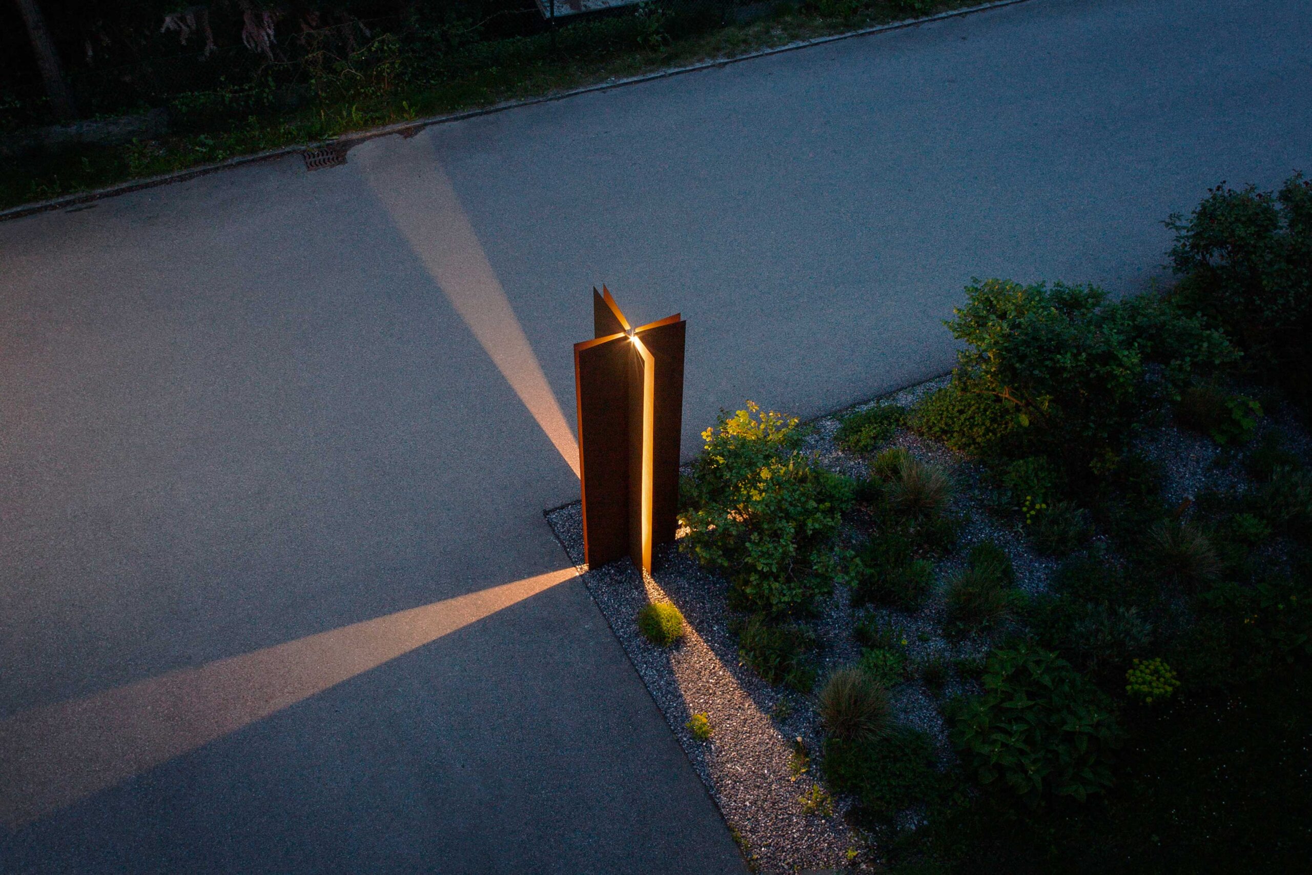
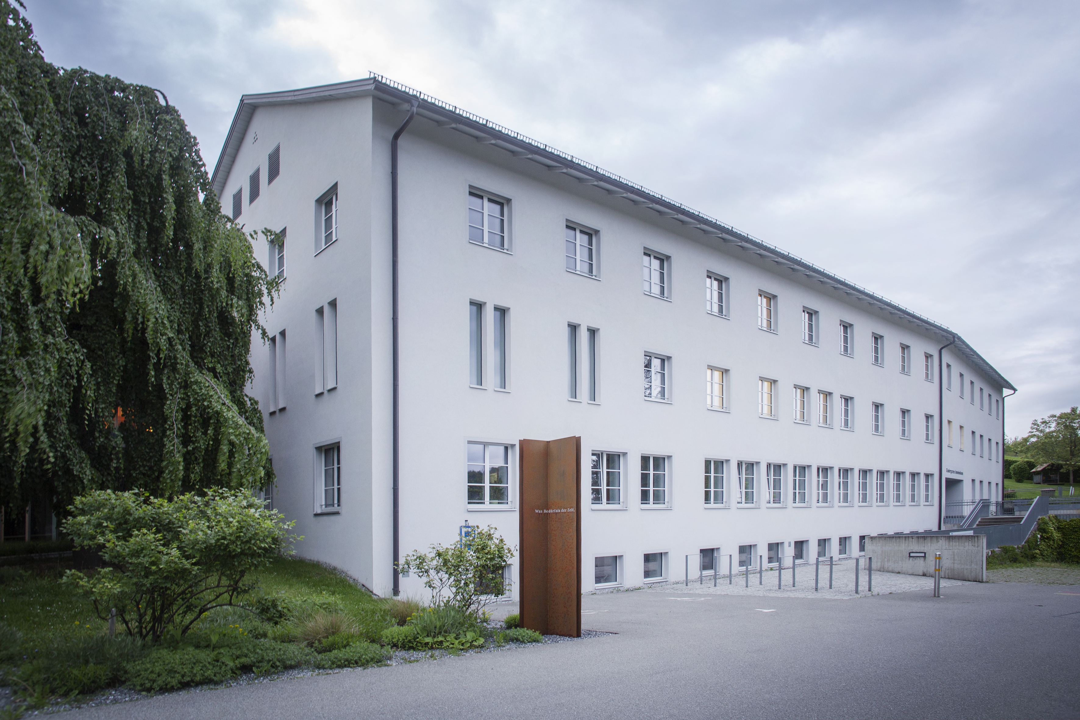
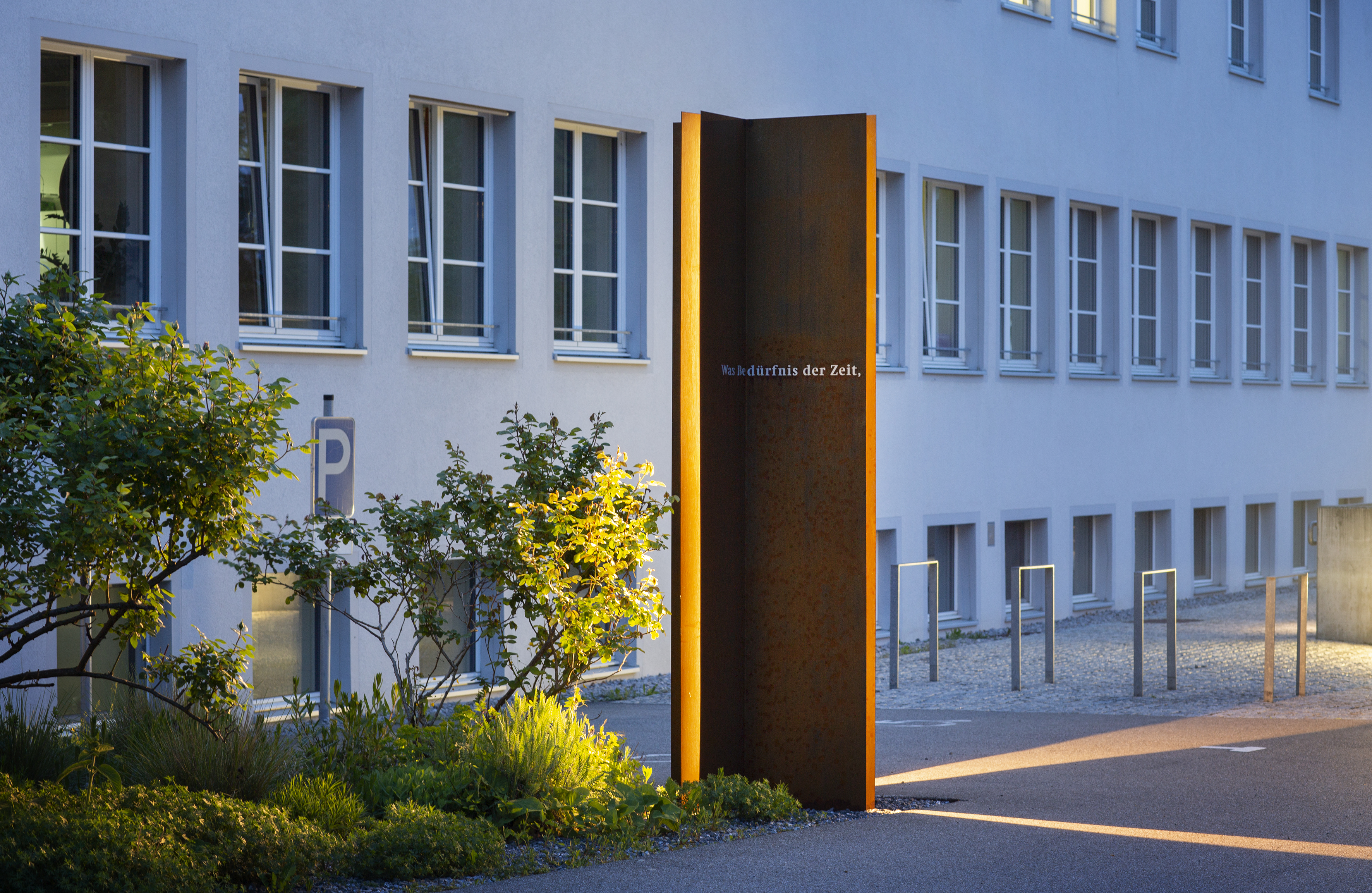
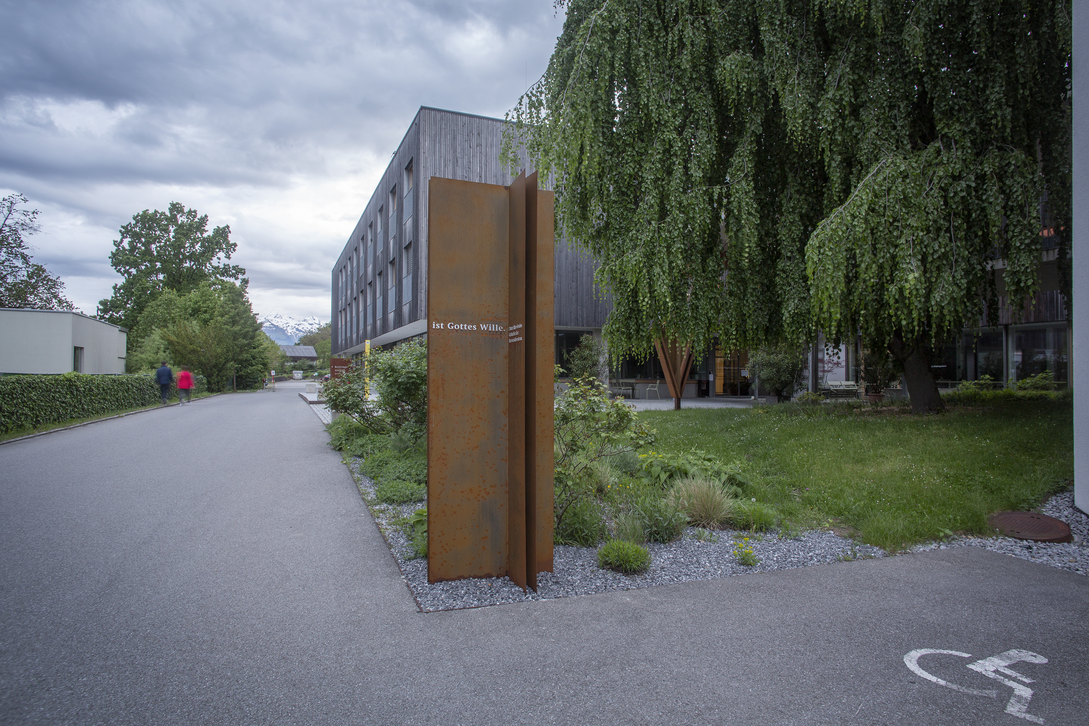
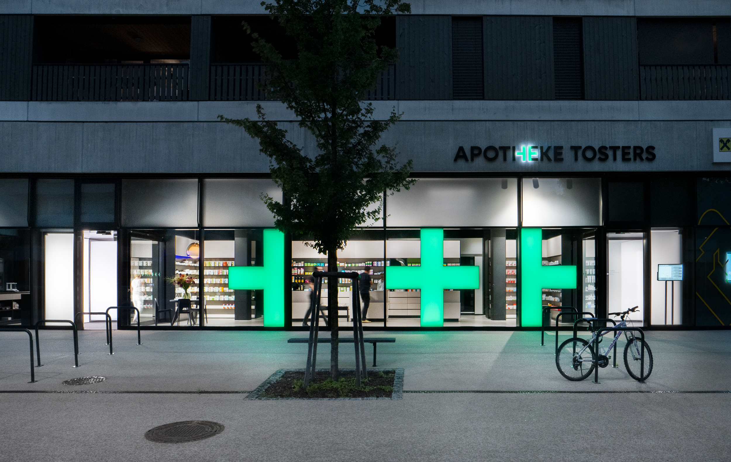
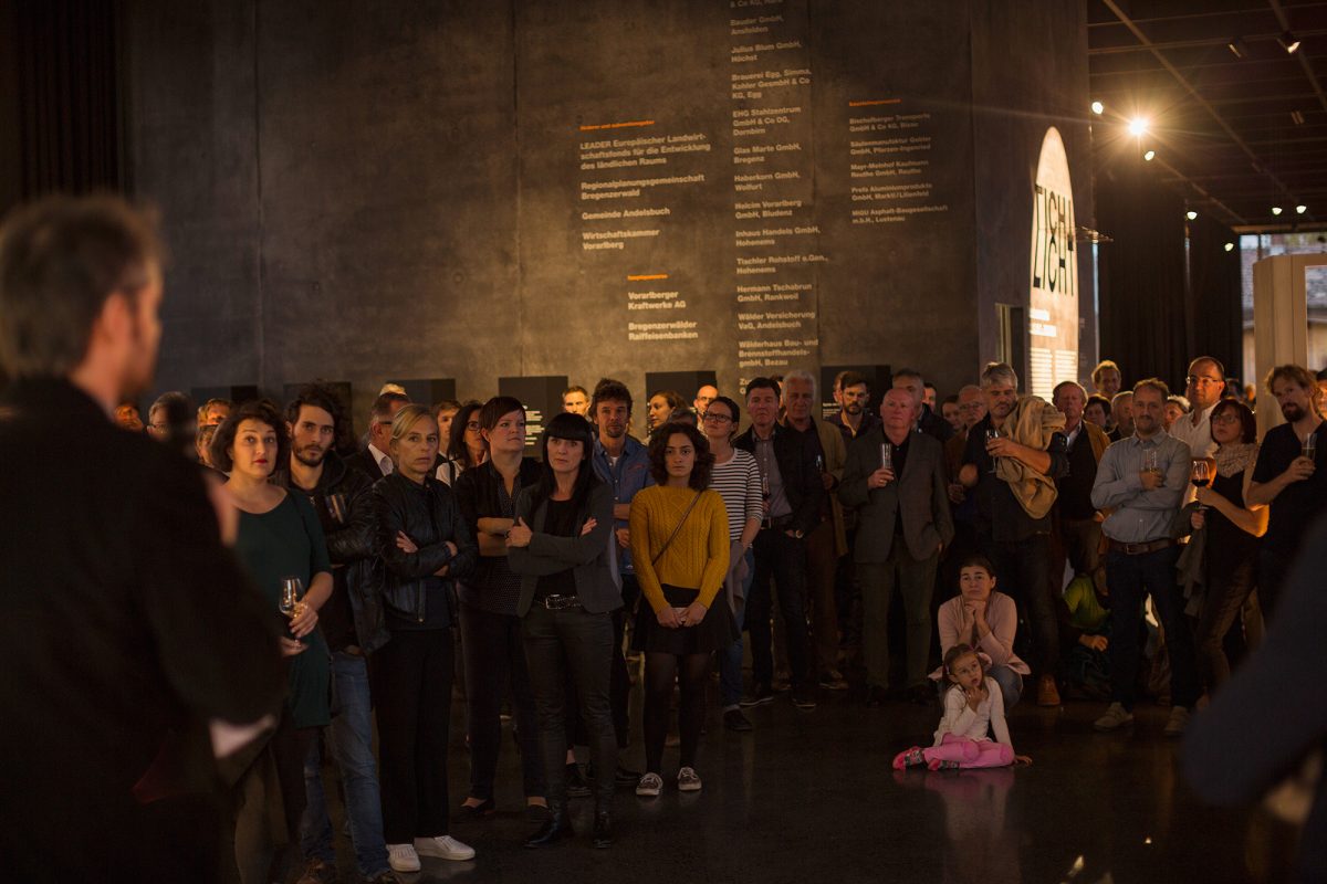
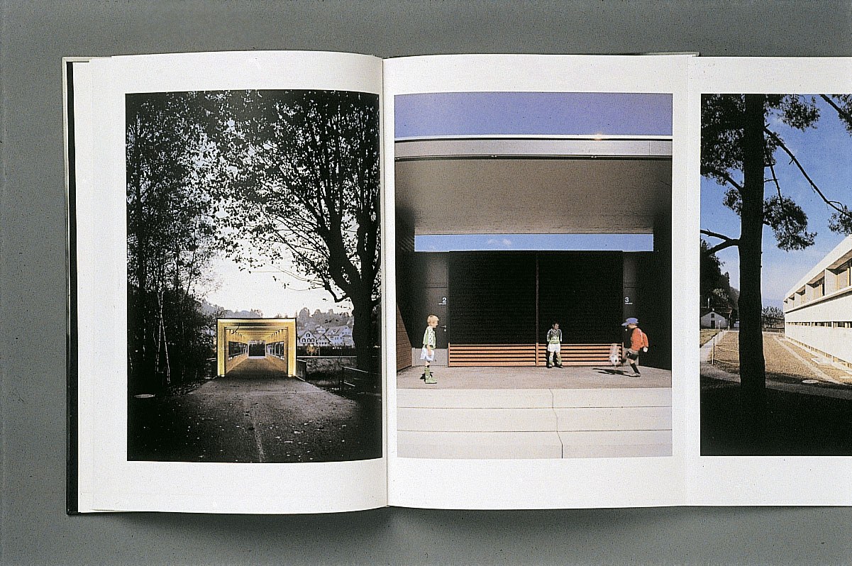
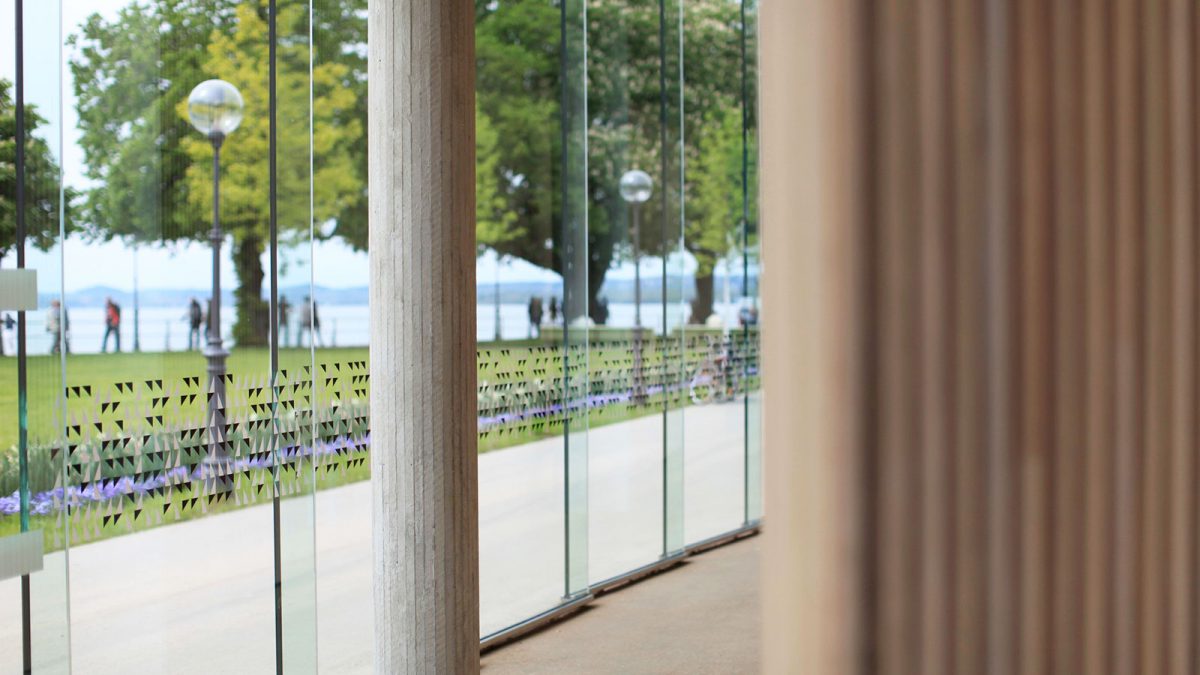
At the end of 1991 I followed the implementation of the new “Dornbirn City Bus” with great interest. The competition was won by a team of two experienced Vorarlberg designers: graphic designer Reinhold Luger and architect Wolfgang Ritsch. The new bus was presented as “luxury bus line”. This had absolutely nothing to do with the old Postbus as we knew it, but also not with a touring coach with all the usual kitsch. It was more like a private car: modern bodywork – the powerful red paintwork edged above and below in anthracite, large, dark band windows, restrained lettering, inside elegant shades of grey, functional seating with lovely fabrics and finishes. The most spectacular aspect, however, was the chassis of the so-called “low-floor bus”, which can lower itself slightly towards the passenger and has two entrance and exit doors. This was something that people knew, if at all, only from airport buses. In connection with a slightly raised pavement area it made barrier-free boarding possible and 20 years ago that was, at least in our part of the world, something completely new for a public bus. The stop had a surprisingly modern bus shelter transparently built of steel and glass, with restrained lighting and fittings. The plain, slender columns indicating the stop were also most striking. The visual appearance was determined by the severe typographical design in a sans-serif New Helvetica. The use was consistent and geared for the future – which is something that can be better judged today. The buses, bus-stops and the means of communication were all committed to good contemporary form. Dornbirn had its own bus system for local public transportation, a functional timetable, a bus station and a dense network of stops at a high urban design level. Advertising and user guidance were based on modern visual communications. Through its temporal and spatial presence the “Dornbirn City Bus” shaped the image of Dornbirn – the town became a city.

The concern was not simply a packaged mobility service but an image and identity, a striking architectural and urban design pattern.

The new bus in Dornbirn was talked about throughout Vorarlberg. As well as the improvement to the service that resulted from more modern vehicles and more user-friendly intervals, bus and stops were now perceived as image-enhancing and identity-building elements. Hardly surprising: the stops positioned at busy locations and the buses that travel along main traffic arteries offer unbelievable opportunities for contacts in public space. It is not by chance that they are so often misused for advertising. But not in Dornbirn. The new buses and stops were kept free of advertising, or advertised just themselves. They said: we are Dornbirn, a city with a modern bus system that is “our bus”. This message, constantly repeated through its public presence, supported a feeling of community and belonging throughout the entire city. In the competition between the various towns and cities of Vorarlberg this was a clear plus.

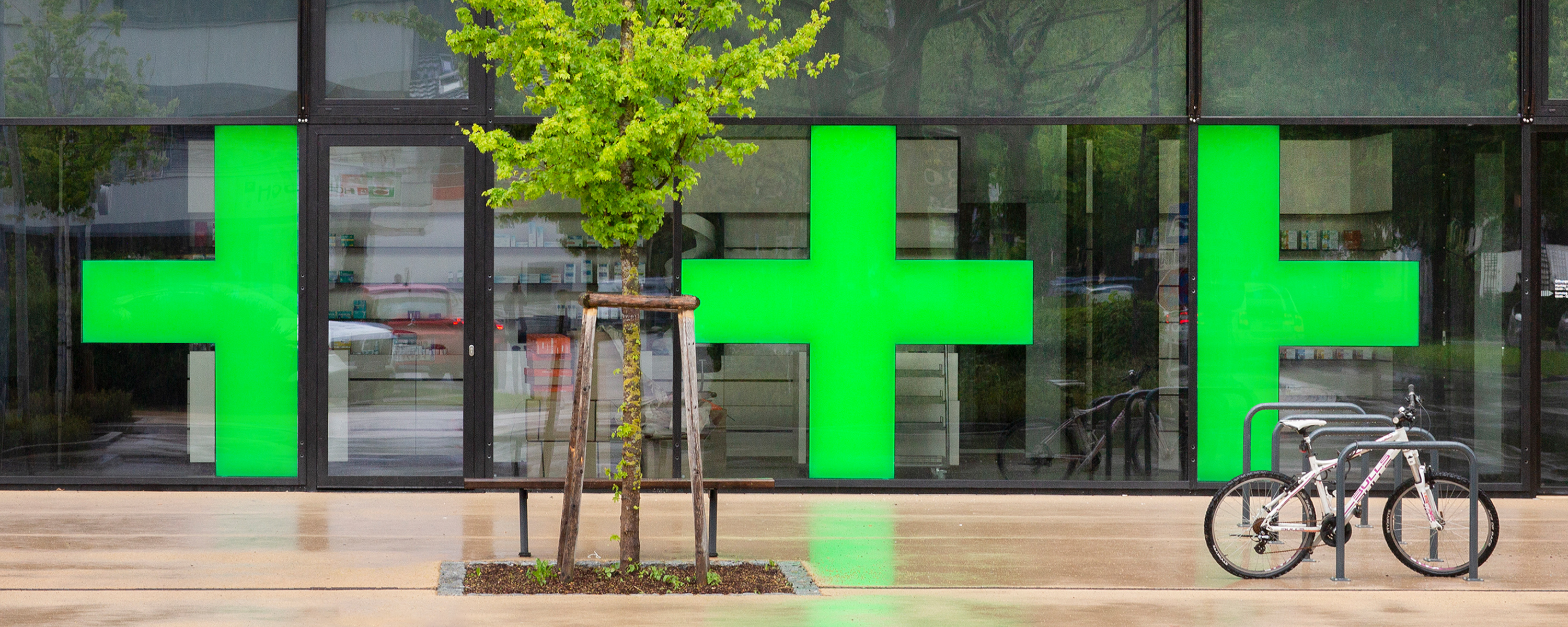
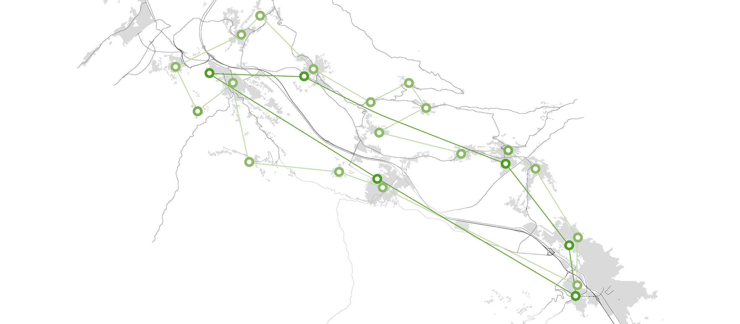
These towns were already working on their own concepts: in 1992 Feldkirch commissioned our studio to design a public appearance for the Feldkirch city bus. The commission went clearly in the direction of city marketing and was conceived as an answer to the pressure of competition from Dornbirn. We developed design solutions with a strong connection to Feldkirch in terms of colour and typography. Around the same time we received an enquiry about designing the appearance for a new “Vorderland Country Bus”. This made me somewhat uneasy and mistrustful. I made enquiries which confirmed that several towns and associations of local authorities were engaged in designing their own bus systems and commissioning designers to produce further “island or isolated solutions”. I called up the deputy Governor and later Governor Sausgruber, who had an open ear for my reservations about this matter. Naturally, such an initiative was the responsibility of the individual communities but it needed to be linked and, in the medium-term, connected to form a transportation system throughout the province. In my opinion the need for a uniform appearance had been overlooked at the start, but even without my intervention it would certainly soon have been recognized. For me the question of what should happen with the well-established appearance of Dornbirn city bus was quickly answered. I proposed that all individual design proposals should be withdrawn and that the Dornbirn concept should be employed to generate an appearance that could be used throughout the province. The design solution in Dornbirn had the potential for supra-regional use. In fact I learned only later that, from the very start, the designers had taken into account the fact that the system might one day be used throughout the province. Those in positions of responsibility reacted positively and rapidly. The province acquired the rights to the architectural elements from Wolfgang Ritsch. Nolde Luger transformed the logotype using different names for other towns and regions and differentiated the various applications through individual colour schemes. Bludenz, for instance, has green, Feldkirch a rich yellow, Dornbirn the powerful red and Bregenz blue as the basic colour for the paintwork of the buses and the directional system. These colours are generally also corporate design elements for the respective towns. For the regions between the towns lemon yellow was used as a uniform colour, and Landbus (country bus) was added to the name, rather than Stadtbus (city bus).

The “touchability” of a good form has nothing to do with lofty detachment. It is there as something that can be experienced and accepted, with a human scale. In the city and country bus system it was realized consistently.

The modern line buses and the stops with the information columns soon became a familiar sight in the region. The stops work equally well as freestanding elements in the landscape and in inner-city areas. The harmonized colours used for the vehicles, columns and the graphic design of the timetables help to guide users in a highly efficient way. The sizeable state subsidy for the operation of the buses is tied to the requirement for the individual communal bus operators to observe all constraints with regard to the general appearance. To the present day this has served as a guarantee for uniformity and consistency. Unfortunately, this does not apply to the bus shelters and consequently in some place less than satisfactory shelters are encountered. These were erected by poster companies which save the local authorities the entire cost of building and maintaining the shelters and in return receive the proceeds from renting the advertising surfaces in them. For those in positions of responsibility in Feldkirch and Vorderland I worked out what renting areas for posters or placing advertising at the usual rates would cost the bus companies compared to using the buses and stops as an advertising medium for their own services. Further important arguments against “special solutions” of the kind outlined above are the damage to values that result from having outside advertising on communal vehicles and waiting areas and the opportunities to shape the appearance of a place that are lost by allowing an architecture that is alien to the system. The bus system used throughout the region has remained largely free from outside advertising – to the present day.

The completely unexpected increase in the number of passengers – in Dornbirn, for example, the figure rose from 2.6 million in 1991 to 5.2 million passengers in 2011, i.e. around 100% – is naturally not due solely to the good form. There are certainly other important factors, which I register less as a visual designer and more as a consumer: the organization of a Vorarlberg transport and tariff association, giving priority to buses in traffic planning and the continuously improved and self-communicating service. In Dornbirn alone, a city with a population of 46,000, today there are 20 line buses, most of which run at ¼ hourly intervals and serve 240 stops – 42 of which have bus shelters. The Dornbirn city bus provided the decisive impulse for the system of bus routes throughout the province. Thanks to the vision of people in positions of responsibility and to the advantage of all a service and design originally planned at a local level could be used supra-regionally and developed further. As a result the province and the communities obtained a modern public transportation service and at the same a strong, connecting building block for the construction of an image.

Reinhard Gassner

Corporate Design

  |   By  |  0 Comments

The main visual protagonist of corporate design is the logo or the logotype. This is a sign or symbolic depiction reduced to essentials, which is tied to a certain identity. For the effectiveness of an image or word and image brand, its concision and semiotic accuracy are of decisive importance. A comprehensive CD programme includes further elements such as typography, colours, palette of substrates, design grid, editorial and image concept as the formal “rules of the game”. A visual appearance first achieves an effect that creates identity and shapes an image through the creative interpretation and consistent application.

We are not aware of it but in fact we constantly bathe in a sea of the meanings of images and things. They are present in signs, forms, sounds, spaces, and they influence our perception. These are the things graphic designers deal with in their profession. Generally, in one’s work one attempts to cultivate the beautiful or at least the interesting. What is referred to here is not kitsch or visual frenzy but far more the delicate tones of gradually increasing, emphasising something: swelling, brilliance and contrasts, the repetition of constructive and symbolic forms – for instance the wings in many symbols or the central axis as a design principle (national coats-of-arms, McDonald’s logo, images of angels…). The right scale is rarely found. Exaggerations are counter-productive. The following thought has been handed down to us from the ancient Greek thinker Longinus: “…in general bombast seems to be one of the failings that it is hardest to avoid. For, out of fear of being described as feeble or anaemic, all who strive for greatness tend somehow or other to make this mistake.”

Book vs. e-book

  |   By  |  0 Comments

The main visual protagonist of corporate design is the logo or the logotype. This is a sign or symbolic depiction reduced to essentials, which is tied to a certain identity. For the effectiveness of an image or word and image brand, its concision and semiotic accuracy are of decisive importance. A comprehensive CD programme includes further elements such as typography, colours, palette of substrates, design grid, editorial and image concept as the formal “rules of the game”. A visual appearance first achieves an effect that creates identity and shapes an image through the creative interpretation and consistent application.

We are not aware of it but in fact we constantly bathe in a sea of the meanings of images and things. They are present in signs, forms, sounds, spaces, and they influence our perception. These are the things graphic designers deal with in their profession. Generally, in one’s work one attempts to cultivate the beautiful or at least the interesting. What is referred to here is not kitsch or visual frenzy but far more the delicate tones of gradually increasing, emphasising something: swelling, brilliance and contrasts, the repetition of constructive and symbolic forms – for instance the wings in many symbols or the central axis as a design principle (national coats-of-arms, McDonald’s logo, images of angels…). The right scale is rarely found. Exaggerations are counter-productive. The following thought has been handed down to us from the ancient Greek thinker Longinus : “…in general bombast seems to be one of the failings that it is hardest to avoid. For, out of fear of being described as feeble or anaemic, all who strive for greatness tend somehow or other to make this mistake.”

Turn of the year

  |   By  |  0 Comments

For the turn of the year 1980 Atelier Gassner started an edition on the theme of the development of lettering and alphabets. Traces of lettering, in many cases researched at the original locations, were edited as annual gifts, produced in limited editions and in different forms of presentation. From 2010 Gassner Redolfi KG has continued this edition in an expanded sense using typefaces and their visual significance.

1980/81 Mesopotamia – cuneiform script of the Sumerians, clay tablet
1981/82 Egypt – hieroglyphics, screen print, water-coloured
1982/83 Syria – alphabet of the Phoenicians, gold foil embossing
1983/84 South America – Maya alphabet, jaguar head as plaster relief
1984/85 Tibet – original calligraphy by Geshe Thubten
1985/86 China – original calligraphy
1986/87 Germany – Gutenberg’s characters, wooden numbers, book printing
1987/88 Armenia – year as ceramic piece
1988/89 Persia – Pehlevi lettering, seasonal greeting and drawings by Iranian children
1989/90 Central America – Zouche Nuttal Codex – Mixtec pictography
1990/91 Armenian alphabet – by Franz Gassner, embossing
1991/92 Japan – original calligraphy by Mitsue Kono, scroll
1992/93 Greece – alphabet ODOS, enamel tablet and leporello (folded booklet)
1993/94 Africa – lettering of the Tuareg, wet-impressed in handmade paper
1994/95 North Germania – Viking runes, beech rod and leporello (folded booklet)
1995/96 Slovakia – Cyrillic alphabet, post-cards in booklet
1996/97 Sinai – Arabicsalphabet, Nivea, “The Blue Tin from the Red Sea...”
1997/98 America – Morse- alphabet, Morse strips
1998/99 China – Pa-kwa writing, I-Ging, folded poster on India paper
1999/00 Occident – ©, Jesus without centre parting, poster
2000/01 England – SMS “WOT R U TRYNG 2 SAY?” TypoGraphic 56, book-/offset printing
2001/02 Arabia –zero, al-sifr, the greatest nothing, embossing
2002/03 Arabia Mohammed Jesus – poster made at the start of the Iraq War
2003/04 Turkey – Turkish alphabet, poster with a poem by Kundeyt Şurdum
2004/05 Armenia – Georgian/Armenian alphabet in newspaper format
2005/06 Syria – the first alphabet, photo-poster, Umayyaden Mosque Damascus
2006/07 America – “Segoe” from Windows Vista, email
2007/08 Middle East, Caucasus – “Du bist keine Fremde hier in Kalimera”, book about 7 journeys
2008/09 Israel – “Schalom”
2009/10 Tokyo – keep on swinging...
2010/11 GASSNER REDOLFI KG – portrait with punctuation marks

Mohammed Jesus – print collage

  |   By  |  0 Comments

Reinhard Gassner used poster motifs to make a print that relates to the chaos of war in former Yugoslavia. The subjects, sketched directly as an illustration on offset panels, were printed over each other so often that the aesthetic of a ‘bold misprint’ was created. Instead of the titles of theatre pieces the two names ‘Mohammed’ and ‘Jesus’ are placed together like the first name and surname of one and the same person; well-known icons of creeds with imperial aspirations are named. The war and evil lies essentially in the belief that only one prophet can be the true one. The conflict is visualised typographically through the use of the Cyrillic and Latin alphabets.

Cambio Milenio – poster for the new millennium

  |   By  |  0 Comments

Do you know who invented the copyright symbol? Reinhard Gassner was unable to find this out. Whatever the case; it contains the Roman number 100. Around the ‘C’ there is a circle that you could also call a halo. Along with 30 other German-speaking designers Gassner was invited to design a poster for the Goethe Institut in Santiago de Chile to mark the start of the new millennium.

The visual idea is derived from a remark made by Jan Tschichold; about the theme of the centre axis he said: imagine Jesus without a centre parting. In the representation of saints we encounter the circle as a halo and the emphasis of the centre axis as a sign of uniqueness and credibility. As the model for the design a well-known Russian icon with the sacred face is used.

The intervention in the image is restricted to changing the centre parting and the direction of the gaze and visually addressing the zeros of the year 2000, which were still unfamiliar at the time – packed in the copyright symbol; the new century without a halo.

ImWalgau.at – Database of the Knowledge and Thought of a Region

  |   By  |  0 Comments

Located in the south of Vorarlberg the Walgau region consists of numerous small communities. With the goal of encouraging citizen participation in these communities and integrating them in the regional planning process it was intended to develop dialogue-oriented communication.

The main page provides all the important basic information. A subpage functions as a kind of Wiki for information worth knowing about the region, in addition technical functional tools for participation and open communication are offered. A product of regional development, the website is intended to form an actively used database of knowledge and thought in the region that extends beyond the period of the process. A well though-out and consistently used design grid introduces the requisite calm and clarity and ensures user-friendly application.

Hippokratest.com – self-assessment for doctors

  |   By  |  0 Comments

Hippokratest® is a self-assessment instrument for doctors who work in the areas of internal and general medicine, for quality circles and doctor networks. A catalogue of questions was compiled by experts from 15 clinical disciplines with the aim of achieving a modern kind of further training. The assessment consists of 60 multiple choice questions, followed by an evaluation backed up by anonymous comparative values and suggestions for further training tailored to the participant’ specific strengths and weaknesses.

Hermann-Kaufmann.at – presentation surface and archiving tool

  |   By  |  0 Comments

The website “hermann-kaufmann.at” not only provides a representative and comprehensive internet site, an integrated database that the feeds the site also serves as an archiving tool and as project server for current projects. This system was used to create a complex and forward-looking administration and data management tool.

dataholz.com – interactive building component catalogue

  |   By  |  0 Comments

dataholz is an interactive building component catalogue with more than 1500 tested and approved variations available at the press of a button. The contents are constantly expanded and improved by proHolz Austria and Austrian Timber Research, which considerably simplifies the work process for all architects and planners.

New architecture in Austria – architecture guide

  |   By  |  0 Comments

“Neue Architektur in Österreich” (New Architecture in Austria) forms part of a series of architecture guides. Gasser Redolfi KG already collaborated on the earlier volumes covering Vorarlberg, Carinthia and Tyrol.

The content is divided up into regions; the start to each chapter contains large photographs – scenographic views or bird’s eye perspectives, introductory texts and maps showing the locations of the buildings. As only two numbers are employed, one for the region and one for the respective building, the book can be used very easily by readers. The pages on the buildings are designed in a very compact way. The small, convenient format requires exact typography and high reproduction quality in print. In the first edition the architecture guide also covers the neighbouring region of western Hungary and is trilingual – German, Hungarian and Croatian.

La Mirada Muda – triptych as book concept

  |   By  |  0 Comments

This book serves as the exhibition catalogue for architecture photographer Ignacio Martinez. His aim is to show pictures without text, hence the title “Der stumme Blick” (The Silent Gaze). The image on the cover shows a much enlarged shadow of the photographer’s father cast on Spanish ground. In the book the pictures are combined in groups of three. For Ignacio Martinez the formal relationships between the photos are important, and not so much the buildings themselves. When you first open the book it is black and white. The content is revealed only when you open out the folded pages. The groups of three photos – the triptychs - are not accompanied by any text. The relevant facts are to be found in the information graphics in the appendix. In an overview the most important photographic lines are shown and something about the formal aspects is conveyed; at the same time this approach also allows the editorial information about the pictures to be correctly ascribed.

Vision Rheintal – bibliophile cartography of regional development

  |   By  |  0 Comments

The publication “vis!on rheintal Dokumentation 2006”, which was issued by the State of Vorarlberg and 29 municipalities in the Rheintal, documents the results of a two-year work process and is intended to provide stimuli and to function as a reference work for the further development and implementation of the Vision Rheintal.
The informative cartographic view extends through the publication like a red thread. The consistently pragmatic design was provided by the design office grafiksg - Stefan Gassner as project leader in collaboration with Gassner Redolfi KG. The printers Höfle in Dornbirn were responsible for the high-quality reproduction and printing.

Wood spectrum – facsimiles of European kinds of wood

  |   By  |  0 Comments

Working in collaboration with recognised experts, proHolz Austria produces a practice-related handbook for two dozen native kinds of wood, which, in a concentrated way, compiles technical values, botanical characteristics and references from cultural history. In visual terms the main part is made up of magnificent colour prints of the selected kinds of wood. These were directly scanned and printed at the very highest quality.

The book “Holzspektrum” was awarded a diploma of honour in the international competition “The Finest Books from throughout the World 2007”. On 16 and 17 February 2007 in the Deutsche Nationalbibliothek in Leipzig seven jury members from China, Germany, France, Austria and Hungary examined 545 books from 33 countries. These books had either already received an award in their respective national competitions or had been selected by committees of experts in their country of origin. 14 different awards were decided upon.

Elementares zum Raum – theory and architecture in a single book

  |   By  |  0 Comments

The works of architect Roger Boltshauser provide the framework for a differentiated examination of the human perception of space and of its basic elements. In the first half of the book theories of spatial perception are presented, illustrated and discussed. This part reflects the joint teaching work of Roger Boltshauser and Aita Flury and, in the form of a dialogue, links various approaches and scales ranging from the individual building to urban planning. The second part forms a complement to the first and presents Bolthauser’s works. These are, at one and the same time, both a link and a contrast to the discussions in the first section. The functional, severe and reading-oriented design of the first half of the book here gives way abruptly to a fully illustrated and generously wrapped layout that expresses the strongly defined tectonics and powerful structure of Boltshauser’s buildings. German and English are ascribed equal importance and are consistently placed side by side. The typogramm used to differentiate the languages and to organize the contents hierarchically contains two families of typefaces from the 1950s – Univers by Adrian Frutiger and Melior by Hermann Zapf.

The special challenge lay in preventing the book, which has two (apparently) different halves, from “breaking part”. The integration is achieved by directly meshing different examples of images and by the use of certain design measures: a finely articulated basic grid, graphic severity, deliberate breaches of the rules in the layout, and black and white Duplex reproductions throughout on finely coated, matt art paper.

You are not a foreigner here in Kalimera – travel book

  |   By  |  0 Comments

This sentence, taken from an ancient stele in the Apulian town of Kalimera, is used as the title for a new book about seven journeys that followed the traces of Greek (language) culture outside Greece. The contributions, which are in German and Greek, appear in the spring programme of Residenz Verlag in St. Pölten and the publisher Ianos in Thessaloniki.

The travel report by Kunrich Gehrer is a cogent contribution to interpreting and understanding European western culture and its Greek roots. All the carefully made photo reports are by Paul Rachbauer. Reinhard Gassner provides information on the development of lettering in the countries visited and the relationship to Greek lettering, illustrate with graphics and alphabets.

Wood works – the art of building in wood in detail

  |   By  |  0 Comments

Hermann Kaufmann is a European pioneer in the field of modern building with wood. This book presents an interim balance of the projects he has carried out in the last decade. 25 works are organised in five thematic groups and comprehensively documented. Through the design of the book the complex contents and the descriptions, which are in three languages throughout, are presented in as clear a form as possible.

A double page is divided into four columns. In the first column the chapter or project title, short introductory texts and paginated footnotes are positioned. The language mutations – typographically slightly differentiated – are given equal value and arranged beside each other in the remaining three columns. The typographical design invites you to read, gives the layout a rhythm, and provides the necessary interim stops amidst the generously laid out pages of images and plans. “Wood Works” is illustrated with top class reproductions of images and plans and provides construction details of important aspects along with specially designed tables and diagrams. Photographer Nikolaus Walter’s picture essay on the everyday world of the buildings provides a view that expands on Bruno Klomfar’s objective architecture photography. In accordance with the “aesthetic” of Hermann Kaufmann’s buildings instead of heavy, smooth art paper a fine and open-pored substrate is used. The fine grain and the reduced colour contrasts of the illustrations are entirely intentional. In terms of the kind of paper, the binding and format the book-block is deliberately light and “soft”, flexible and handy. With a width of 216 mm and a height of 270 mm the volume has 256 pages and, including the linen cover, a thickness of 25 mm.

Rauch House – a building monograph

  |   By  |  0 Comments

The dwelling house and studio in Schlins, Vorarlberg erected by clay builder Martin Rauch together with architect Roger Boltshauser is a model of contemporary building with clay.
The publication describes the development of a house built of earth, documents the construction details and shows the ecological nature of the material clay. The motivation lies in coming closer to the varied aspects – largely unknown in the current architecture discourse – of this special rammed clay building and awakening an understanding of the material’s qualities and potential.

Through formal quality the theme is rescued from the alleged naivety of the ecological movement and is given a new presence. Calm sections of text contrast with exciting sequences of images. The reader is invited to explore the house visually and in terms of content. For the lamination of the cover, the front and back endpapers and in the core a highly voluminous substrate with a haptic velvety surface was used. The book itself is more like a textbook than an illustrated book. The reliefs on the half-linen cover tell about genesis and decay

KONstruktiv – magazine for Austrian architects and engineers

  |   By  |  0 Comments

A magazine with a rich tradition, “KONstruktiv” is the media flagship of the Austrian Federal Chamber of Architects and Consulting Engineers. For a re-launch of the magazine the professional transfer of knowledge was prepared in a contemporary form and revitalised. For the cover concept the title images were placed on one side and different decorative colours used. Other elements include an exciting use of text wrapping and careful macro and micro-typography with interwoven narrative and factual typefaces, editorially oriented explanatory graphics and lexically built-up pages in-between. Additionally, there is also a kind of “display case” with a consistent design line that provides a new form of presentation for advertisements.

materialegno – Italian language architecture magazine

  |   By  |  0 Comments

The title materialegno is derived from the words material and legno (wood). It thus conveys the content in a clear and concentrated manner. materialegno is an Italian language magazine that appears at irregular intervals, produced by promo_legno, Milan – an Italian platform for timber marketing. The magazine is directed at designers and those interested in building. materialegno shows new methods of production, construction, design and implementation of the material timber. To embed the messages from the start in a good reader environment this extra-large medium appears as a supplement to the Italian architecture magazine Domus“.

The aim of the design is to convey the language of modern architecture through visual communication. The concept of the magazine alone makes it clear that here information is not to be disturbed by foreign images or advertisements. It is not the name of the main sponsor that is placed on the back cover but art connected to the material wood. Every cover is in a different decorative colour. Thus the key visuals are viewed through coloured sun-glasses, as it were. Inside the magazine the typographical interventions are combined with generous amounts of pictures. The layout is cleanly organized but also variable and fresh.

Holzperspektiven – permanent exhibition about wood and the forest, Rubner Haus Kiens

  |   By  |  0 Comments

Working together with architect Alberto Alessi, Zürich, Gassner-Redolfi develops a permanent exhibition in an exhibition space measuring 400 m² in the new administration building of the international timber construction company RUBENS in Kiens, South Tyrol. With the title “Holzperspektiven” (Wood Perspectives) the exhibition tells about the forest, trees and buildings, makes the physical and haptic qualities of wood tangible, and demonstrates the importance of this material for the culture of building, in earlier times and today, both regionally and internationally. The exhibition is a reminiscence of the phenomenon wood, a haptic, spatial narrative about wood, starting from its source as a raw material and extending to different perspectives on how the material can be utilised. This is not a product exhibition but a wood exhibition. It is about the passion for wood which is clearly evident in the RUBNER business and which the exhibition aims to convey.

Hohe Auflage – exhibition about remarkable media cooperation

  |   By  |  0 Comments

Project description from the book Atelier Gassner:
extensively focussed | Hohe Auflage – exhibition vai, Dornbirn

Since November 2011 the Vorarlberger Architektur Institut – known in short as vai – has been responsible for the project selection and editorial design of the cover series for the “Leben & Wohnen”supplement to the Vorarlberger Nachrichten newspaper. The concept of a media cooperative, which Reinhard Gassner helped to develop, is new. The exhibition “Hohe Auflage” is intended to present this remarkable collaboration between vai and VN in an enjoyable, enthusiastic overall show.

33 reports, representing a total of 175 pages on architecture, are detached from the property supplement and a facsimile is made of them on a fifty-metre-long piece of paper. This length of paper is stretched through the exhibition spaces, moves up and down, is twisted in the middle around its own axis, and finally runs out on the floor. Associations with the form of reproduction are awakened by web offset printing on a paper roll, which is standard in massprinting. By lining up the contributions the enormous variety and quality of this reportage is clearly demonstrated.

A glossary concludes the series of contributions on the length of printed material web. The selected words from the fields of architecture and mass communications were compiled from various encyclopaedias and dictionaries. A section of a printed image enlarged more than one hundred times serves as a macro view of the reproduction technology. This wall-mounted image, 566 cm wide by 302 cm high, shows the dot matrix of images and the blurred edges of letters. In the special issue “Nur Text” (only text) the architecture stories – just the texts – are combined in a limited edition of 3500, stacked on a pallet for people to take them home with them. A word image the size of a wall makes the 33 headlines of the contributions readable in a new way. The “forced justification” in narrow columns placed beside each other, with exaggerated spacing between the lines, leads you to read horizontally. This typographical faux pas produces poetic lines made up of words and fragments of words apparently arranged at random next to each other.

Bauen mit Holz – exhibition in the Künstlerhaus Vienna

  |   By  |  0 Comments

»Bauen mit Holz – Wege in die Zukunft« (Building with Wood – Paths to the Future) is an exhibition by the architecture museum and the timber building department of the TU Munich that was launched in 2012 in  Munich’s Pinakothek der Moderne. Now, in an adapted form, it is presented by proHolz in cooperation with the Künstlerhaus in Munich. The aim of the exhibition is to explain and convey to a wider public the transformation of the building material wood, ignored for so long by modern architecture, into a new source of hope for forward-looking urban building.

The information is presented in the form of short texts, plans, photographs or videos on 120 cm wide, vertical strips of silk paper that extend the height of the space. The unbleached, naturally brown strips of paper are combined with models of timber buildings precisely constructed in the TU Munich and give the exhibition its rhythm.

Dates and facts are transformed in impressive explanatory graphics. The relationship between the “primal plant tree” and the technical world of planning and building is also a theme of the exhibition logo. An archetypical house is here formed out of the branches of a tree and semantically focuses on the core messages: that wood is a renewable, highly efficient building material and that building with wood is active climate protection. In the publication that accompanies the exhibition well-known specialist authors analyse the ecological significance, technological potential, and new aesthetic of this familiar construction material.

Bauen mit Holz – exhibition in the Pinakothek der Moderne Munich

  |   By  |  0 Comments

The United Nations declared 2011 the “International Year of Forests”. In response to this the architecture museum and the department of timber construction at the University of Technology in Munich presented an exhibition that dealt with the ecological, technical and design possibilities of this material.

The exhibition starts with the forest and reflections on wood as a raw material. Opposite this, five current timber construction projects are presented and their benefits in terms of climate protection are explained. After this 52 selected international examples illustrate new digital finishing methods and illustrate the architectural diversity of modern timber construction: from the low energy house to wide-spanning structure to high-rise buildings. A room made entirely of beech wood completes the exhibition. Rarely encountered in timber construction, this wood is here used most effectively for various building elements that form the floor, ceiling and wall, employing a variety of surface finishes.

The chief protagonists are the models of timber buildings made with acribic precision by students from the architecture faculty at the TU Munich (department of timber construction). The stands for the models presented are uniform, delicate frames made of spruce. The information is presented in the form of short texts, plans, photographs or videos on 120-centimetre-wide strips of silk paper extending the height of the room. The unbleached, naturally brown lengths of paper surround the huge rooms and give the exhibition a rhythm. Dates and facts are transformed into impressive explanatory graphics. For example: the amounts of different kinds of wood are translated into a 20-metre long bar diagram that uses pieces of the various woods. An 80-year old spruce tree – from the rootstock to the tree top – lies in the middle of the exhibition space as a scenographic intervention. The 40-metre-long trunk is freed from branches, some of the bark is removed, and it is divided into individual sections with increasingly fine longitudinal cuts. The top of the trunk points towards a 5x5 metre patchwork made up of different wood-based materials. The link between the tree as a primal form of plant and the technical world of planning and building is also a theme of the exhibition logo. An archetypical house is shaped from the branches of a tree and focuses in semantic terms on the core messages: wood is a sustainable, highly efficient building material and building with wood is active climate protection.

In the publication accompanying the exhibition nine well-known experts analyse the ecological significance, technological potential and new aesthetics of this familiar material.

Bauen mit Holz – Wege in die Zukunft
Architecture museum of the TU Munich in the Pinakothek der Moderne
10.11.2011 – 05.02.2012

Concrete Works – architecture posters in block format, Marte.Marte im Aedes Berlin

  |   By  |  0 Comments

The design of the exhibition with sculptural models of the buildings and reduced plan graphics is continued in the truest sense of the word by 8 A1-size “poster tear-off blocks“. Here visitors to the exhibition can help themselves. For each of the projects exhibited an iconographic image is chosen that conveys the atmosphere of the respective building in the most striking way. The strong photographs speak for themselves. The header to each poster clearly classifies the particular building depicted and through pictogram-like representations also refers to the other seven buildings in the exhibition.

Bregenz Hafen glass graphics– a visible code, an encrypted text

  |   By  |  0 Comments

For the Hafengebäude (harbour building) of the City of Bregenz an effective visual screen for 80 bays of full-height glazing was to be developed that would not impair the transparency of the building envelope. The starting point was provided by the need to interrupt the transparency, every 5 x 5 cm in black and white, with bars 2 cm high, for a certain viewing height.

The basis for the concept is provided by band of text in the shape of a rhythmical, graphical system of symbols of an abstract binary basic code; instead of 0/1, black and white are used in the form of a boustrophedon cuneiform script. The text, which deals with the theme of glass and transparency and was written especially for this purpose, remains encrypted. Ultimately, what one sees are apparently randomly varied ornaments and a mysterious pattern. Our lives are increasingly determined by a communication system which essentially consists of two symbols and is generally concealed from us. The concept is based on making this system visible and, with it, the rhythmical structure and order of the text. An extract from the text: “ … comparable to the phenomenon when the reflective surface of the lake, fleetingly moved by wind and waves, acquires this fascinating shimmering quality that meditatively captures the eye and at the same time relaxes it…”

Below the full deciphered text

In architectural parlance transparency is primarily associated with glass simply because we can look through it. But from outside, during the day and in the sunshine, large areas of glazing in buildings are never completely transparent. Through the reflection of the sunlight, the way the surroundings are mirrored glass buildings or glazed building parts can seem extremely massive, indeed hermetic, and from certain angles even dark and monolithic. From a distance, due to their reflective quality, they are highly noticeable, radiating space as it were, glittering like crystals. The idea of using digital patterns to break up the aggressive mirroring effect of such glass facades makes sense from a number of perspectives and is helpful in both design and functional terms: the ornament defuses the monolithic brilliance of the facades, giving the eye areas on which it can focus, whereas excessive transparency would create a safety problem in using the building. The crystalline surfaces relax in a pattern that introduces a certain grain, a suggestion of texture. A multi-dimensional layer is placed over the essentially mono-dimensional quality of glass, which creates a visual distraction and in semantic terms adds new layers and effects to the simple reflective aspect. In this way the material, whose surface repels everything, both visually and factually, is given a certain depth. The irritating aspect of the external effect is permeated, visually opened up for contrasting characteristics, more complex layers of meaning. Thanks to the printed pattern the architecturally intended transparency, the visual lightness of the building’s external and internal impact are retained, indeed even strengthened, as the reflective effects are limited, defused so to speak. In the harbour building the concern is the effect of lightness, dematerialisation, ultimately also of glass, which can best be achieved by ornamentation. With a pattern of this kind the glass of the building can relax in a pixel effect, comparable to the phenomenon when the reflective surface of the lake, fleetingly moved by wind and waves, acquires this fascinating shimmering quality that meditatively captures the eye and at the same time relaxes it…”

Dornbirn train station – images of human beings, re-railed

  |   By  |  0 Comments

Individuality and the masses: difference and indifference, randomness and rhythm, boundaries and the grid; the passers-by, those who welcome each other, ignore each other, those who move and search are all depicted going about their business. The reflections are, however, liberated, detached from their particular time; through the rhythmical collage they form a new reality and become a depiction of the place.

Everybody has their place in the glass graphics, together they produce a crowd. After attempts made using various patterns within the texture, concentration focussed on horizontal movement. The figures flow across the windows like lines of characters in a pictograph; they can be read individually and as an entire picture, they start hesitantly at the main entrance and in the second wall element become denser, filling the area to the edges. “A walk through the big city reveals that the difference to and indifference towards other people form a closely entwined, unhappy couple. The eye notices differences, to which it reacts with indifference.” Richard Sennet

FH-Vorarlberg – F, rgb, digital/analogue as protagonists

  |   By  |  0 Comments

The aesthetic platform of this image is the contrast between traditional and new means of design. The visual elements are the “F”, the colours r-g-b, as well as the Avenir family of fonts designed by Adrian Frutiger. Using printable paints the “F” is applied directly to the offset plate and printed on large sheets in pastels shades of red, green, and blue, one on top of the other. When trimmed to DIN sizes, this produces lithographs with wonderful pictorial compositions. The “F” appears in some form or other in all publications and documents and, as an airy, transparent landscape of colours and forms, creates the background for overprints in black and white. The F form also serves as raw material for visual essays. The complex corporate design program can be developed further by various users in the institution. Without the need for any elaborate form of graphic design monitoring new applications are produced constantly in various programs and systems

The town of Lech – a typeface, a coat-of-arms and nothing else

  |   By  |  0 Comments

To complement its appealing tourism advertising this town was looking for an image for all its communal forms of communication. Visitors to Lech am Arlberg are struck by the contrast between the gentle contours of the elevated valley and the rugged, soaring and plummeting outlines of the powerful mountains. The “Trinité” family of fonts by Bram de Does reflects something of this atmosphere. The standard form of this typeface is slanted slightly in the direction of reading; the individual letters are shaped with a high formal quality. This results in a sovereign and calm type, easy legibility and gracefulness. The special aspect of this Antiqua is the way the family is expanded to include three different ascenders and descenders. The characteristics of the different fonts are shown in a matrix and allocated to the different areas. This typeface is used for the entire correspondence and communication– ranging from letters written by the mayor to minutes of meetings, the community newsletter or public signposting. The municipal coat-of-arms, which is of heraldic origin, is respectfully integrated as a further principal element of the town’s image.

nu Datenautomaten – what’s that supposed to mean?

  |   By  |  0 Comments

The business “nu” produces both individual high-tech content-management systems as well as standardised software solutions for special users and branches. This “twin track” quality is taken up in the company’s verbal and visual communication and provides the basis for the design. With the name consisting of only two letters and a logo made from just a single form of letter – in one case standing on its feet, in the other on its head – a striking letter ornament is created: two colours, two letters, two directions. Overlaying these repeatedly produces new forms and colours. The “2” thematically addressed in the design also recalls the binary set of characters of the digital world

Cervantes&Co – book and wine, et cetera

  |   By  |  0 Comments

Cervantes&Co is a small bookshop that also sells Spanish wine and delicacies. The name is borrowed from the Spanish national poet, Miguel de Cervantes y Saavedra. The emblem blends the letter “C” and the ligature &, which is derived from Latin word “et”, to form a circular ornament. The opulent culinary figure accompanies the bare, functional name in a series of humorous insertions – as a stamp on packages, as a symbol that seems to fall off the edge of a facade flag, as decoration for a postcard, et cetera.

gbd – trade mark architecture for a group of businesses

  |   By  |  0 Comments

gbd is a group of businesses in Dornbirn made up of gbd ZT, gbd Fassaden, gbd Mosbacher, and gbd Lab. The areas in which this group works include: structural design, project management, the preparation of expert assessments and specifications as well as technical supervision and consulting.

Starting from the logo for the main business, gbd ZT, , variations with certain additions were produced for the partner businesses. Based on the square, new letters are constructed for “gbd”. Borrowing from the idea of the elevation, plan and sketch these are made up of open and closed squares and parts of squares and address various technical aspects such as anchoring, supporting, loading and hovering. These forms produce a dynamism and movement which, however, is restrained again by the static centre, a closed square.

ImWalgau – communication about regional development

  |   By  |  0 Comments

The Walgau region, which lies in the south of Vorarlberg, consists of numerous very small communities. To encourage citizen participation between the communities and to integrate this in the regional planning process a dialogue-oriented image was to be developed.

Graphically combining the words “im Walgau” to create a single noun positions and grounds the theme of planning, which is essentially an abstract one and, at least in part, is dominated by experts. The curving line between the points suggests the meandering space, the mountains and valley of the landscapes, and the concept of planning. As communication instruments unusual cartographies, visual documentary standards for the planning process and – in collaboration with author photographer Nikolaus Walter – pictures of the region are made and information pages appear every two weeks in the local newspaper, the Walgaublatt.

Bregenz – giving new life to the existing city trademark

  |   By  |  0 Comments

The requirement and the strategic goal are to create a basis for the contemporary communication of the city of Bregenz. The first measure is based on organizing an exchange of ideas between the various users of city communication and working out a series of recommendations for coordinated and clearly structured communication work. Based on analyses and graphic design studies an overhaul and modernisation of the city’s existing image seems to be the best approach. Subtle modernization by redesigning an existing trade mark represents a greater design challenge than creating a new one. The changes are intended to give the logo a contemporary formal quality that equips it for the future, while at the same time relating to the old form. The economic background to this decision lies in the advantages of exploiting the existing logo’s familiarity and avoiding the expense of introducing an entirely new symbol.

The changes are intended to give the logo a contemporary formal quality that equips it for the future, while at the same time relating to the old form. The economic background to this decision lies in the advantages of exploiting the existing logo’s familiarity and avoiding the expense of introducing an entirely new symbol. The characteristic mirrored word-image trade mark, originally created by Nolde Luger, is deliberately retained. The necessary contrast between light and dark is achieved by using two different typefaces: a modern and striking Grotesque and a delicate, playful Antiqua. This effectively develops the logo into a flexible logotype with the appropriate visual impact. The modernized logotype is part of the city’s newly created corporate design program, which is defined and designed in further stages. An entire series of variations on the new image is created for application in very different areas and is documented in a comprehensive corporate design manual. The concept provides design proposals for basic printed and advertising material for the various departments, facilities and institutions of the city of Bregenz.

Jazzclub Lustenau – sounds from out of the tube

  |   By  |  0 Comments

From a poster designed in 1978 for the Jazzclub Lustenau, a logo was also made. It represents the transformation of a mustard tube into a saxophone and tells the story of jazzy sounds that are squeezed into a saxophone and then breathed or bellowed out. Today this image is the key image and logo of the association and the poster has been used as the basis for a number of different applications.

Constructive Provocation – exhibition catalogue about new building in Vorarlberg

  |   By  |  0 Comments

Under the title “Konstruktive Provokation – Neues Bauen in Vorarlberg” (Constructive Provocation – New Building in Vorarlberg) in 2003 an exhibition was shown in the headquarters of the Institut francais d’architecture (ifa) in Paris. Since then it has toured through other French cities. The publication “Konstruktive Provokation – Neues Bauen in Vorarlberg” appeared at the same time as the eponymous exhibition in ifa.

As well as short texts it is above all images that are used to tell about the development of the small province of Vorarlberg. Three levels of images are chosen:

1.) A visual essay about the province and its people in black and white photography. These are images, one could almost say small films, which always have a story to tell and which, when looked at closer, reveal further layers.

2.) The presentation of the current situation of architecture by means of pictures of architecture which, instead of depicting individual buildings in the usual manner of architecture photography, show ensembles which tell something about architectural neighbourhoods and relationships.

3.) Explanatory images that present numbers, facts, and statistics by means of informative, and at times also ironic, graphics. For instance the contour line from Paris to Vienna is shown, or cows are placed on guest beds to illustrate the fact that Vorarlberg has roughly the same number of cows as guest beds.

The title shows a sketch by the author of the chronologically organised web of relationships in the architecture scene – who built for whom and with whom; which people and events worked together when; when which architect began to produce his or her own works. On the inside of cover this history is told in a somewhat more precise manner by means of a synchronoptic visualisation.

BauBuche – a new wood-based material is launched on the international market

  |   By  |  0 Comments

An innovative high-performance material for timber building is produced layer by layer. Similarly, the verbal and visual communication used to launch it on the market is built up step by step. This laminated veneer lumber product made from beech introduces a new option in structural timber building – an area previously almost entirely dominated by softwoods. The design principle, used in a number of different applications, is based on enclosing and revealing the condensed material in order to develop the strikingly beautiful pattern of the veneer layers in graphic design terms. The result – alongside an exploration of all the possible variations in appearance – is a filigree key image that narrates in an illustrative way the path from peeling the trunk to the product’s linear structure. The robust packaging complements this approach: the weighty wood sample is kept in a kind of casket (for instance hidden in the woods or stacked to make a patchwork).

Kiel Week – the regatta and the keelson

  |   By  |  0 Comments

In 2004 Reinhard Gasser was invited to take part in the annual competition for the corporate design of the organiser of the Kiel Week, the world’s largest sailing event. By dispensing with the usual visual clichés Kiel was declared the protagonist for the communicative scenario. The “i” from Kiel becomes a keel (the German for which is Kiel, just like the name of the town) and, with a part of the word, dips below the water line. All the strength of a ship is gathered in what is called the “keelson” (German “Kielschwein”). In the end a different poster concept by Professor Klaus Hesse was used.

Collini facade graphics – the area beneath the surface

  |   By  |  0 Comments

A new building, a facade around eleven metres high with a total length of almost 300 metres. The horizontal strips used by architects Koeb & Pollak in their design for the upper part of the façade are somewhat like splayed plumage, beneath them is a cladding of perforated trapezoid metal. Beneath the grid of the perforations is an underlay consisting of a grid of points. This “printed matter” on the wind protection membrane has an area of over 1000 square metres.

These overlapping patterns engage each other in a relationship and develop something new – circular moiré effects that change constantly as you move and according to the angle you view them from. This makes the facade into a surface with multiple layers, a skin that represents both the building volume around which it is wrapped and the business accommodated inside.

Tannberg information system – signage at 2000 metres above sea-level

  |   By  |  0 Comments

The Tannberg forms the axis between Bregenzerwald, Arlberg and Lechtal. The Walser tribunal which gave the regions its name and which, after the arrival of the Walser in the region, unified the three towns of Lech, Warth and Schröcken for centuries, used to convene there. Information about the special qualities and the shared history of this region was to be conveyed at specially selected points and routes for hikers and had to be suitable for exposed locations at a height of up to 2000 metres above sea level, where weather conditions can be extreme.

Instead of a conventional signage system the concept is based on benches and »look-out areas« made from planed, untreated larch that carry CNC-milled lines of lettering – no artificial colours, materials or signs. The combination of plain wooden benches with interesting messages gives the individual elements a great real – and also symbolic – effectiveness. Surround by a stunningly beautiful landscape, the users learn worthwhile information and short histories of each specific location. In-depth information that augments the core messages is given on an interactive hiking map with dynamically programmed cartography.

zuschnitt – architecture and timber building magazine

  |   By  |  0 Comments

This top magazine from proHolz Austria presents decision-makers, architects and designers with the current trends in timber building at the highest level. Four times each year it brings important information on form, material and construction, theory and practice, timber research and timber construction in the form of interplay between the various disciples. Acceptance, reading frequency and intensity remain at a constantly high level.

“zuschnitt” has proven its value as an important element for communication between the specialist public –a magazine about timber as a material and buildings in timber that focuses consistently on the target group of planners and decision-makers. Great attention is paid to the quality of the contents. The visual design of the magazine responds to these aspirations with bibliophile design and implementation. In order to distance itself from the “colour intoxication” that dominates communication media today the reproduction is deliberately restricted to black and white lithography. The inside pages are cleanly and editorially organized with, in part, an emphasis on the text. The impression of advertising is deliberately avoided. Independent surveys have convincingly confirmed the success of this medium in terms of attention, reader-magazine relationships and image. In addition to dealing with factual themes a number of issues are marked by design and poetic intentions. For example issue 16 examined “timber in language and timber as language” – it was deliberately designed without photography. Here things are precisely the other way around: the images are placed in the texts and in the typographical design – Pinocchio’s nose across several pages, a flow image with hundreds of different names of types of wood etc. In the title, too the usual image is avoided and a structured red surface is printed in letter printing with a wooden block. The structure of wood is visible and tangible.

“No matter whether it is in the field of architecture or communication, choosing a certain material for a design application means incorporating its function and its character in the design. Beneath the surface of what is purely visible deeper significances of image and things are concealed. Why does something appear to us to be dry, bombastic, dusty, romantic, modest, unappealing or attractive? How can we, as designers, deal with this? The language of the material wood is varied and it can be experienced in a sensual material way; these are not artificially produced surfaces but appearances that develop from the life of the tree.”
Reinhard Gassner

Building with Wood – exhibition catalogue

  |   By  |  0 Comments

The publication “Bauen mit Holz – Wege in die Zukunft” appeared in conjunction with an eponymous exhibition by the TU Munich, which was held in the Pinakothek der Moderne (10 November 2011 to 5 February 2012).
The aim was to present the ecological importance, technological potential and new aesthetics of the familiar construction material, timber. With the aid of explanatory graphics the first chapter illustrates the contribution to active climate protection made by the forest as a supplier of material. All the examples of buildings used in the graphics are presented by means of brief texts, informative photos and plans. In the following part nine well-known experts analyse the technological and aesthetic potential of the construction material timber in clearly structured texts. These texts are illustrated by a variety of examples of architecture. In the second chapter the main focus is on the constructional/technological aspect, which is reflected by the greater amount of building documentation material. In the third chapter large-format photography impressively illustrates the enormous range of exciting design possibilities that timber offers as a construction material. Rounded off with a comprehensive bibliography, this publication represents an interesting, descriptive and sensually stimulating read in a reader-friendly format – and not just for experts.

Wald & Holz installation in the columned hall of the Austrian Parliament, Vienna

  |   By  |  0 Comments

On the occasion of the international year of forests and the plenary meeting of “Wald & Holz” on 21 September 2011 the Austrian forestry and timber industry presents itself in the Viennese parliament. The challenge is to make the “Year of Forests” visible in an effective way and to introduce it into this place, which, socio-politically, is the most important location for discourse. The concept consists of a spectacular installation in the columned hall of the 19th century parliament building designed by Theophil Hansel. Photographs of tree tops captured are printed on a translucent net that is spanned below the glass roof of the hall. The light that filters through the glass roof onto the 270 sq. m. of stretched material creates a striking illusion of the atmosphere in a forest.

The marble columns of the hall become tree trunks, the roof of the hall a canopy of leaves. You look, as it were, into the sky, inhaling the air through your nose, fully registering the forest’s rich, earthy smell. Eight planed wooden planks – up to 8.5 metres long – are fixed along the row of columns and in large lettering convey important information about the value and function of forests and of wood. To complement the installation a magazine designed by Gassner Redolfi KG is issued in a large edition by pro Holz Austria. On a total of 16 pages it provides information about forestry and the timber industry, about forest people and wooden heads.

Wooden Flooring Outdoors – reference book

  |   By  |  0 Comments

“Holzböden im Freien“ (Wooden Flooring Outdoors) is a book from the series proHolz Information. The prejudice that wood is not practical for outdoor flooring is dismantled by means of expert tips from Holzforschung (wood research) Austria and by a number of convincing international examples. Empirical knowledge and the clarity of the reference projects are deliberately separated from each other in design terms but also in the layout of the book. The book core is embedded between natural brown printed front and back endpapers. The cover shows the sky and clouds and becomes the emotional starting point for the conditions under which wood products are used outdoors.

Marte.Marte – architecture book in five acts

  |   By  |  0 Comments

An architecture book composed of visual essays in five acts: persons / outside / inside / ideas / actors; as intermezzi there are plans and texts in the form of written reflections by five authors: Emmanuel Caille, Andrea Maria Dusl, Marina Hämmerle, Otto Kapfinger and Anatxu Zabalbeascoa. The buildings appear in all acts, the separate pictures establish cross-references across the pages to the virtual whole. In the manner of a “road movie” the journey through the architectural landscape of Marte.Marte is deliberately separated into inside and outside. Why? The aim is to enable the viewer to experience the architecture of Marte.Marte sensually – from the void to the volume and back again. Marte.Marte build their “nests” with very precise external shells, the “semi-outside” of the internal courtyards seems itself like a split or separation, a part of the rigid spatial boundaries. The fascinating qualities of the interiors include the special scale, the way in which expansiveness alternates with constriction, the increase and reduction of the pressure of spatial states and the architects’ handling of light. In the external elevations one is struck by the way the horizontal building volumes are anchored in the ground, the special figure-ground relationships and field of forces generated by the buildings.

The graphical implementation of these qualities offers a new visual narrative of architecture in an unconventional book form. The inside / outside relationships in Marte.Marte’s architecture are woven together in a complex way. These relationships are presented in analogous form in the space of the pages of the book: aerial views of the buildings on the one hand convey an “extreme outside” in the sequence of photos of indoor spaces; on the other hand the reduced “X-rays” of the floor plans and sections form icon-like counterpoints in the “outside” sequence of images. The aerial views produce a visual miniaturization of the landscape and the buildings. By raising the buildings from the familiar plane the aerial perspective gives them a dimension of depth like a model. The magnificent series of colour images by Bruno Klomfar, Mark Lins, Petra Rainer, Ignacio Martinez forms the actual substance of the visual narrative and the images are articulated and reflected upon by informative passages of text with their own typographical design. As a volume, looked at from outside, the book seems like a building block – monochrome, compact, straight-edged and sharp without any protrusions or modelling. The voluminous, coarse-grain paper gives the book a tangible volume and a tactile lightness – a black box 163 x 225 x 41mm, with surprising insights on 416 pages. The cut edges, which are black on all sides, additionally give each panorama page an ultra-thin surround. The cover title makes its visual impact solely as the result of being partly painted – black on black

Geninasca Delefortrie Architectes – This is not a book…

  |   By  |  0 Comments

This is not a book. As architecture, what you are holding is an unusual object that contains a multiplicity of situations and places. There’s room for reading, for vision, for comparison. This publication presents the APPROACH, the attitudes, and the architectural works of Geninasca Delefortrie as an opportunity to reflect in general on the relationship between architecture and its geographical, cultural, economic, and political context.

You can run through the following pages in several ways. In accordance with its title, the book is structured like an open matrix of various elements. A polyphonic dialogue runs throughout the book, involving the words and viewpoints of many participants, who discuss the assumptions behind the practice of architecture, analysing the relationship between architecture and its context, between architecture and its clients, between public and private. It considers what the architect does, his work between programme and interpretation, the various planning tools at his disposal, and his end product: the shape and beauty of things.

This wide discussion is illustrated by and imbued with the architectural works of Geninasca Delefortrie. Twenty projects are presented at length, each as a specific operation. These are put forward as concrete examples of how to clarify the ongoing relationship between architects, clients, contractors, public officials, and civilised society.

A double page at the beginning of the book collects and compares all the principal buildings, presented according to the same parameters, in such a way as to bring out their richness of dimensions, the variety of functions, and the typological complexity that the architects have dealt with from 1995 to the present day. The independent judgements of five ‘critics’ complete the deliberation and help to define the character and qualities of the architectural approach that Geninasca Delefortrie works out in their creations.

All these discrete elements are indissolubly interwoven among themselves: every theme for discussion relates to another aspect of the practice of architecture, projects can crop up in many parts of the book; attitudes and dialogues often return to the same argument, but always linking it to further aspects and insights.

Alberto Alessi

Woodbox – mobile exhibition container about structural timber building

  |   By  |  0 Comments

Project description from the book Atelier Gassner:
moving urbanely
woodbox – mobile exhibition proHolz Austria, Vienna

WOODDAYS are “best practice events” devoted to the theme of timber construction for greener, expanding cities. The core element of the “road-show” is a mobile exhibition box measuring 3 x 3 x 12 metres. The first stops on this tour initiated by proHolz Austria and planned to extend over a period of several years are Bratislava, Ljubljana and Milan, where a start was made on 21 March 2014. In terms of content the exhibition aims to present the evident potential of timber construction; in terms of communication it addresses the material’s thematic presence in urban space, its direct appeal and how it is encountered ; in design terms the focus is on eliminating the folksy quality, on the material’s haptic quality and elegance, while in terms of function the show concentrates on mobility and autarchy (through the photovoltaic supply of energy).

On one side wall of the interior pioneering developments in the field of timber building are shown. Vertical text bars and illuminated panels showing examples of projects are inserted rhythmically in the timber structure. The wall opposite communicates the ecological arguments for forests and wood. This is done by means of eye-catching graffiti with in-depth messages that relate to the pictograms on the external facades. The entrance and exit at the ends of the box contain introductory texts, labels and display windows featuring attractive exhibits.

The starting point for this action was the exciting exhibition “Bauen mit Holz” in the Pinakothek der Moderne. It was initiated and curated by Hermann Kaufmann, TU München and designed in collaboration with Atelier Gassner. The innovative German timber building expert Alexander Gumpp, gumpp&maier, working in collaboration with the department of timber construction at the TU Munich, was responsible for condensing the large exhibition for this small mobile exhibition box. This show is the predecessor of the WOODBOX and was awarded the Gold Medal for Exhibition Design in the European Design Awards 2013. The new box is optimized in terms of content and design and equipped for different languages.

The event label created by Andrea Gassner is a further development of the trademark created in 2005 by Stefan Gassner for “european wood”. The striking façade logo on the outside wall is made by incisions in the black wooden cladding of the box, accentuated by a restrained use of colour. The line grid produced as a result is continued graphically in various marketing communication applications. Poster subjects with “forests of battens” and folders with bar charts are created.

A mobile wooden container about wood – “schauholz”

  |   By  |  0 Comments

The principal protagonist of this exhibition is the exhibition space itself – a wooden box in the form of a shipping container that is transportable and can be erected and taken down quickly. “schauholz” – the name and motto of the action are cut into the external walls in oversized letters. The short ends of the box allow a view into the interior. The contents of the exhibition represent a “distillation” of the large exhibition “Bauen mit Holz - Wege in die Zukunft”. Openings to introduce light are made in the structure of beams and posts that is exposed in the ceiling and the right-hand wall. A show of current timber construction is embedded in the opening, similar to an analogous slide viewing box. It presents the current importance and the architectural range of wood as a building material.

On 120 plates the screen presentation offers a second way of reading the selected projects. On the untreated left-hand wooden wall various ecological and economic aspects of the raw material wood are presented in a memorable way by graphics that employ crate lettering. The starting point for the texts and illustration was the scientific consultancy work for the original exhibition by Gerd Wegener and Holger König, Munich. The show case in the rear area forms a stage for a spectacular model building. It terminates the exhibition space and, seen from outside, creates an attractive display window for the show.

Text-text

  |   By  |  0 Comments

For a number of years Reinhard Gassner has been practicing phenomena with the simple word ‘text’. The ‘T’ at the start is pronounced differently to the ‘T’ at the end. At first it accelerates, it even borrows an aspirated ‘H’ and then ends with a rather dry final note, between the ‘X’ and the ‘T’ a ‘sharp S’ develops. The ‘E’ is essentially a letter with many different tones. The typographical grimaces that result from the various fonts tell different stories; for instance the ‘E’ that laughs out loud, the shyly smiling ‘E’, or the ‘E’ that grins maliciously.

Häfele Hasenfratz – integral work with people and organizations

  |   By  |  0 Comments