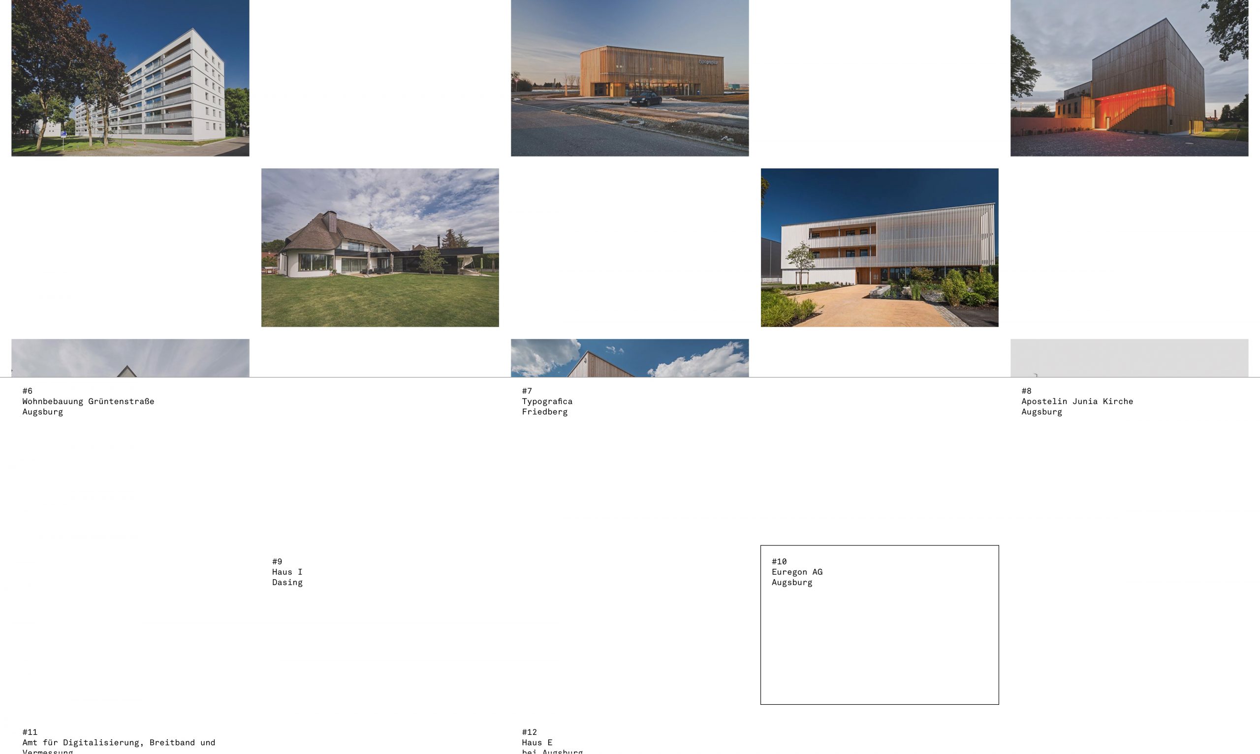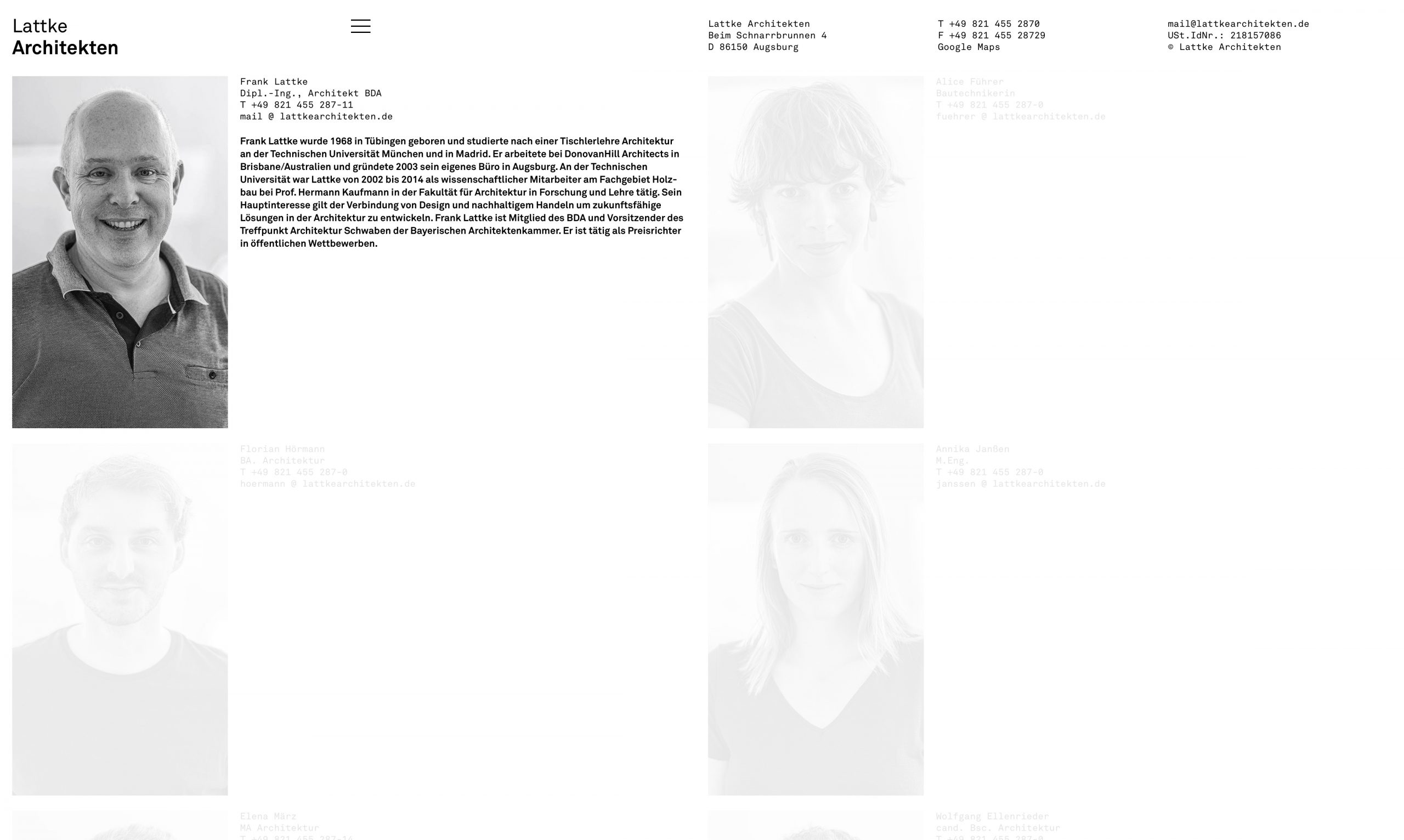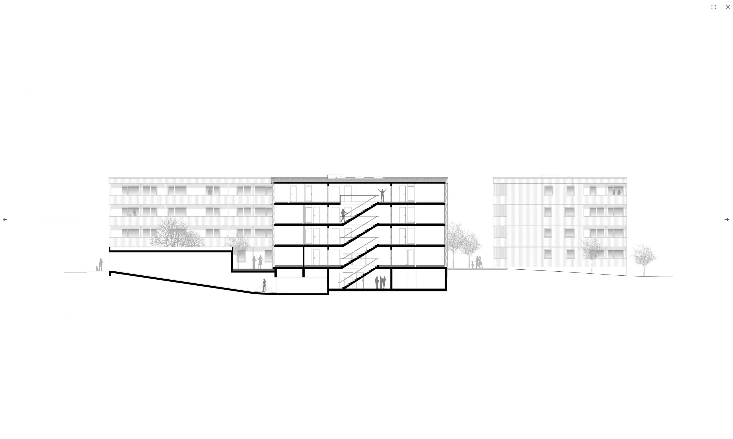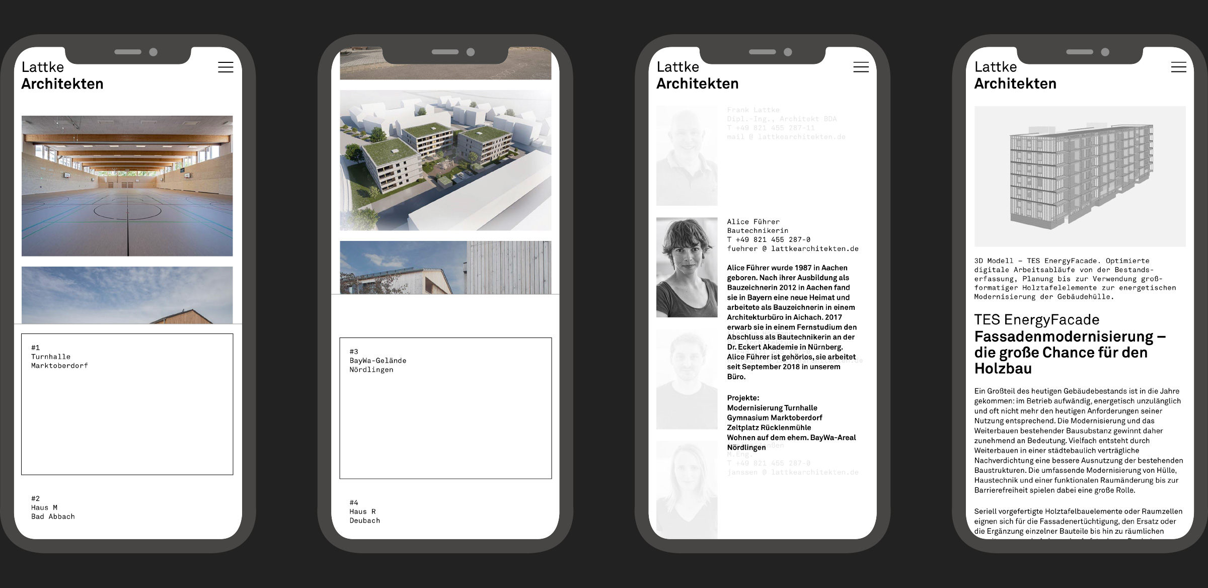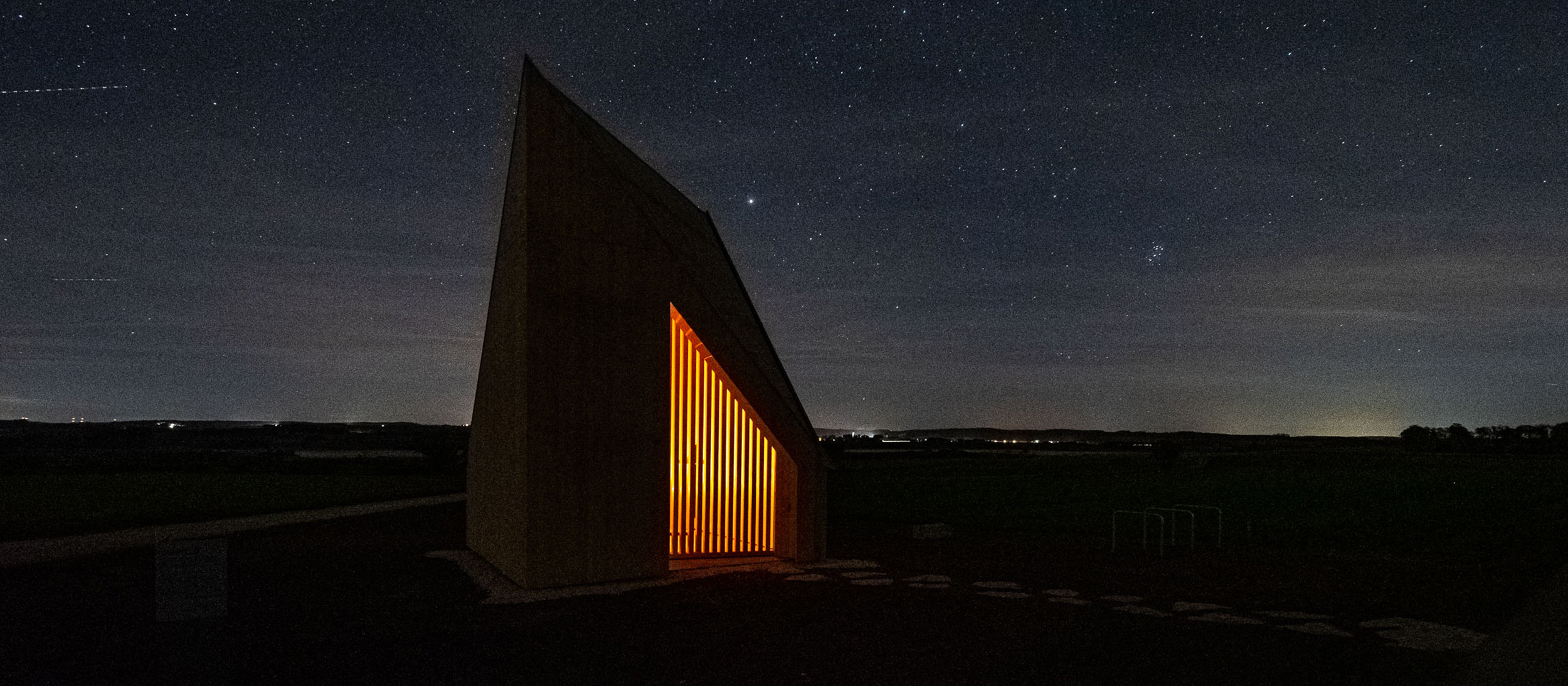

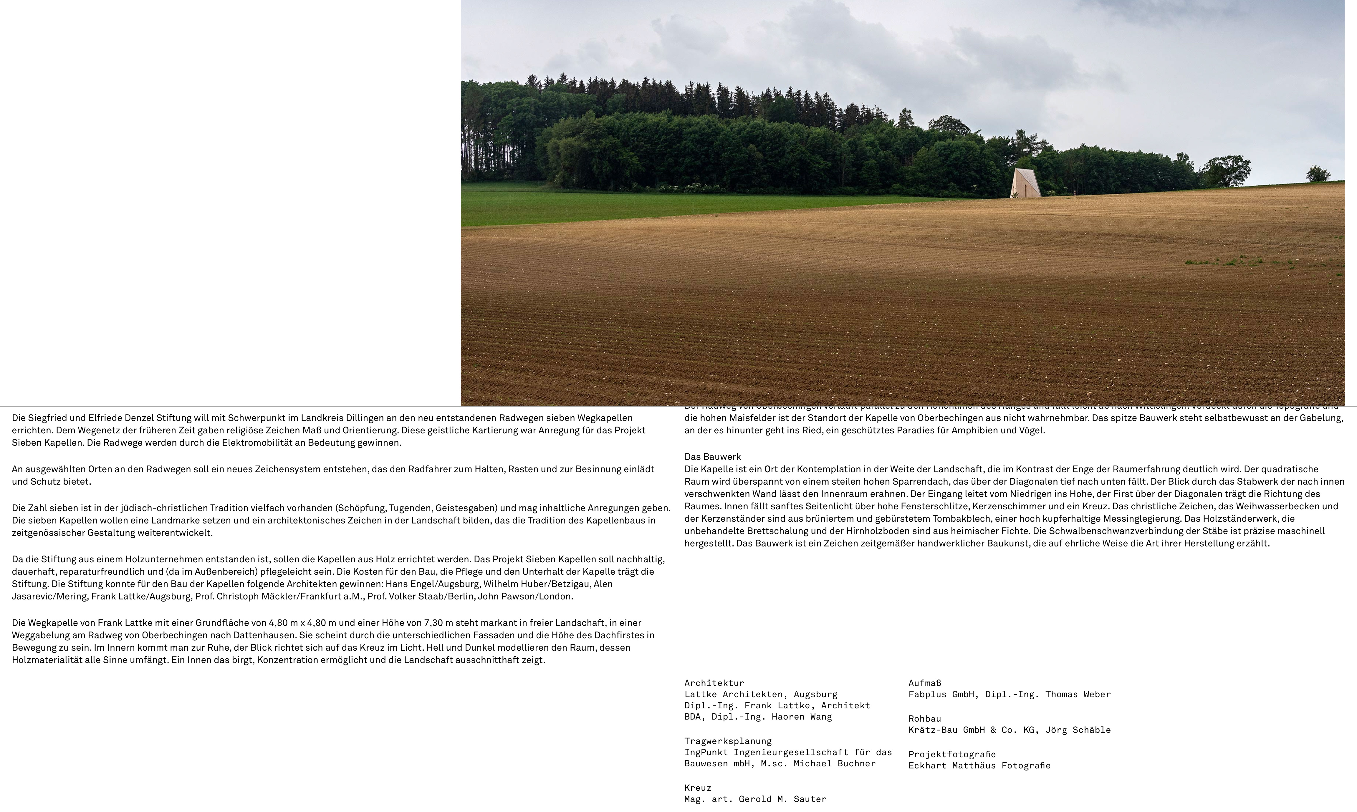
For the design concept for the website of this Augsburg architecture practice Atelier Andrea Gassner uses photos, texts and plans – i.e. the elements used to depict architecure – as signs that can be moved vertically in a horizontally divided surface. Scrolling across the vertical develops a content that is moved twice – pictures on top, floorplans or texts in the bottom area. The site invites you to interact – but without getting lost in pointless games – and works responsively in both wide and portrait format. The visual character is shaped by a lot of white space, with a flexible and yet astonishingly simple design grid.
Responsive web design means the adaptability of a design concept in depiction and application, from the wide monitor to the small smart phone. In both vertical and horizontal format. At a time when digital communication is practiced increasingly on the smart phone, responsiveness is an important design factor.
