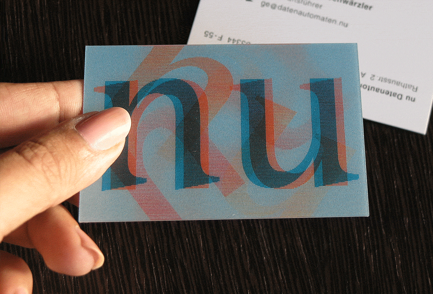
The business “nu” produces both individual high-tech content-management systems as well as standardised software solutions for special users and branches. This “twin track” quality is taken up in the company’s verbal and visual communication and provides the basis for the design. With the name consisting of only two letters and a logo made from just a single form of letter – in one case standing on its feet, in the other on its head – a striking letter ornament is created: two colours, two letters, two directions. Overlaying these repeatedly produces new forms and colours. The “2” thematically addressed in the design also recalls the binary set of characters of the digital world