Since November 2011 the Vorarlberger Architektur Institut – known in short as vai – has been responsible for the project selection and editorial design of the cover series for the “Leben & Wohnen”supplement to the Vorarlberger Nachrichten newspaper. The concept of a media cooperative, which Reinhard Gassner helped to develop, is new. The exhibition “Hohe Auflage” is intended to present this remarkable collaboration between vai and VN in an enjoyable, enthusiastic overall show.
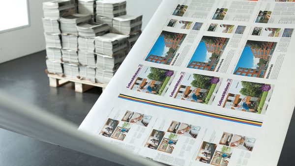
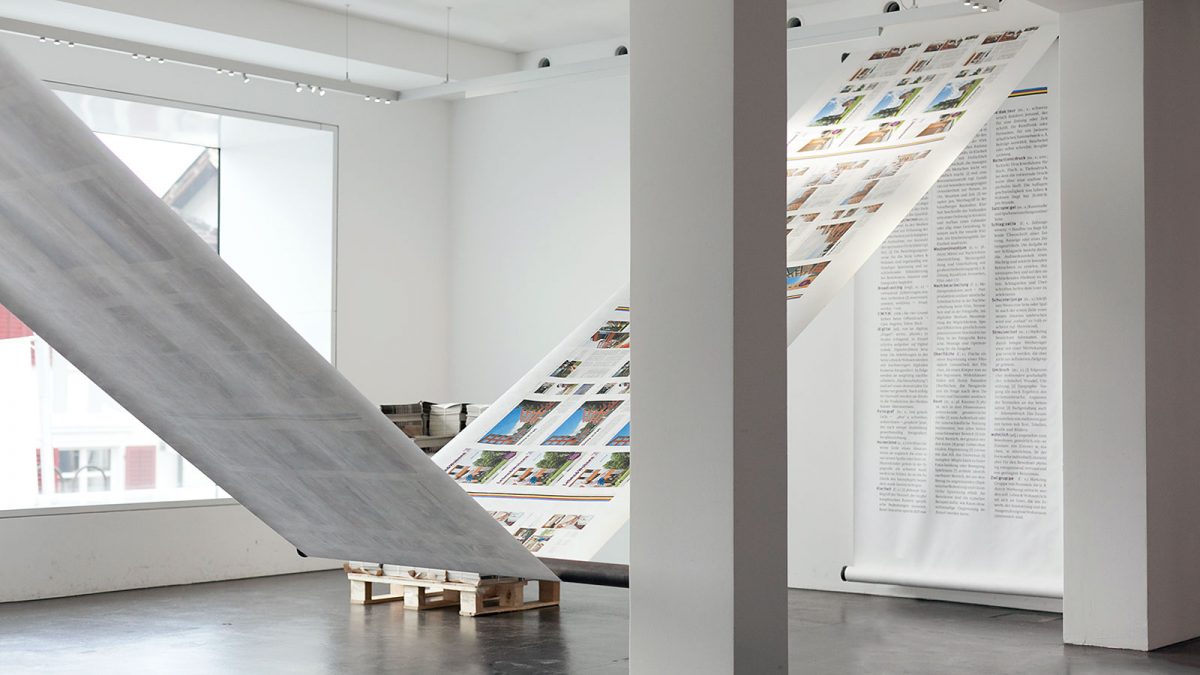
33 reports, representing a total of 175 pages on architecture, are detached from the property supplement and a facsimile is made of them on a fifty-metre-long piece of paper. This length of paper is stretched through the exhibition spaces, moves up and down, is twisted in the middle around its own axis, and finally runs out on the floor. Associations with the form of reproduction are awakened by web offset printing on a paper roll, which is standard in massprinting. By lining up the contributions the enormous variety and quality of this reportage is clearly demonstrated.
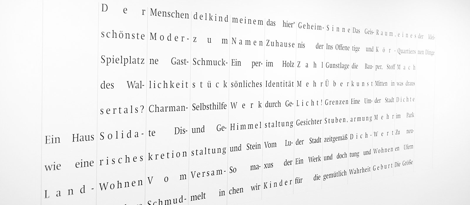
A glossary concludes the series of contributions on the length of printed material web. The selected words from the fields of architecture and mass communications were compiled from various encyclopaedias and dictionaries. A section of a printed image enlarged more than one hundred times serves as a macro view of the reproduction technology. This wall-mounted image, 566 cm wide by 302 cm high, shows the dot matrix of images and the blurred edges of letters. In the special issue “Nur Text” (only text) the architecture stories – just the texts – are combined in a limited edition of 3500, stacked on a pallet for people to take them home with them. A word image the size of a wall makes the 33 headlines of the contributions readable in a new way. The “forced justification” in narrow columns placed beside each other, with exaggerated spacing between the lines, leads you to read horizontally. This typographical faux pas produces poetic lines made up of words and fragments of words apparently arranged at random next to each other.