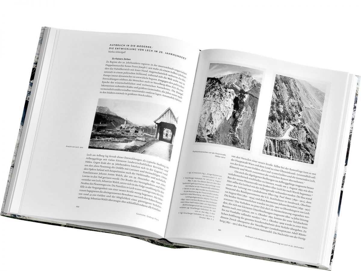
The contributions in this book deal with Lech as a place to live and an economic unit, with its natural setting and with the history and identity of the Walser people. The various authors were allowed to decide on the focal points of their contributions. The major design challenge lay in finding a uniform design framework for the scientifically-based contents and the variety of visual material. The strictly flush alignment of the double page ensures coherence. The generously sized edge column allows a variety of uses and provides the space needed for very different combinations of text and image.
The Trinité family of fonts, a modern book antiqua by Bram de Does, determines the typography of the continuous text. For the marginalia and function texts Foundry Sans by David Quay and Freda Sack is used in a reduced size. The type design is differentiated and, despite the considerable density, can be read with comfort.
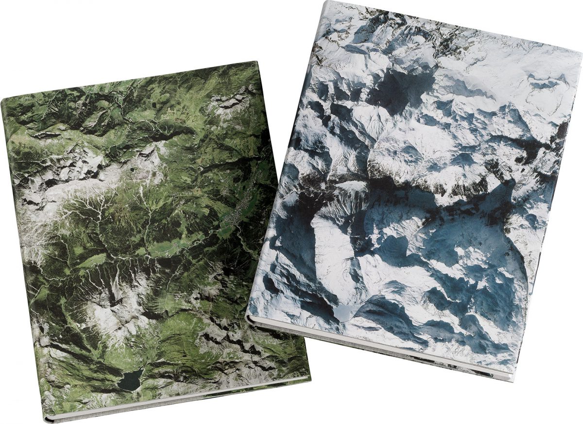
The strict basic modulor is never a shackle but rather a support for an open book design that makes skilful used of the white area. The book core, which is worked through from the smallest detail to the large scale, is produced in excellent lithographic and print technique and finished and bound in a bibliophile manner. The book core is packed in a newly developed concept for the full linen front and back endpapers and in a dust jacket that can be “worn” on either side. It shows a photographic winter or summer motif from the Lech area, both of the same size.