
The aim and the strategic goal of the initially conceptual commission awarded to Atelier Gassner was to provide contemporary visual communication for the regional capital Bregenz. Several workshops with city officials along with a number of graphic studies resulted in concrete recommendations as regards action to be taken; these included differentiation and organisation of official, cultural and commercial measures and the revitalisation of the existing profile.
The characteristic mirroring of the word- and image-mark originally created by Reinhold Luger was deliberately retained in order to exploit its established familiarity. Instead of the screening used previously, the required contrast between light and dark is produced by the difference between the fixed Grotesk typeface and the delicate mirrored Antique. The logotype is formally developed into a robust and easily scalable form. The new appearance is used for a variety of quite different applications and is documented in a design guide.
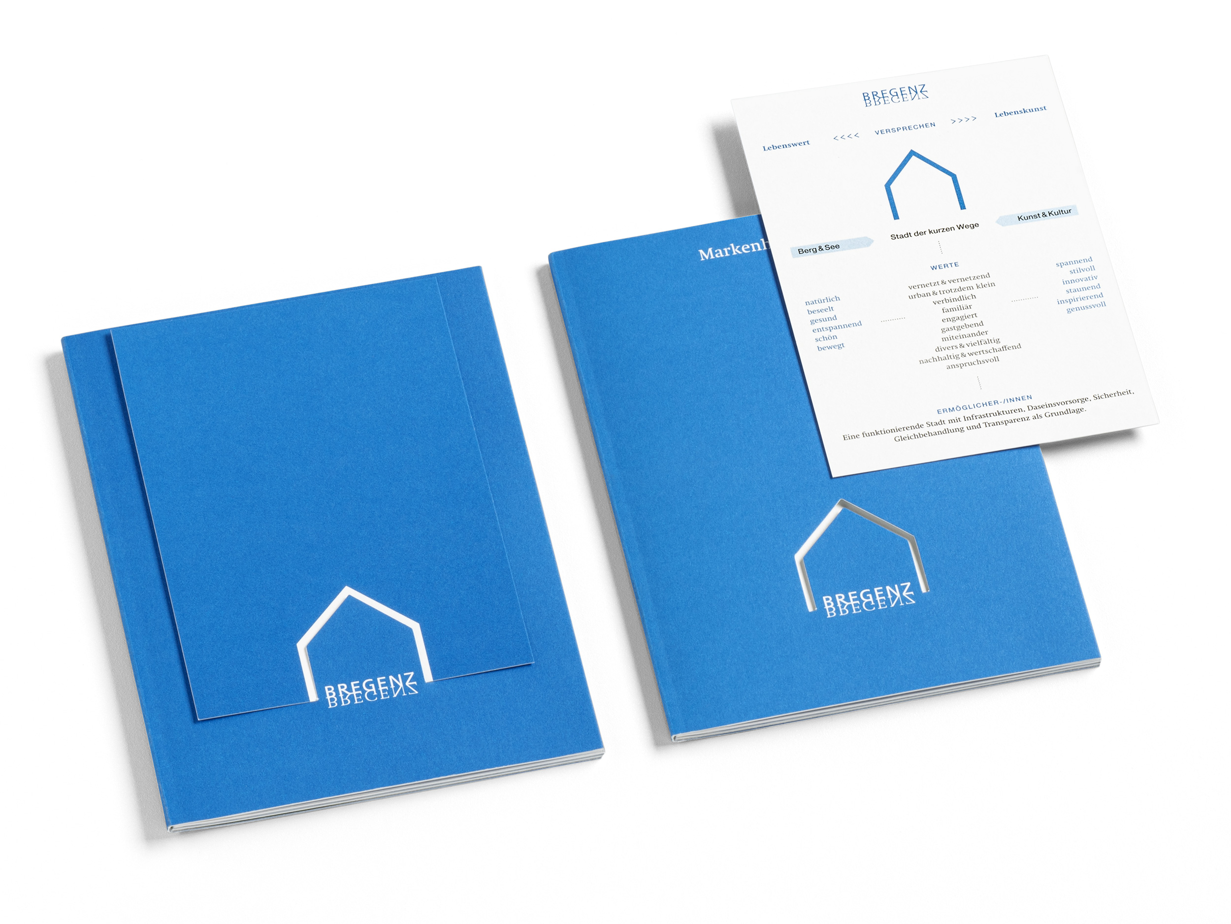
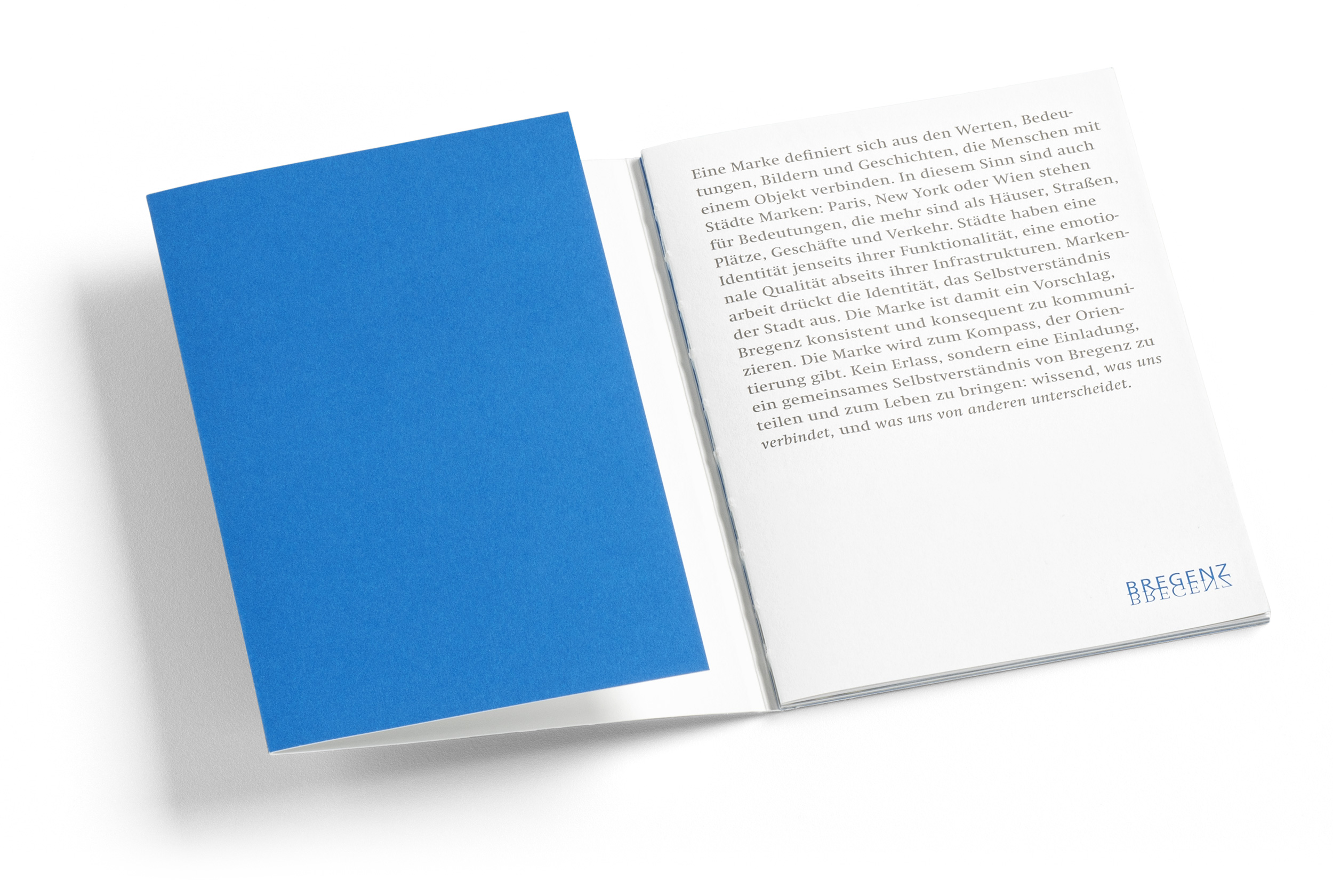
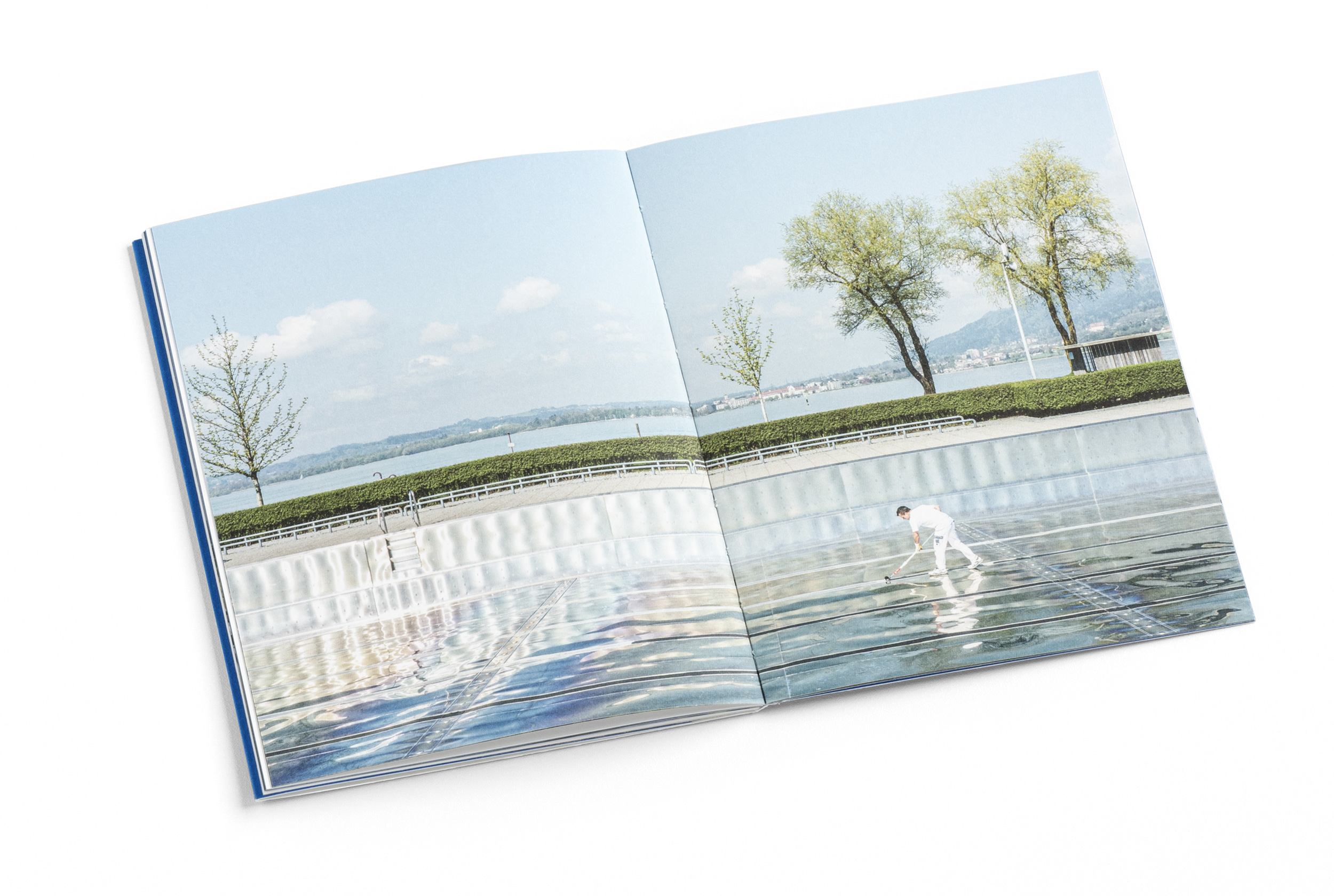
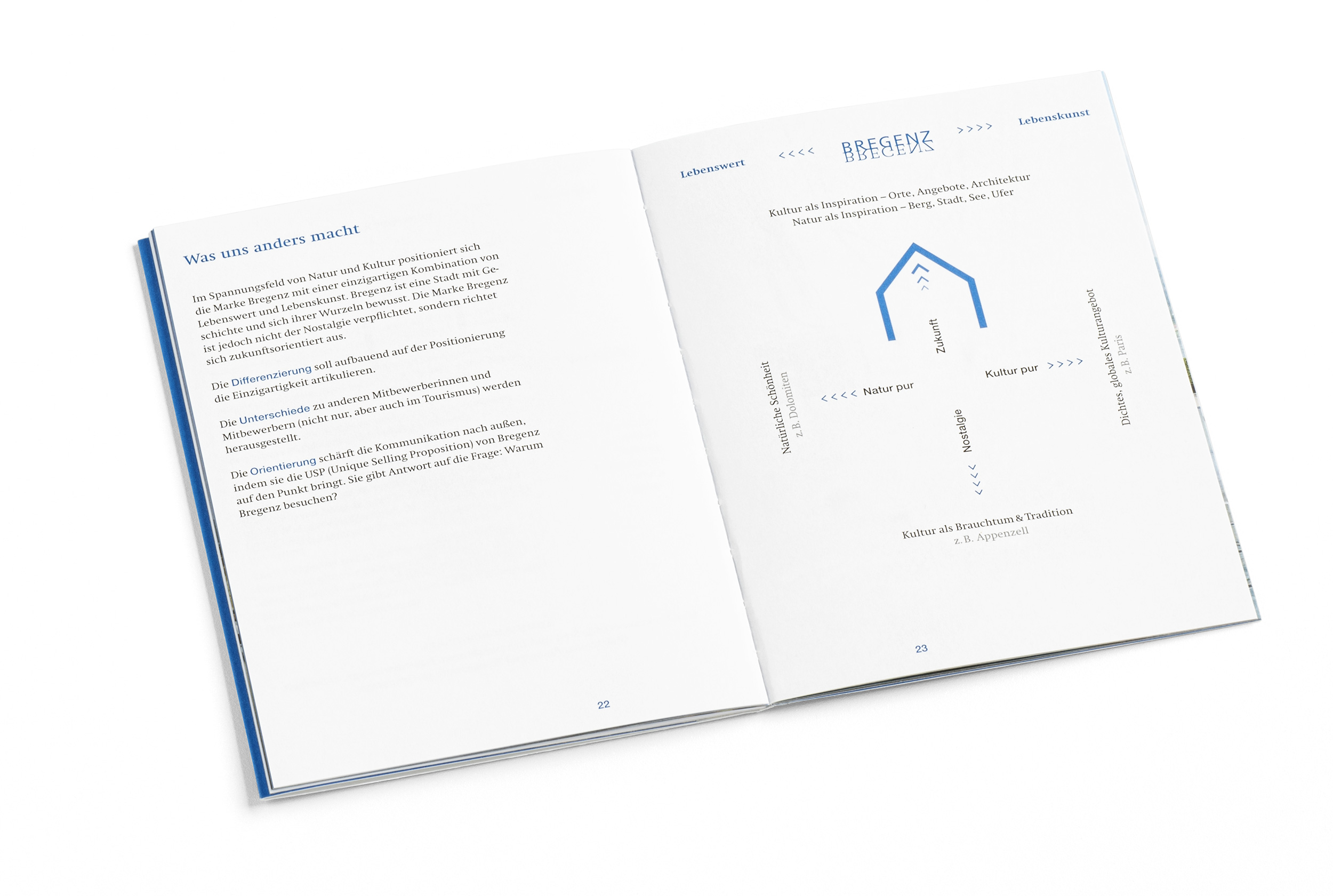
The Markenhandbuch (brand manual) designed by Atelier Andrea Gassner is an exemplary application of creative use of existing design elements. Here theory meets practice, the graphic brand meets the town brand “Bregenz”, the mirrored name encounters its synonymous visualisation in the photographs of the Hafenpromenade. With its concise, convenient format, the brand manual creates a resonance between place and symbols, between the city’s understanding of itself and its public image. The statements, some of them pragmatically formulated, in combination with free photographic impressions aim at bringing the values, meanings, images and stories that make up Bregenz to the point.


