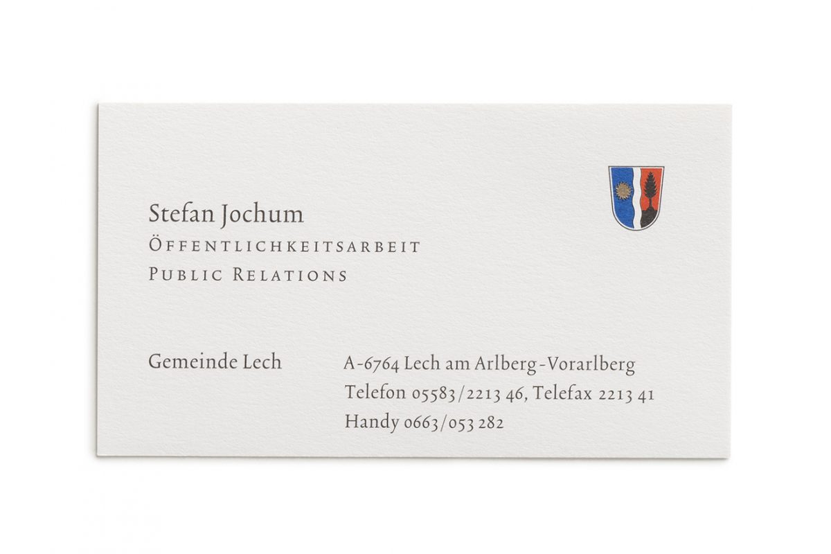
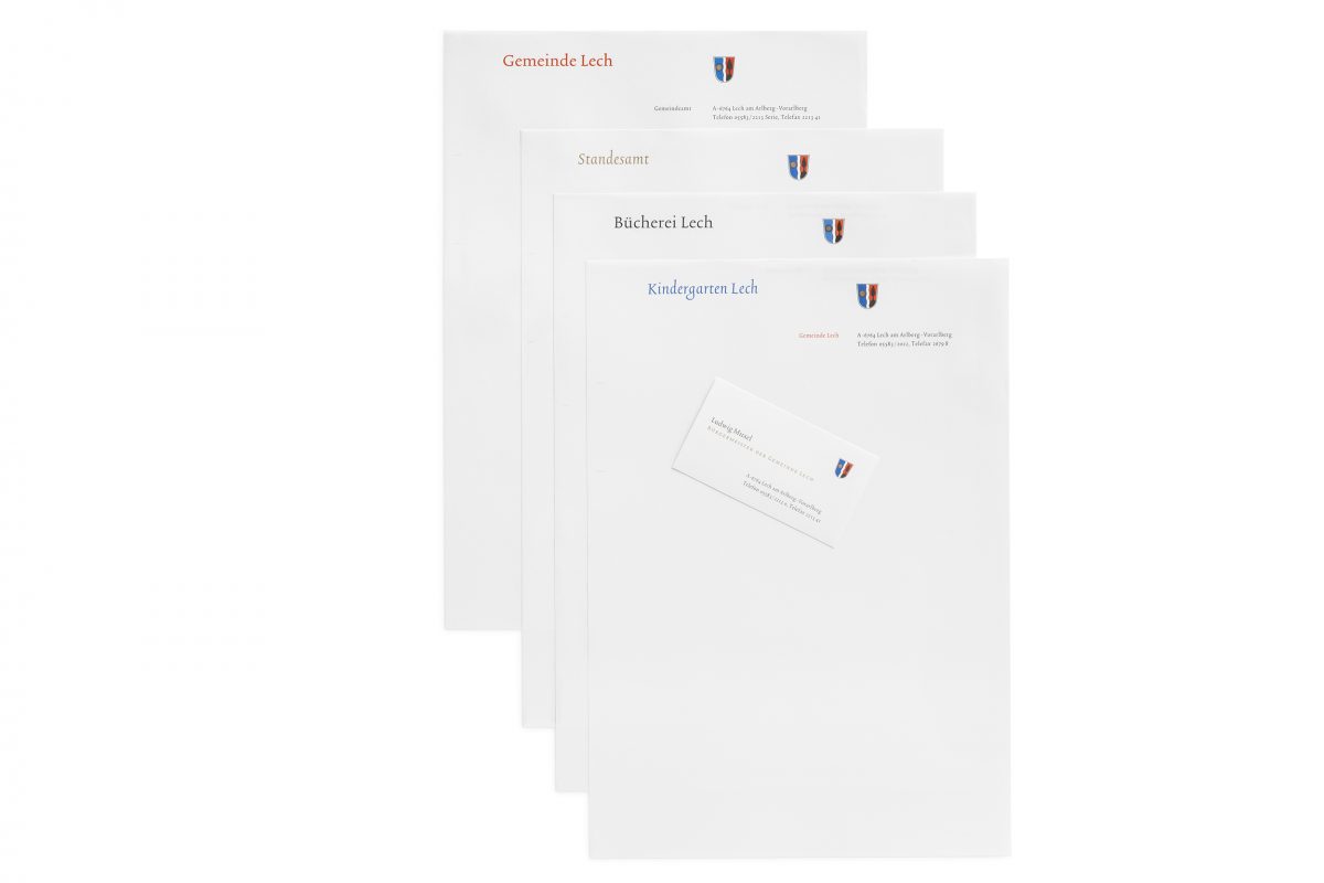
To complement its appealing tourism advertising this town was looking for an image for all its communal forms of communication. Visitors to Lech am Arlberg are struck by the contrast between the gentle contours of the elevated valley and the rugged, soaring and plummeting outlines of the powerful mountains. The “Trinité” family of fonts by Bram de Does reflects something of this atmosphere. The standard form of this typeface is slanted slightly in the direction of reading; the individual letters are shaped with a high formal quality. This results in a sovereign and calm type, easy legibility and gracefulness. The special aspect of this Antiqua is the way the family is expanded to include three different ascenders and descenders. The characteristics of the different fonts are shown in a matrix and allocated to the different areas. This typeface is used for the entire correspondence and communication– ranging from letters written by the mayor to minutes of meetings, the community newsletter or public signposting. The municipal coat-of-arms, which is of heraldic origin, is respectfully integrated as a further principal element of the town’s image.