| Title | Roger Boltshauser - Response |
|---|---|
| Year | 2024 |
| Client | Roger Boltshauser |
| Photograph | Luca Ferrario |
| Production | Mader Werbetechnik |
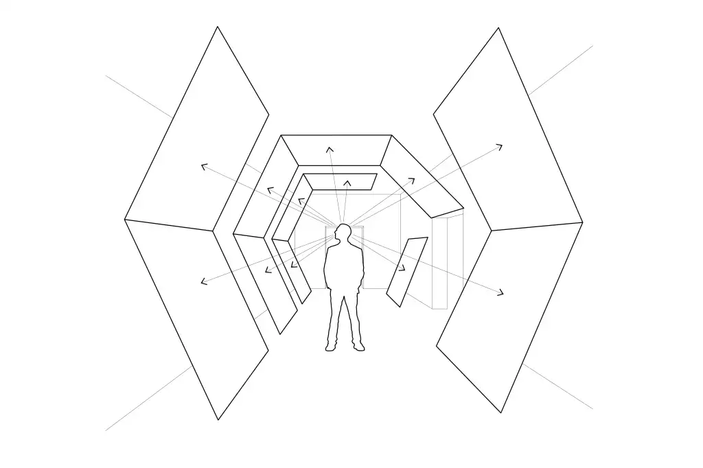
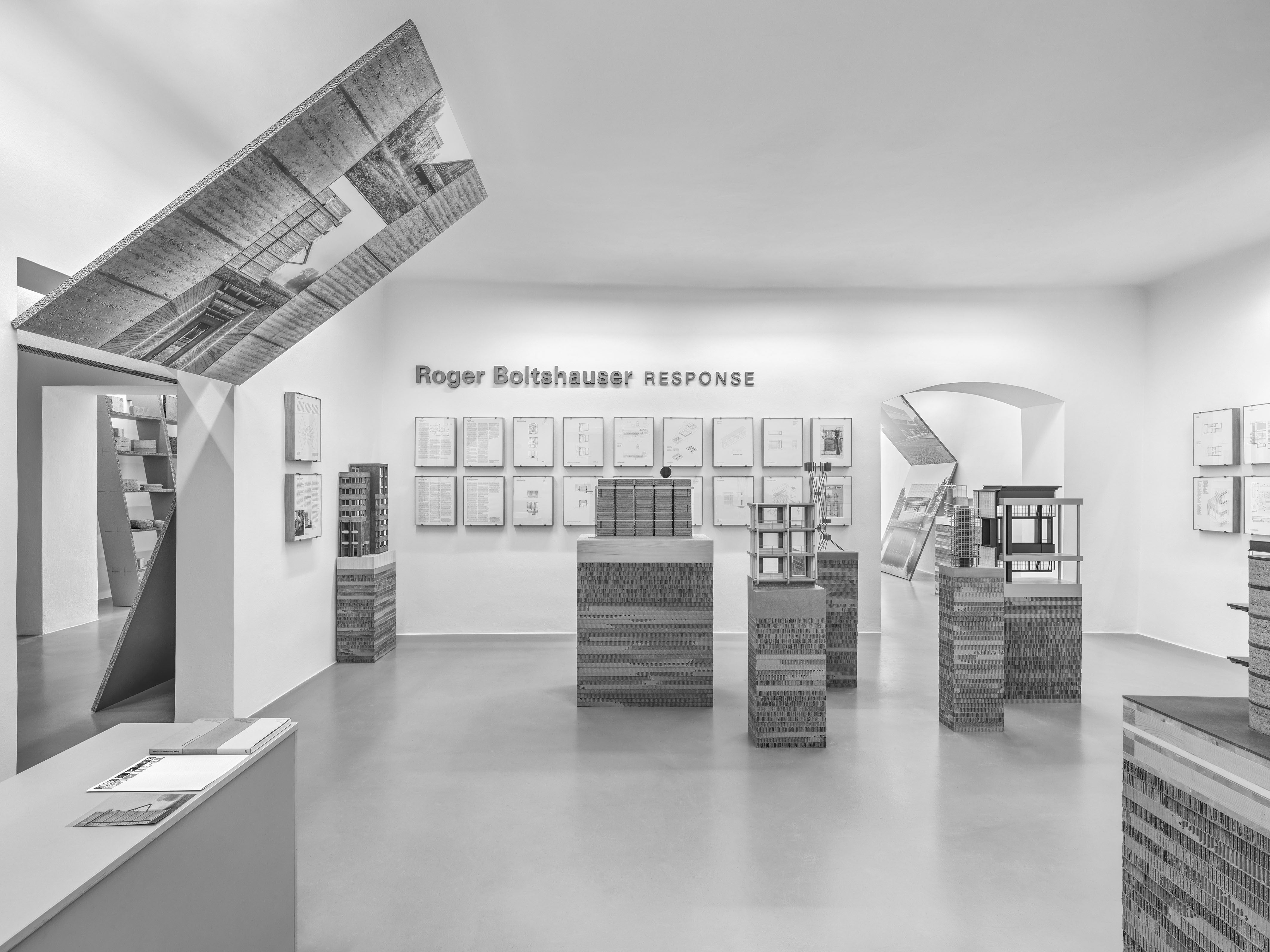
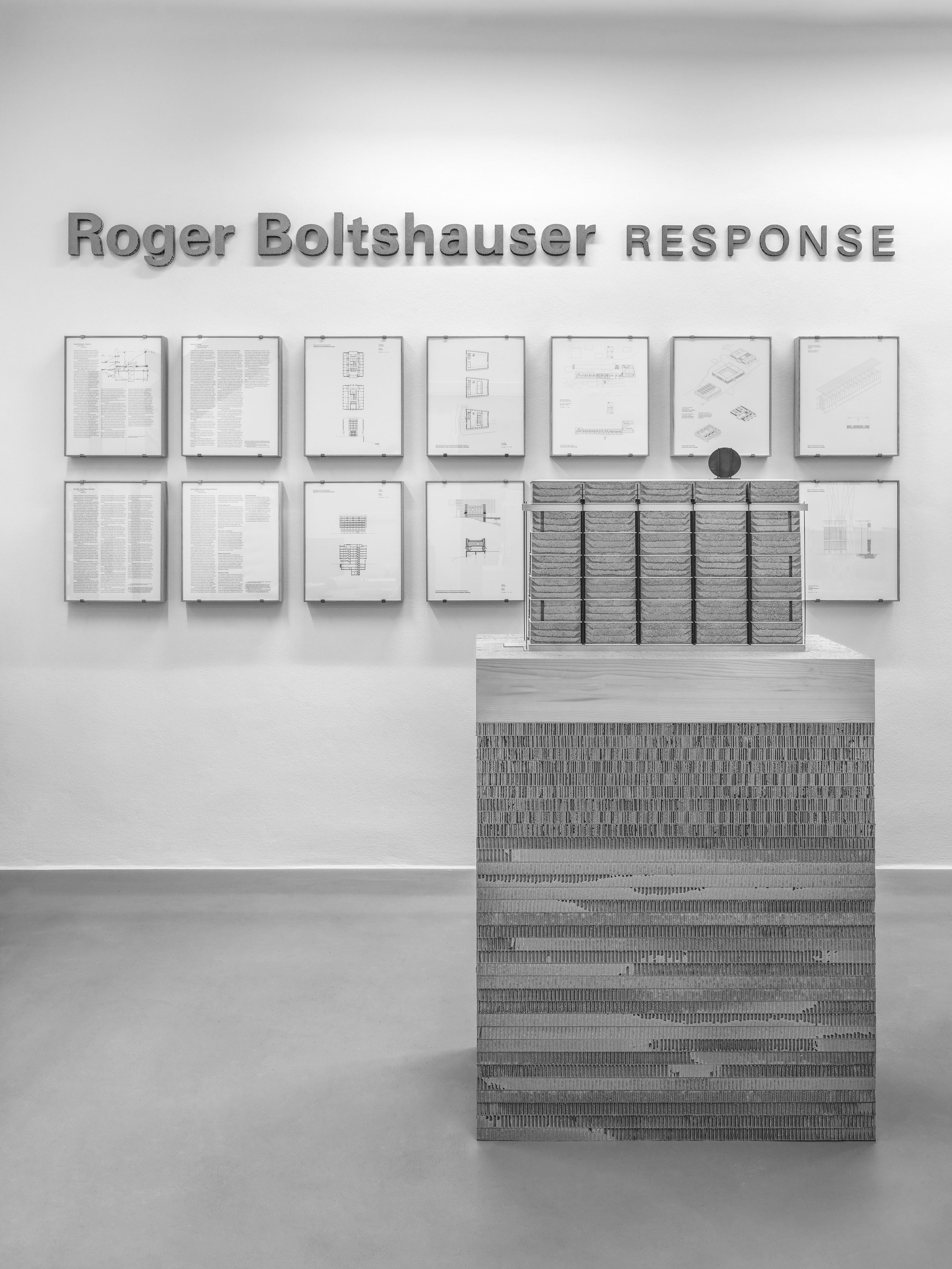
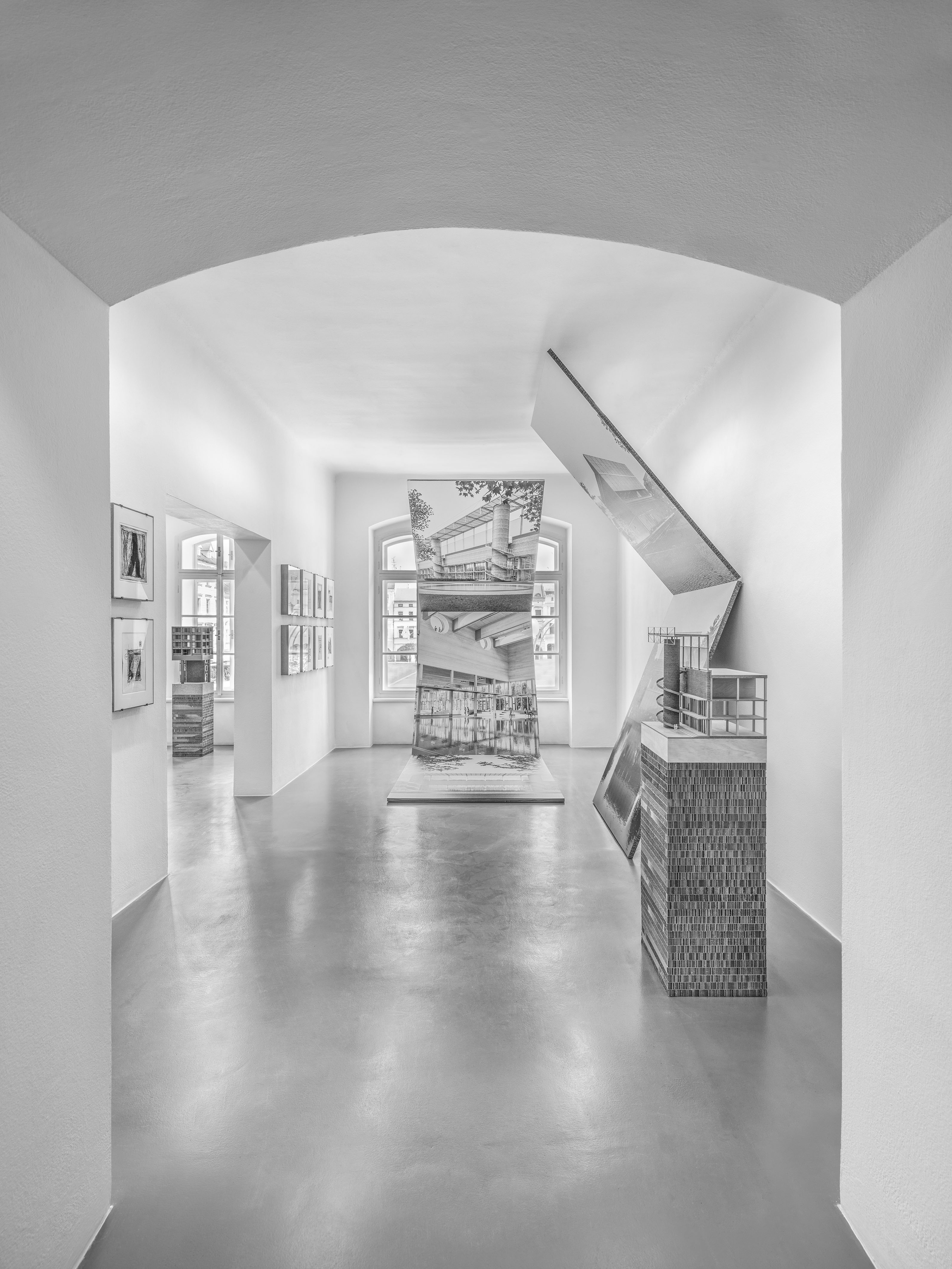
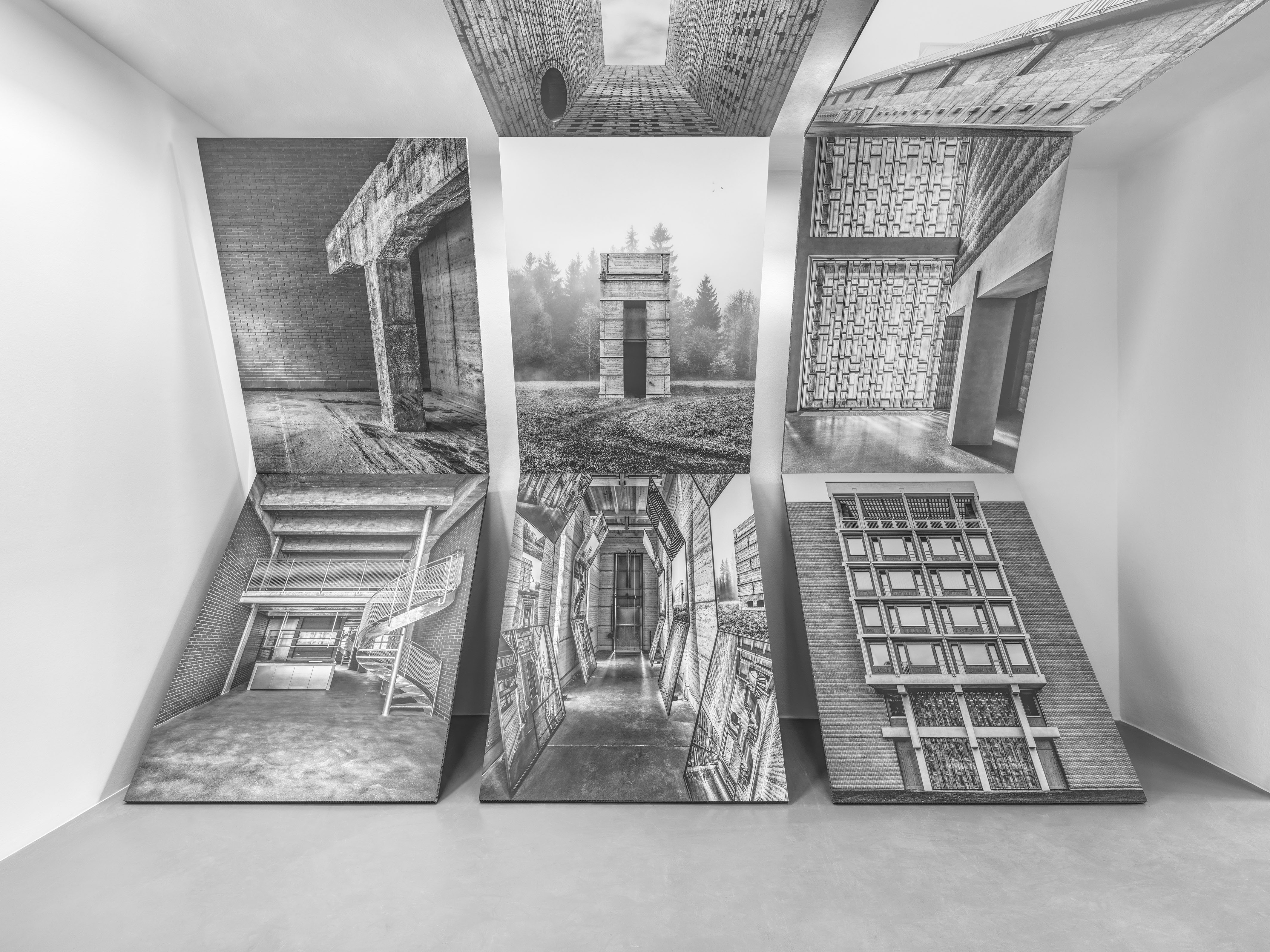
Atelier Andrea Gassner understands scenography as a perpetual process. Roger Boltshauser’s exhibition is based on this principle: it carries elements from one exhibition venue to the next and reinterpreting and overwriting them at the new location. The scenographic concept for České Budějovice is a development of the earlier exhibition in Boltshauser kiln tower in the grounds of the Brickwork Museum in Cham. There, inspired by the building’s folding iron door, Atelier Andrea Gassner developed tall, tilted elements, each consisting of three picture panels mounted one above the other. In the exhibition in České Budějovice these panels have grown, they extend across the ceiling, continue through doorways between the rooms or stand in space like vertical folding books. The scenography develops into an architecture that intervenes in space, allowing entirely new ways of seeing and new kinds of picture space. Renderings of current projects are shown alongside impressive black and white pictures by photographer Luca Ferrario and photographs from the series of images in earlier exhibitions. In contrast to the scenography that engages space, Boltshauser’s Artwork is presented in the classic way on the walls of the gallery, the pieces in their severe, uniform frames are hung close together. The scale models of the buildings stand like sculptures on individual podiums, suggesting a subtle link between the artistic and architectural work. In the spirit of re-cycle and re-build the basic elements such as shelving for material samples, picture panels and podiums are made entirely from untreated honeycomb cardboard.


| Title | Ingenbohl Convent Retirement Centre |
|---|---|
| Year | 2024 |
| Client | Kloster Ingenbohl |
| Architecture | Boltshauser Architekten |
| Production | Grafe AG |
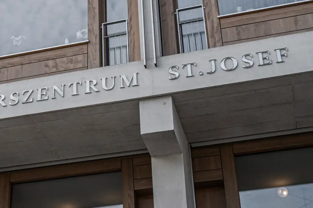
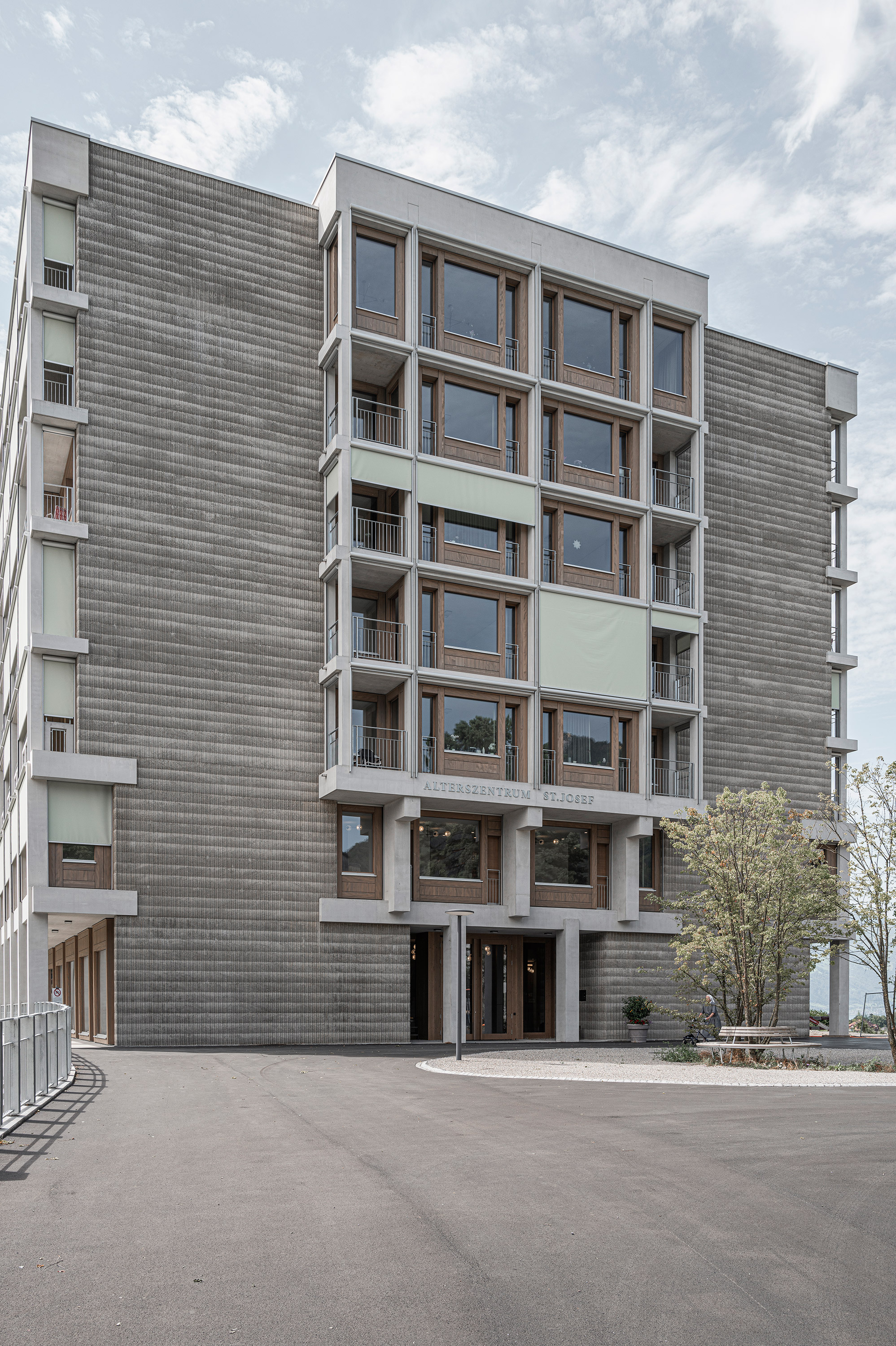
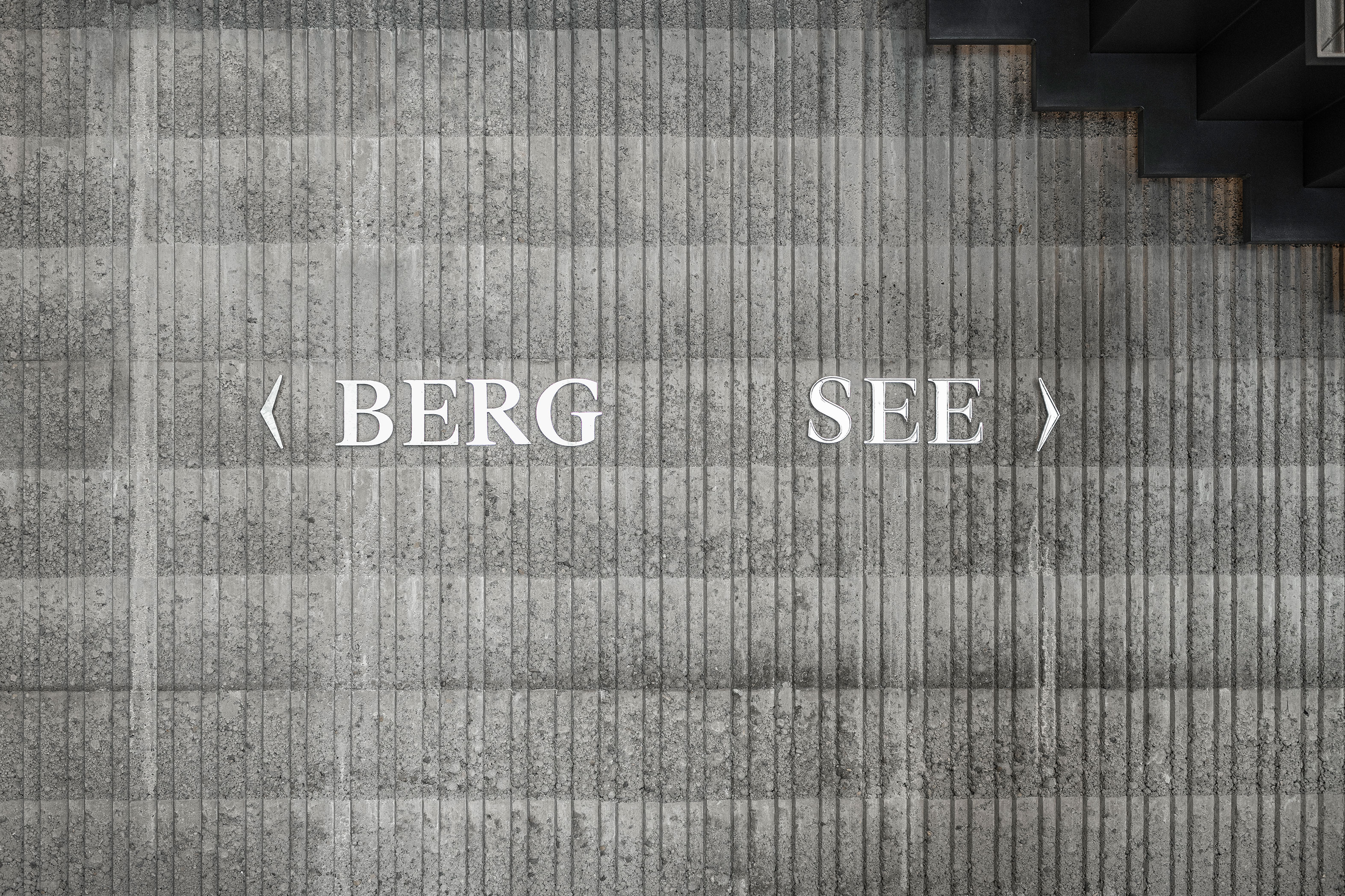
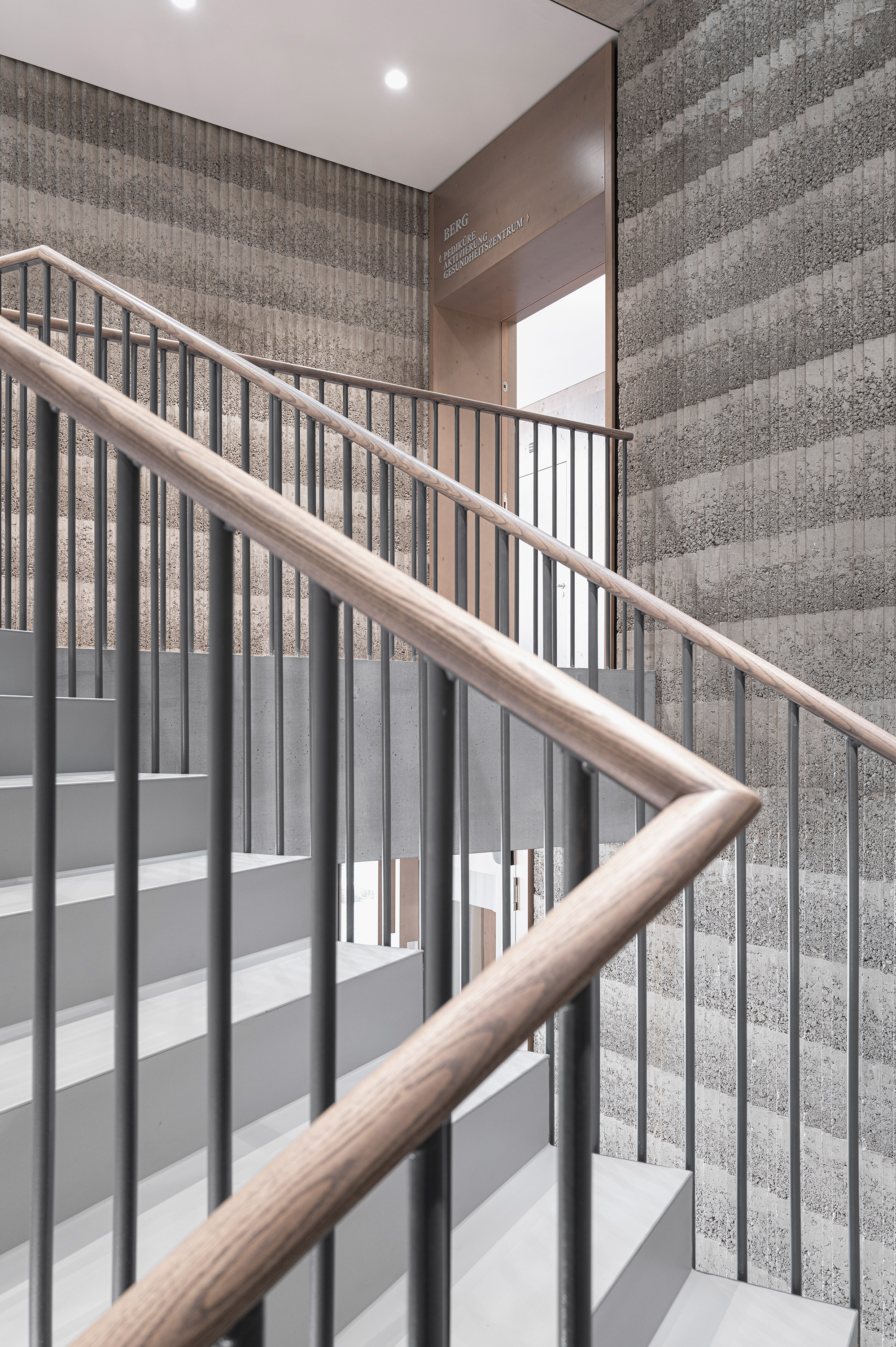
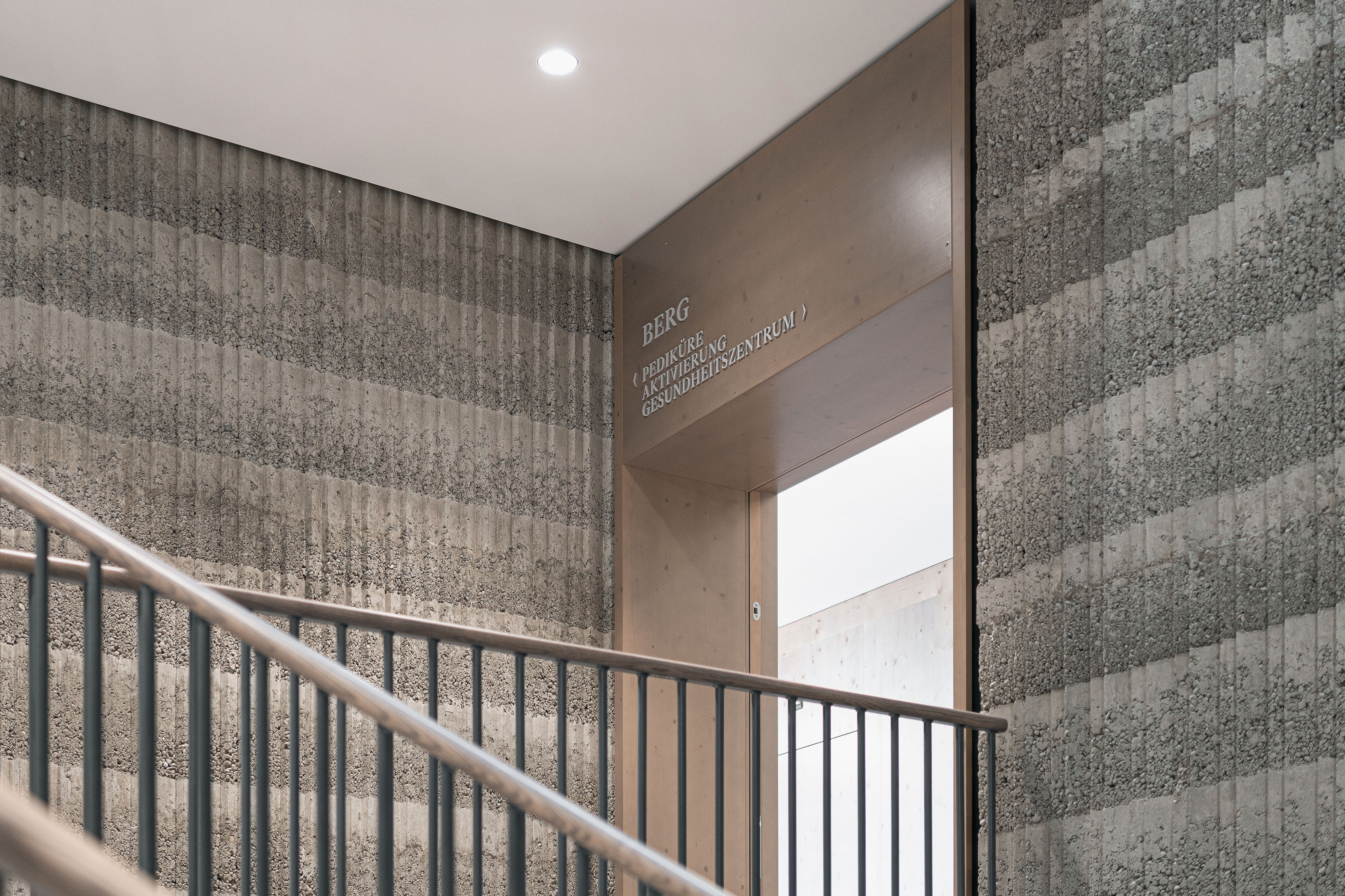
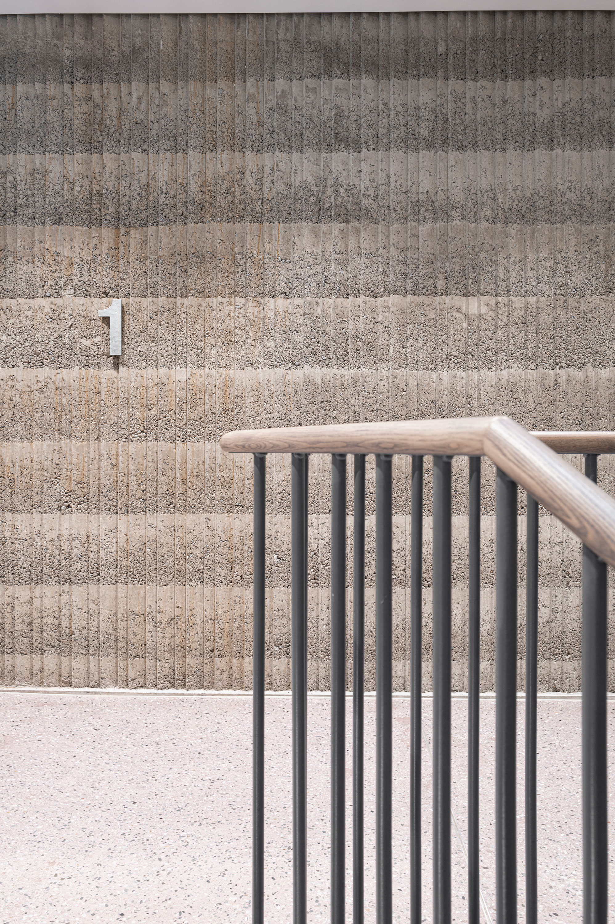
Showing neither trepidation nor any form of banal showmanship the blocky new building by Boltshauser Architekten on the slopes of the hill occupied by the convent gives the existing buildings a modern stamp. The vertical plane draws its strength from the distinctive layering of the building in storeys above the plateau and the basement floors, which are visibly anchored in the slope. Through the privileged position on the plateau two almost complementary visual axes are established to the east the mountains, to the west Lake Lucerne. The design concept for finding the way around the building is based on this complementary pair and uses the semantics of the words “Berg” (mountain) and “See” (lake) to facilitate orientation in the principal directions inside the building.
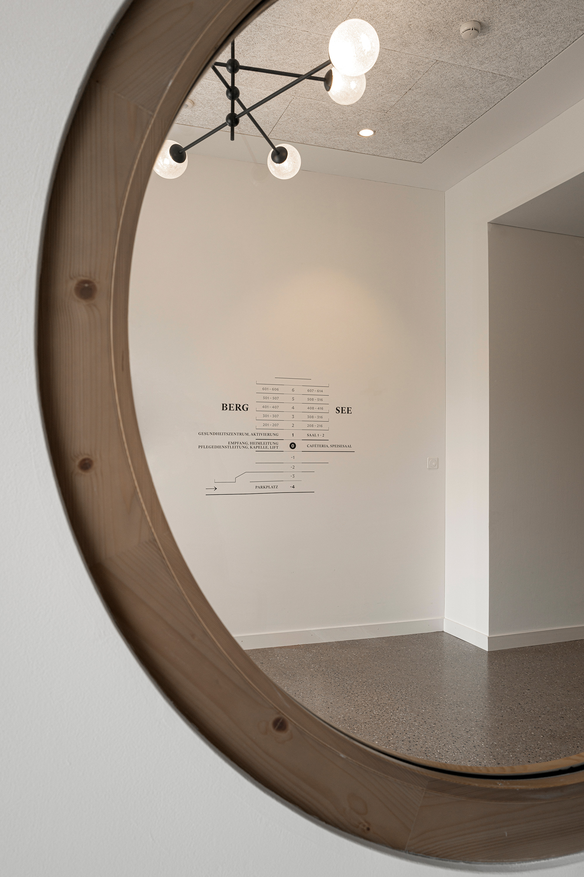
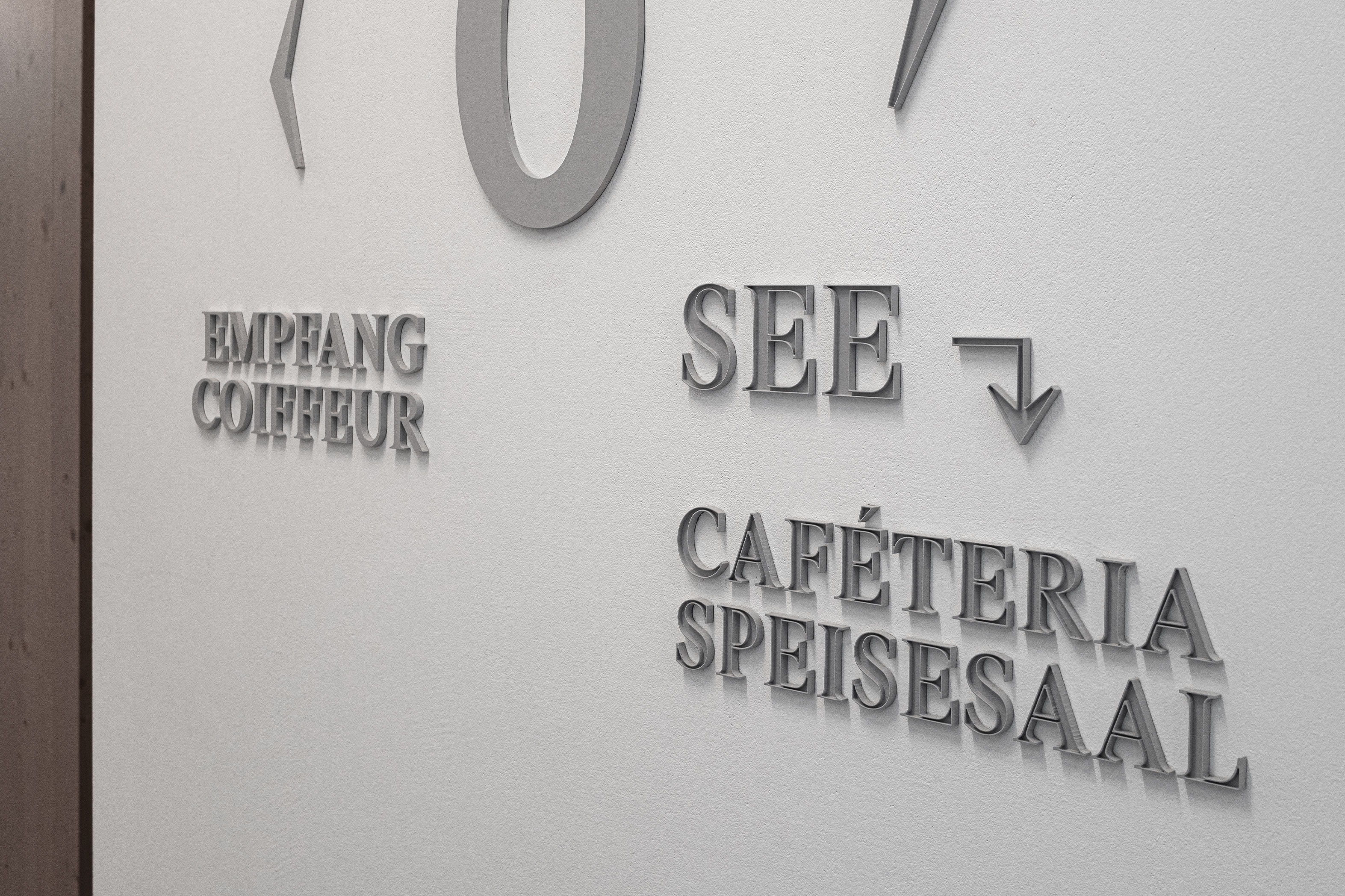
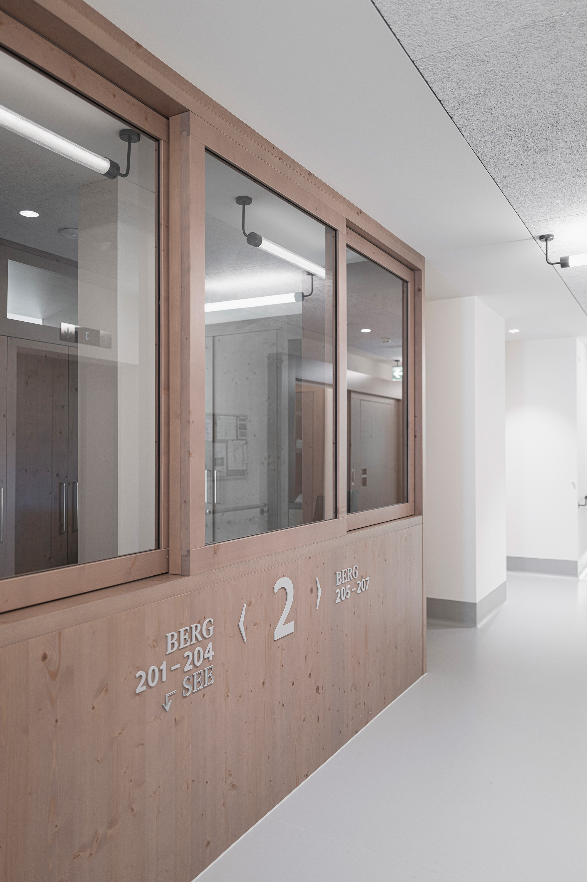
These terms are subtly reflected by the typography and layout. While the numbers, symbols and lettersthat refer to the lake side are hollowedout, like vessels, those that relate to the side of the building facing the mountain are full and corporeal. On the different storeys the information about which rooms are to be found on the respective floor is mounted in two lines: the word “Berg” is placed above the line with the room numbers, whereas the word “See” is positioned below thenumbers.
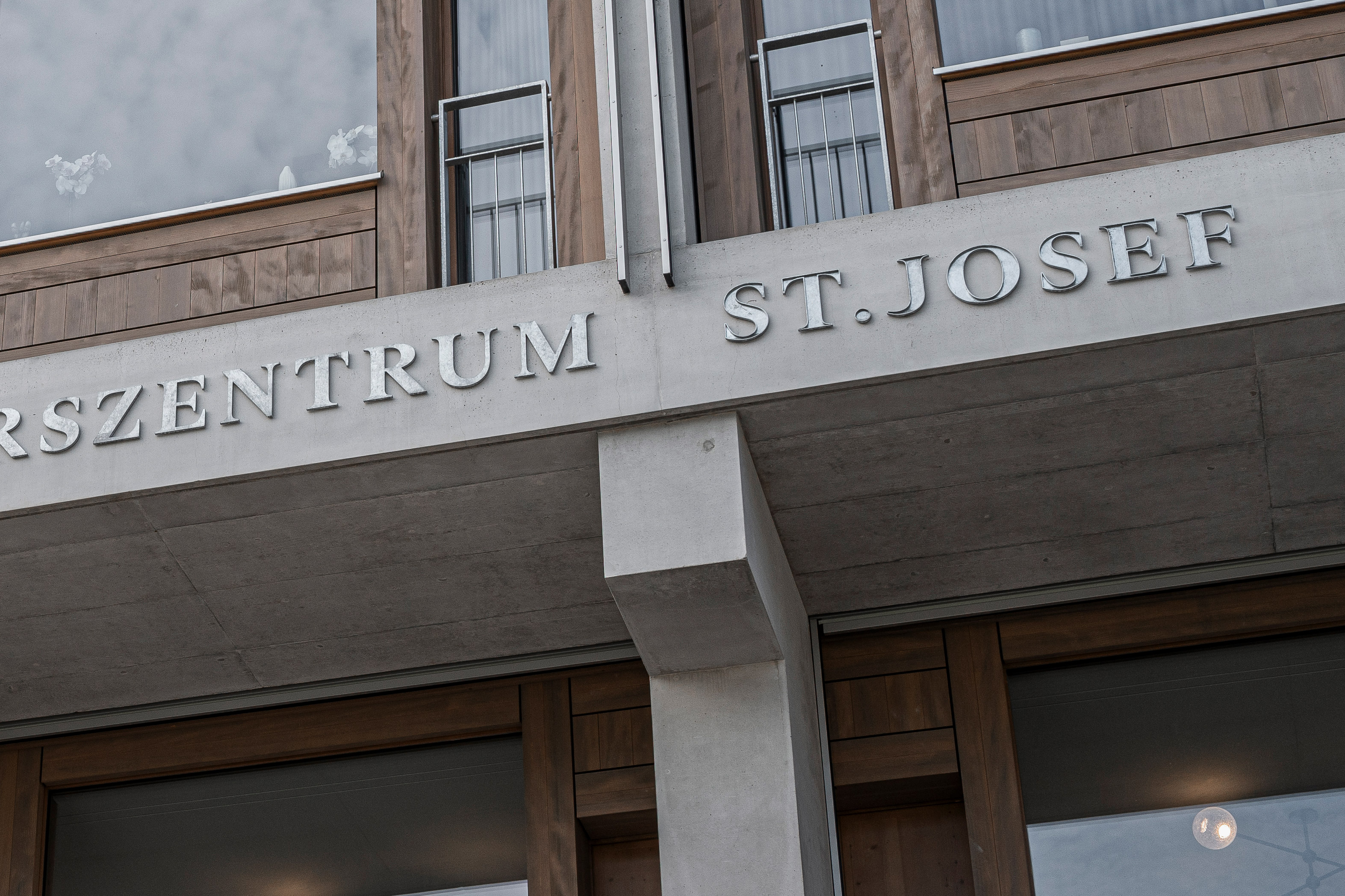
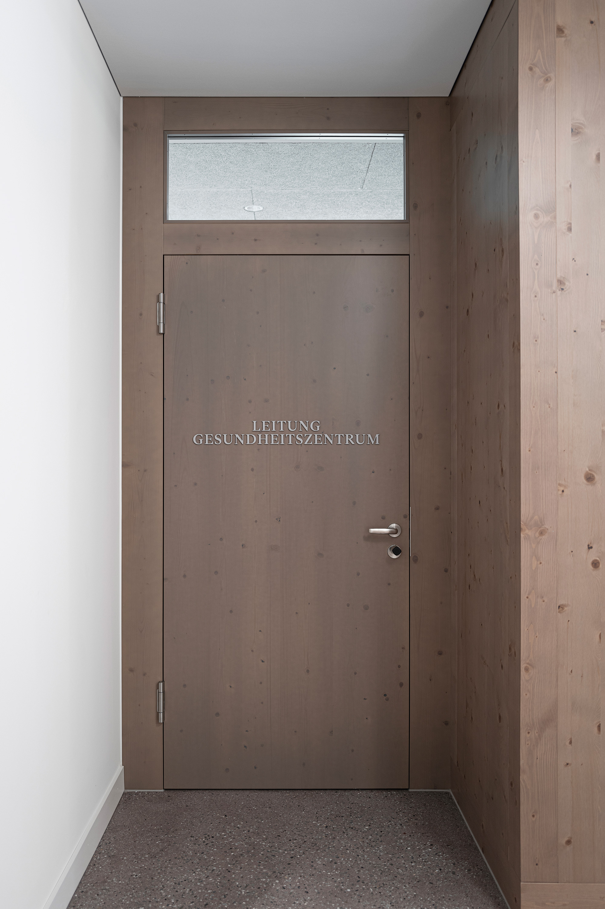
A high-quality typeface family with different weights was chosen for the numbers and the lettering – ranging from the classic Antique with bold capitals to sans serif Linear Antiqua – and was used flexibly. The design is intended to reflect the dignity of this order of nuns thatis more than 150years old while also meeting the need for legibility and a contemporary aesthetic. To employ the same language as the architecture the materialisation harmonises with the canon of materials and colours used in the building. The lettering for the outdoor signage on the trass lime facades is made of sanded and galvanised iron, while inside the building the lettering, which is mounted on a variety of materials, is made of colourless matt acrylic glass. The typographical layout is generally axial and conveys a sense of calm and serenity. The plans that help you identify your location and to find your way around the building have a surprisingly unfussy and unornamented character. They resemble tabular typesetting, which, thanks to the use of lines, almost automatically transforms into a cross-section through building, while at the same time providing the overview and orientation required.
| Title | Elegant, massive, atmospheric |
|---|---|
| Year | 2023 |
| Client | Roger Bolthauser |
| Photographer | Luca Ferrario |
| Cooperation | Boltshauser Architekten, Zürich |
| Curators | Boltshauser Architekten in Zusammenarbeit mit Andrea Gassner |
| Producing | Schlosserei Kalb, Dornbirn; Mader Werbetechnik, Lauterach |
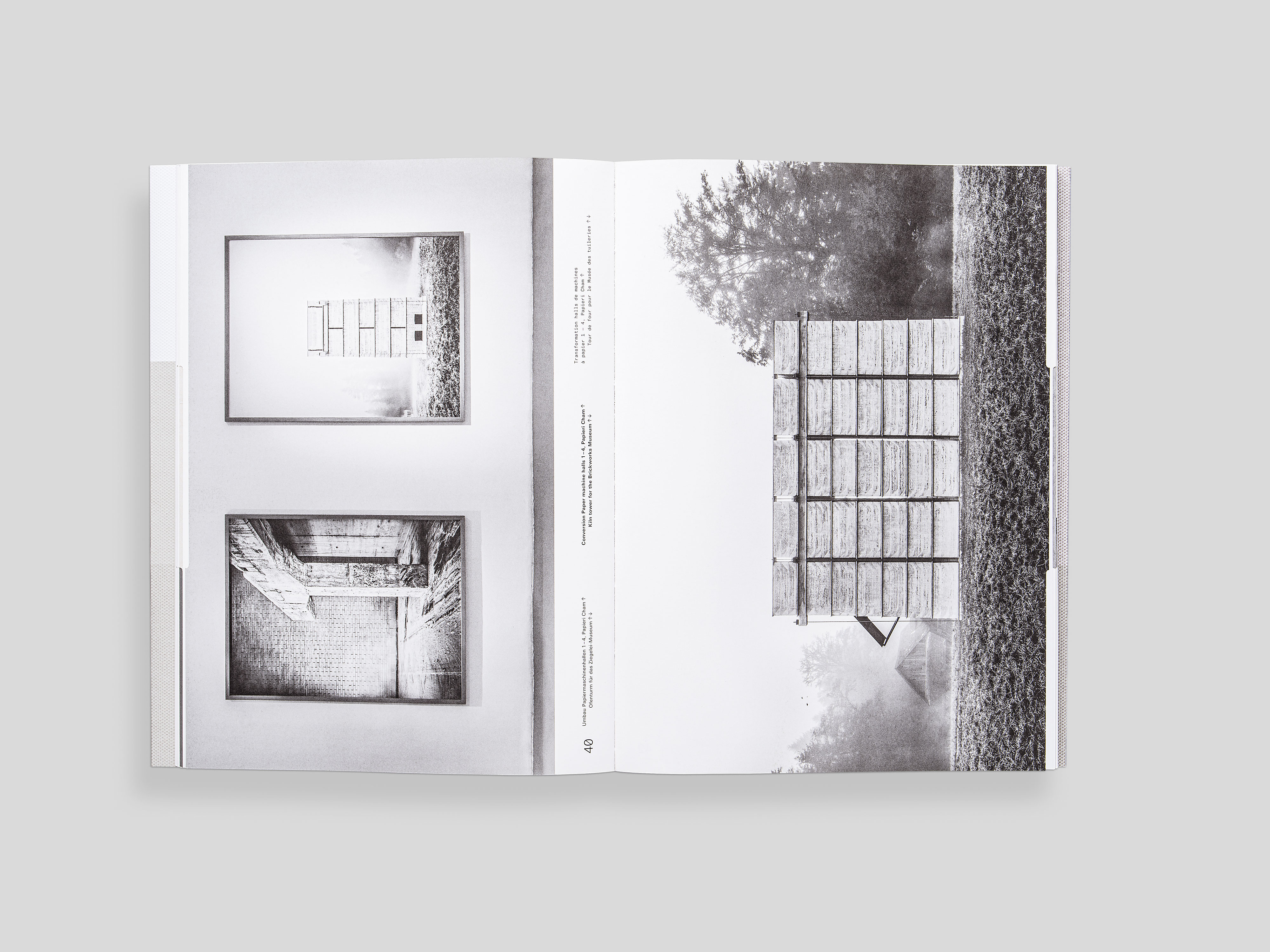
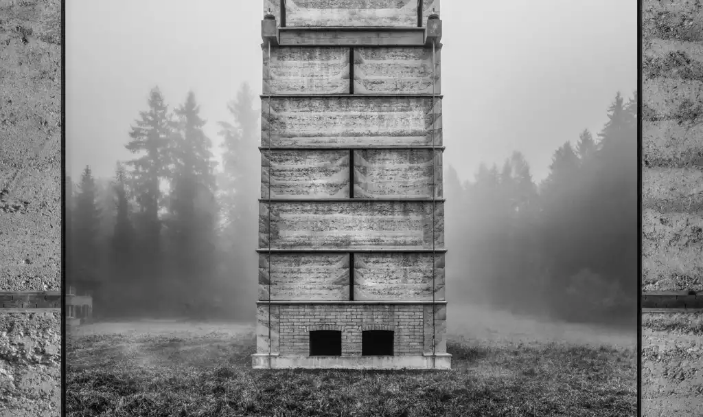
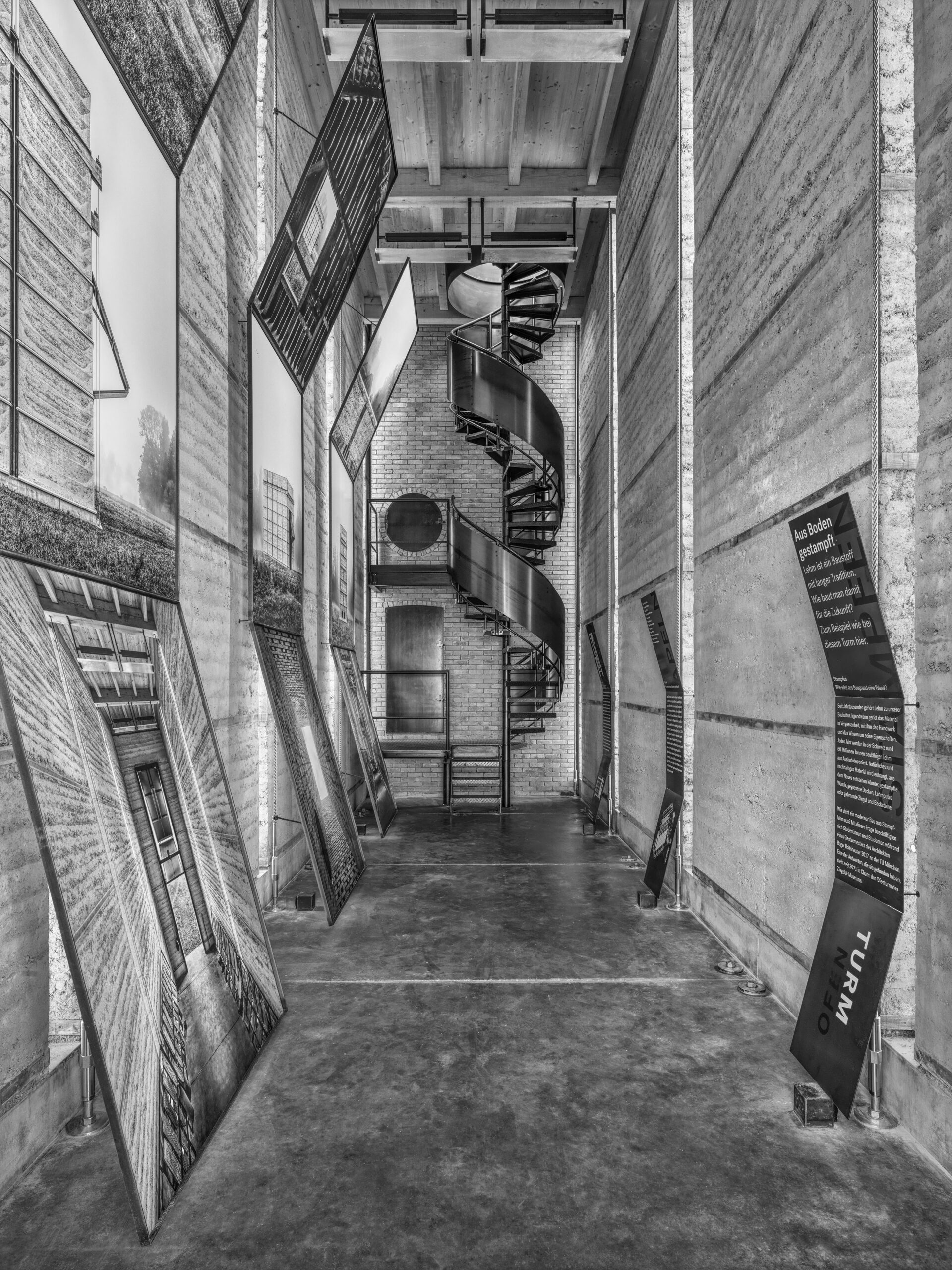
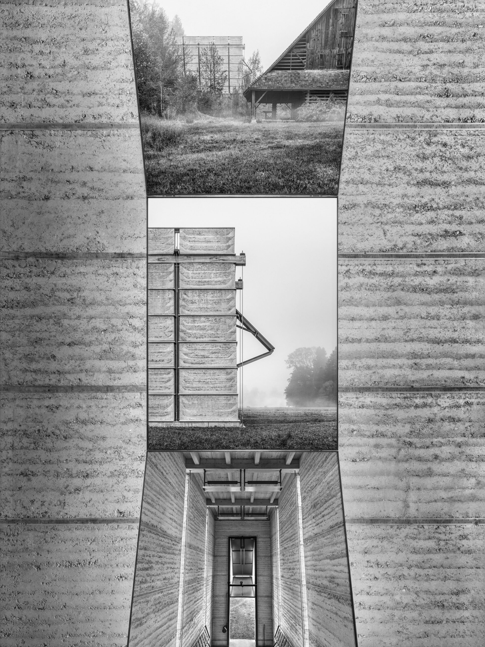
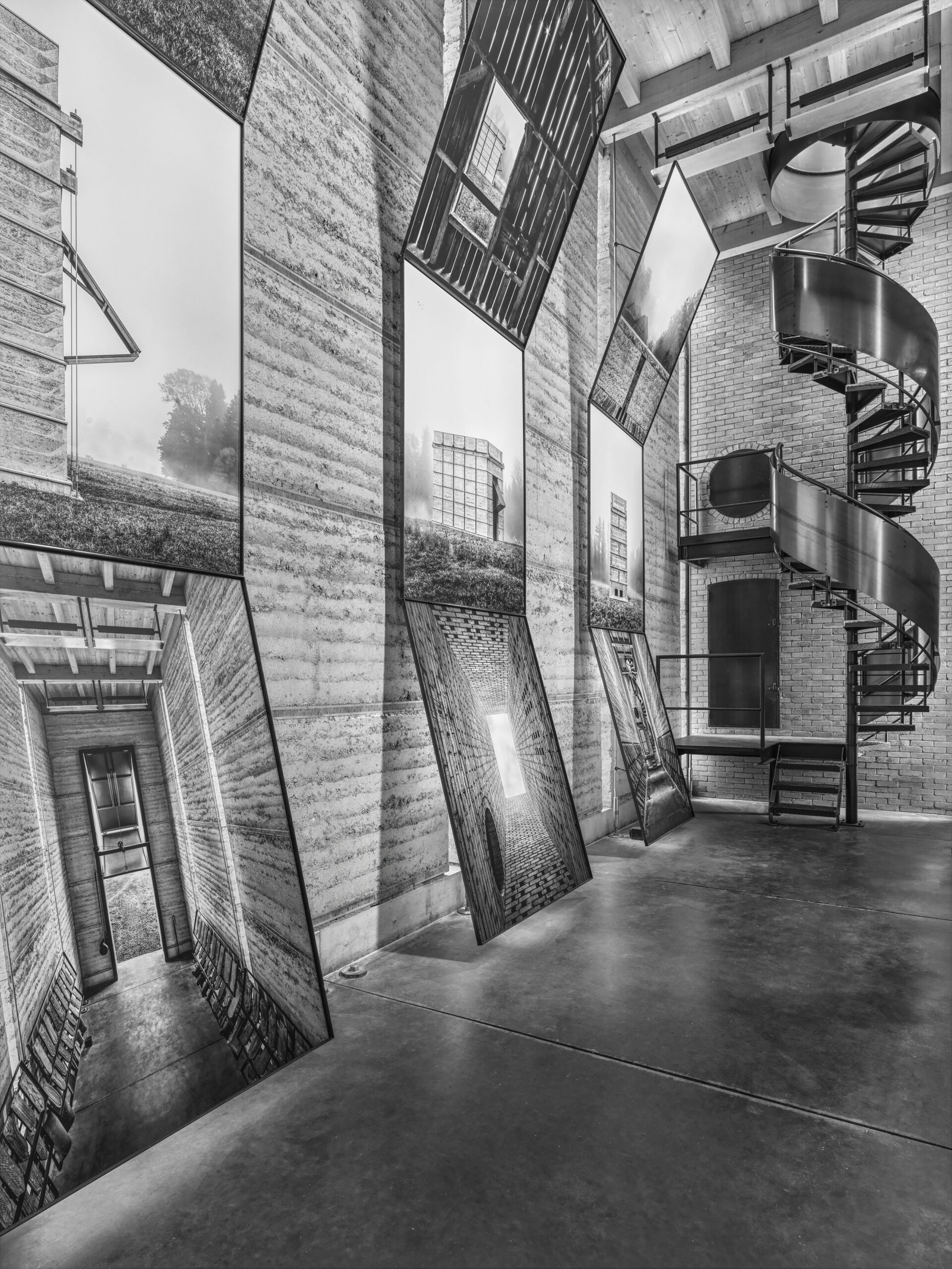
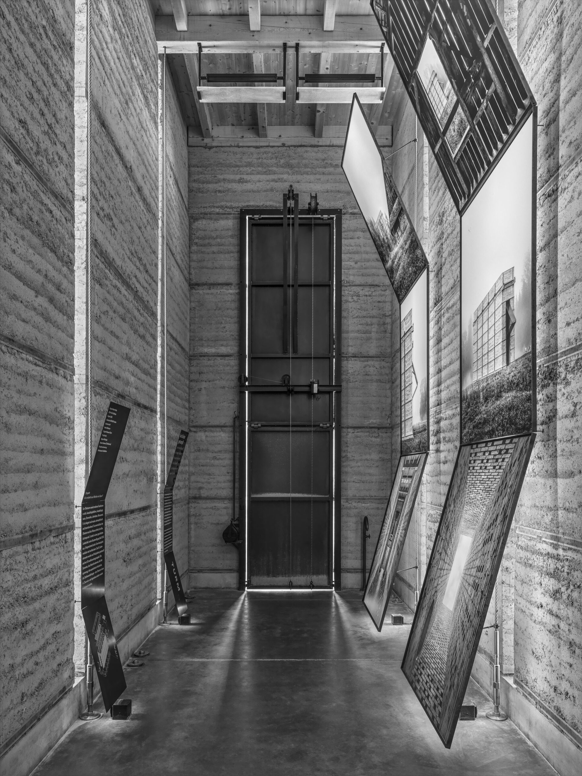
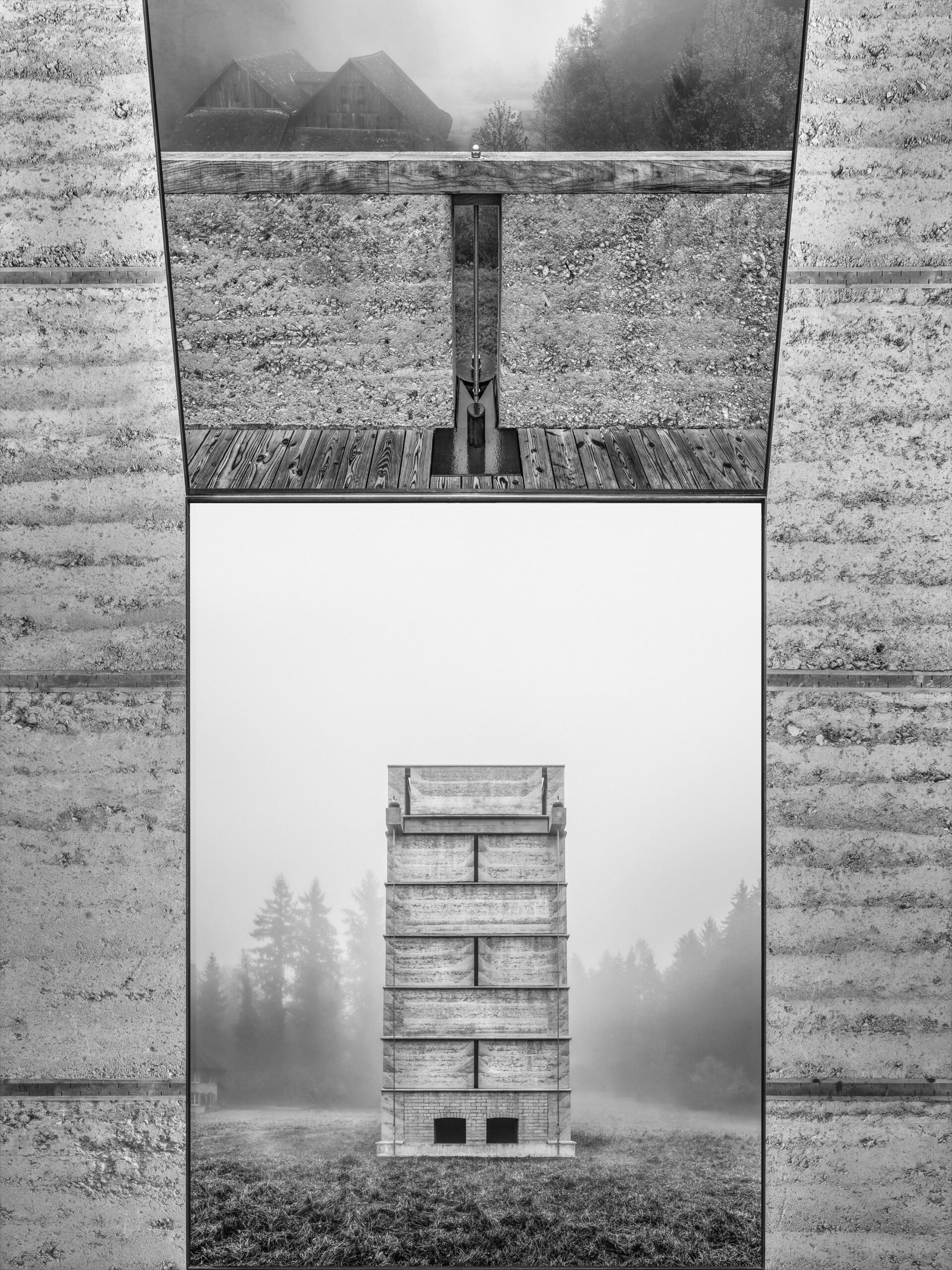
Through its proportions and materialization, the architecture of Roger Boltshauser’s Ofenturm (Kiln Tower) is itself an exhibit. In the interior the special atmosphere of the slender, deep space that flows upwards is additionally intensified so that it seems like a narrow ravine. The tall, massive walls are made of rammed earth, the entrance door and the spiral staircase opposite it are of raw steel. The aim is to integrate the dramaturgy of the exhibition elements in the powerful building, while not competing with the ensemble. For temporary exhibitions in this space the design concept envisages thin panels, each consisting of three images, one above the other. The lowest panel leans against the wall, the middle one is fixed vertically, parallel to the wall surface, while the top one is tilted forward. This allows a good view of each of the panels, even from just a short distance away. The texts are placed opposite on smaller, but similarly shaped folded panels. Here, too, the different angles facilitate legibility and respond to the three almost six metre-tall display panels. Carefully, but with their own kind of naturalness and functionality, these design elements engage the space, becoming part of a comprehensive scenography.
| Title | Antoniushaus Feldkirch |
|---|---|
| Year | 2023 |
| Client | Antoniushaus Feldkirch |
| Photographer | Cornelia Hefel |
| Collaboration | Zumtobel Leuchten, Kalb Metallbau |

| Title | Roger Boltshauser, Response |
|---|---|
| Year | 2023 |
| Client | Roger Boltshauser |
| Photographer | Luca Ferrario, Günter König |
| Editor | Galerie d’Architecture de Paris |
| Publisher | Park Books |
| Authors | Reinhard Gassner, Alexandre Theriot, Jonathan Sergison, Jan de Wilder |
| ISBN | 978-3-03860-332-0 |
| Editing | Andrea Gassner, Roger Boltshauser |
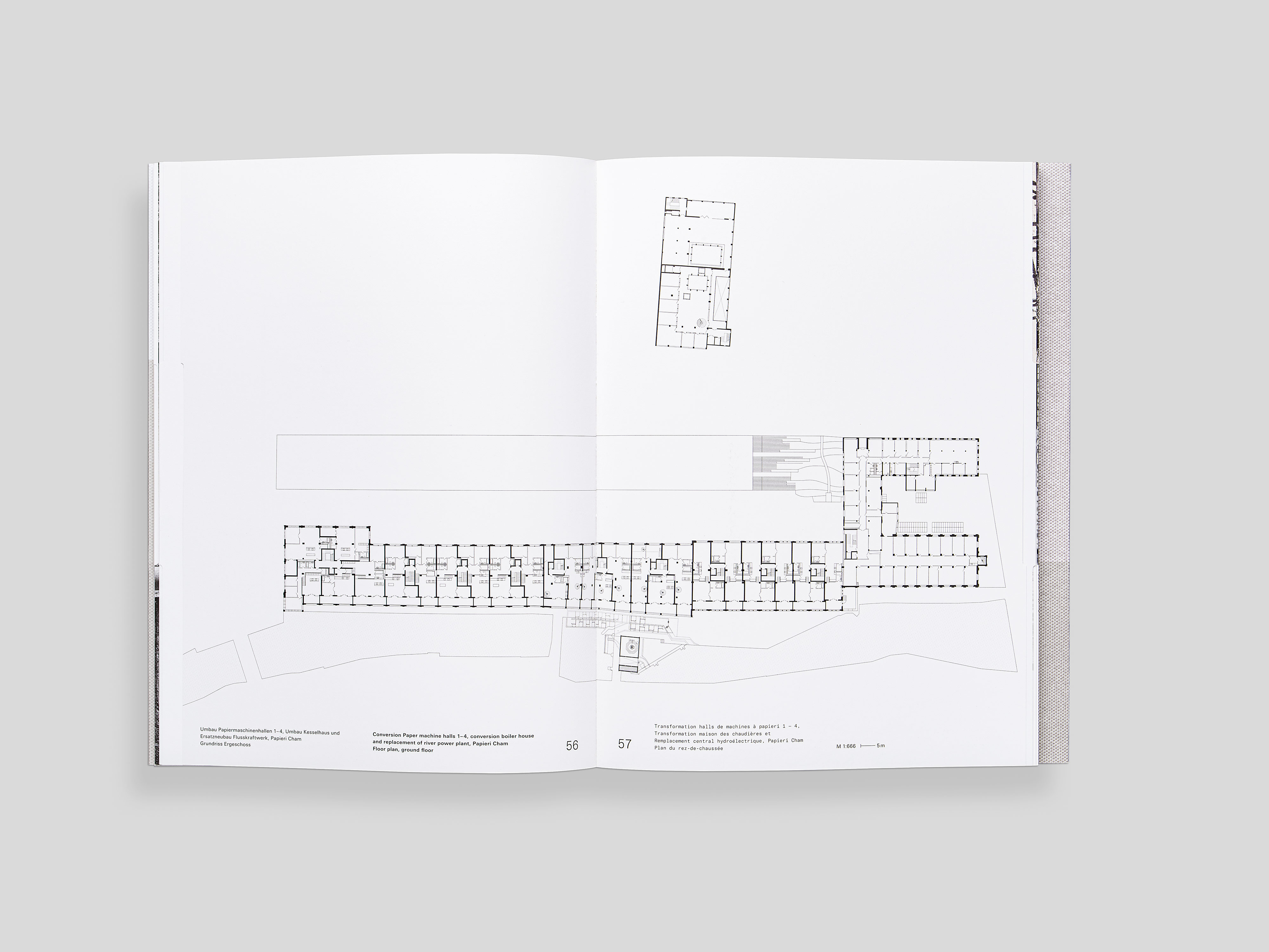
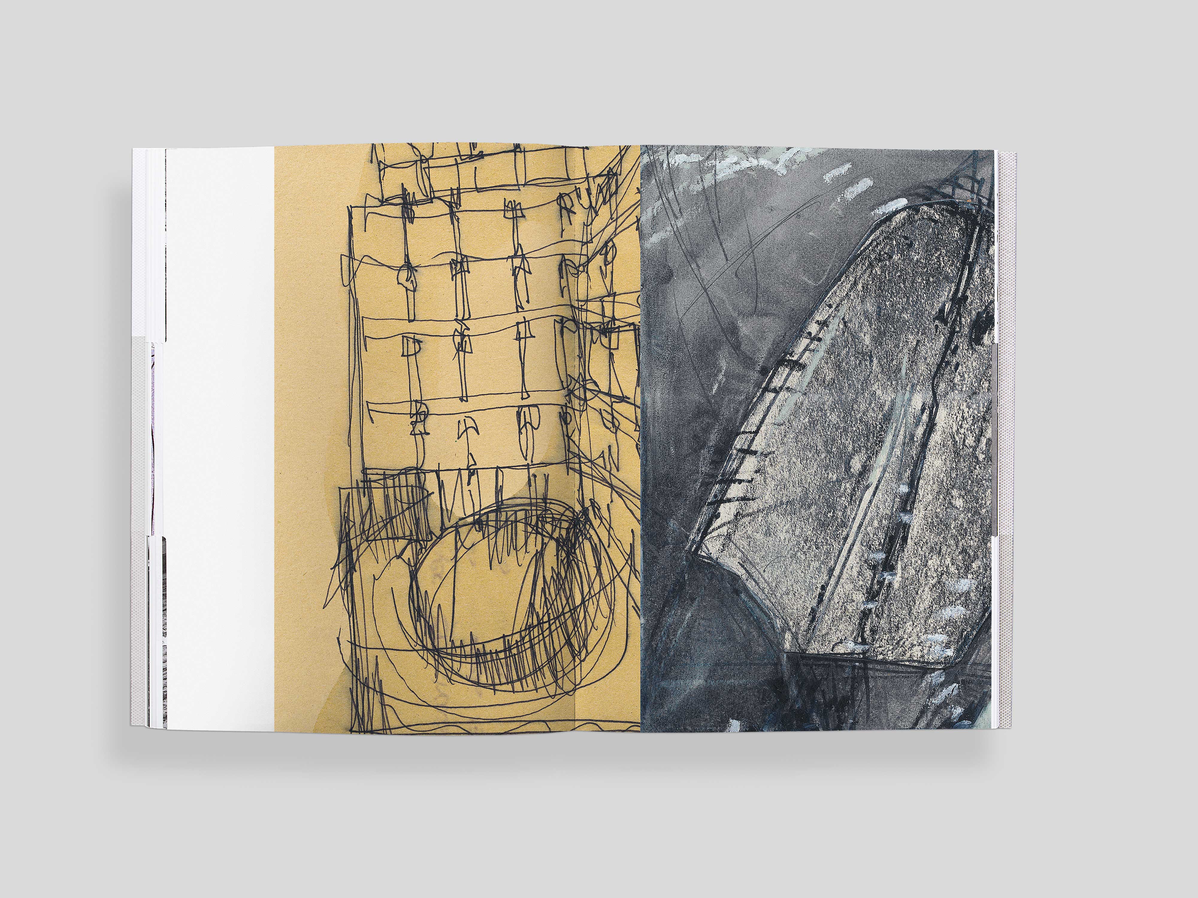
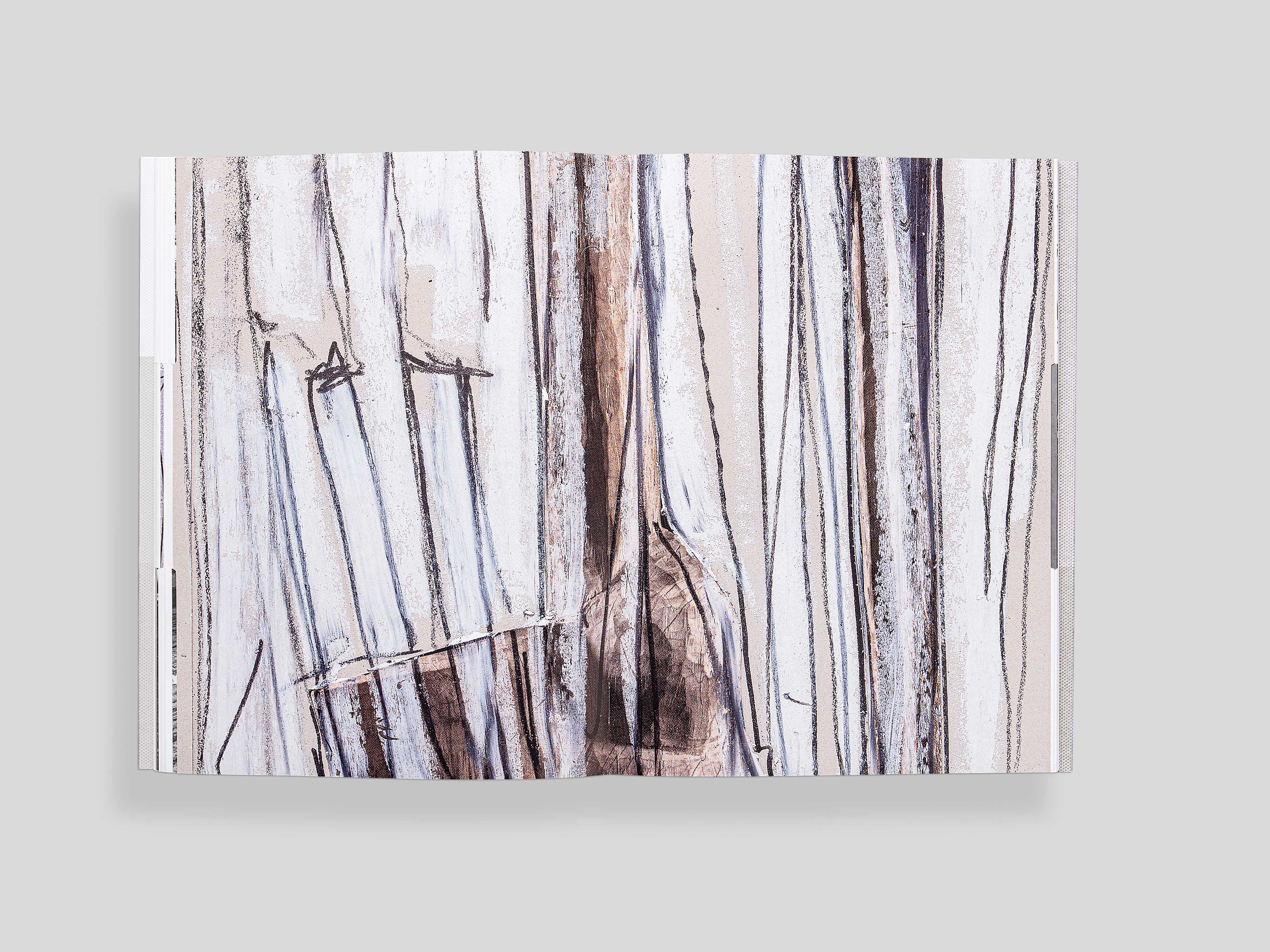
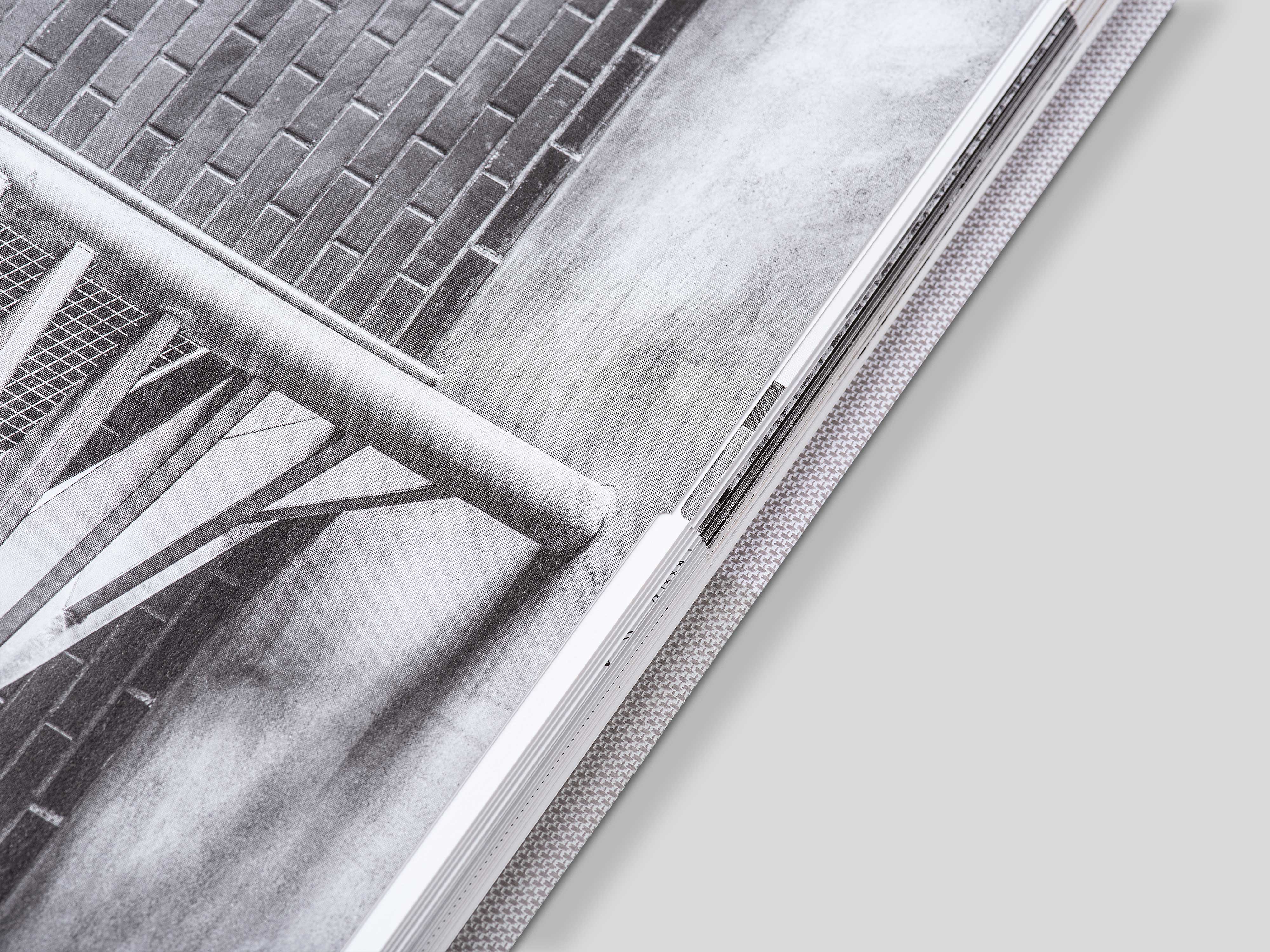
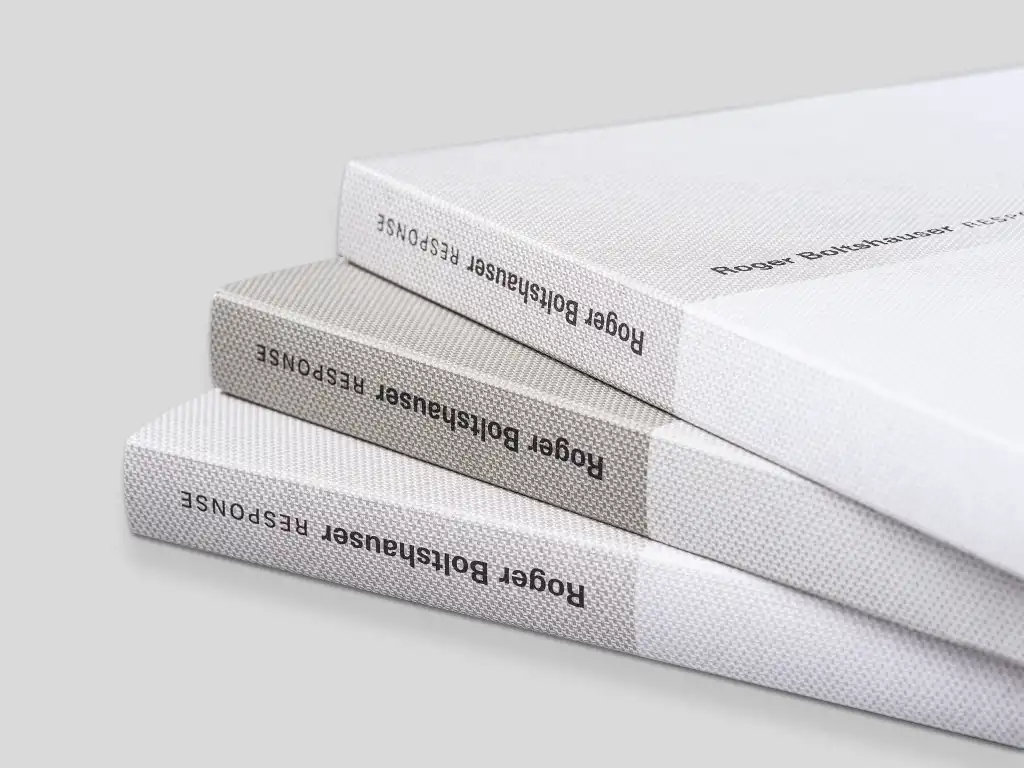
This (first) catalogue for “RESPONSE” maps Paris and is published to coincid e with the third exhibition in Stuttgart. It, too, has a multi-layered design, through reading in different directions, through large jumps in the scaling of illustrations, even through the sequence when turning the pages. This changes, in fact, depending on how the almost imperceptibly incised registers at the cutting edge are used. Texts from the last exhibitions find their place here once again. Jonathan Sergison and Jan de Vylder already reflected Boltshauser‘s work in the monograph. Alexandre Theriot wrote his text on the occasion of the Paris exhibition. They all stand for the over-arching and layered nature that Roger Boltshauser seeks in his work. While the representation of architecture is always related to the object being shown, it immediately develops its own life. Architecture is sketched in order to negotiate it, it is drawn in order to let it emerge, and what is built is finally captured in pictures in order to illustrate it. Sketch, plan, photograph, a logical sequence.

