diversely monochrome
Marte.Marte Architects – book design Marte.Marte, Feldkirch

As a rule the buildings in architecture publications are presented at a series of different, increasingly detailed scales, starting with the site plan and ending with the detail drawings. For the first major presentation of the work of architects Marte.Marte we decided to take a different approach. In manner of a “road movie” the intention was to convey a sense of being on the move and to allow direct comparisons between the respective architectural interiors and external landscapes. In the architecture of Marte.Marte the relationships between inside and outside are not based on legible approaches derived from rhythms of scale but are woven together in an overall conceptual sense. The starting point of their architecture opens up a new visual narrative of the works in an unconventional kind of book.
“Marte.Marte Architects” is a picture book with inserted text passages. The contents are divided into five acts: Persons/Outside/Inside/Ideas/Actors. The texts are understood as linguistic reflections from the perspectives of five different authors: Emmanuel Caille, Andrea Maria Dusl, Marina Hämmerle, Otto Kapfinger and Anatxu Zabalbeascoa.
Reinhard Gassner
I recall walking through Dornbirn with Stefan and Bernhard Marte – one brother on my left, the other on my right, I felt as if I were flanked by two black-clad bodyguards and had to hide the grin on my face.
The architectural language of the brothers is simple and at the same time sophisticated. You immediately have the feeling that each building is cast as a single piece. The buildings stand in public space, uncompromising and consistent. Nothing is left to chance and everything is designed down to the last detail. The design of the book reflects this approach: a monolith cast in black – radical and poetic, at one and the same time. For this book I oriented myself in particular on a principle of my former teacher Jost Hochuli, one of the best-known Swiss book designers: “as much as is necessary and as little as possible”. We decided on a rigorous, picture-oriented language in the sequence and design of the pages. Externally the book resembles a black building block. The cover is printed black on black; the typography is distinguished only by the contrast between matt and shiny. Even the cut edges of the pages are black, giving each panorama page in the book a very thin surround. This design led to discussions with the publishers who said it would be impossible to sell the book in this form. It was only when they held the finished book in the hand that they recognized its special visual quality and even increased the planned retail price. The collaboration with the Marte brothers on this book project was intensive and focused. We share a passion for images and good design. The approach was always holistic; we worked in harmony with each other. During workshops ideas arose for illustrations such as the portraits of clients and the crew or aerial views of the buildings. Stefan Marte accompanied photographer Marc Lins on his helicopter flights. The angled perspective from the air shifts the buildings out of the familiar perspective, placing them like models in larger spatial contexts. The brilliant series of color photos by Bruno Klomfar, Marc Lins, Petra Rainer and Ignacio Martínez in fact form the actual substance of the visual narrative. But what reaches much further is the way in which the illustrations of the outsides and insides of the projects are consistently separated. The intention is that the viewer should experience the architecture of Marte.Marte sensuously – from the void to the building volume and back again.
Andrea Gassner
Marte.Marte form their “nests” and “castles” as a series of shells. Like force fields the compact building volumes convey moments of perception in all directions, in particular the relationships to the ground and the land; they offer contour, rivalry, the overlapping and the defining. Inside, you are fascinated by the special sense of scale, the shift between narrow and expansive, between the increase and reduction in the pressure of spatial situations and by the handling of light. However, the themes of the architectural design first become fully clear in all their consistency and impact by placing outside and inside next to each other. On this account all the projects are first presented from the outside, followed by all projects from inside. These perspectives are successfully woven together through references in the pagination of the double pages. We also celebrate this contrast in the introductions to the project presentations: pictogram-like plans and sections in the outer sequences of images, aerial views in the inner sequences.
Reinhard Gassner
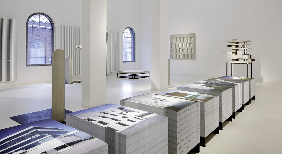
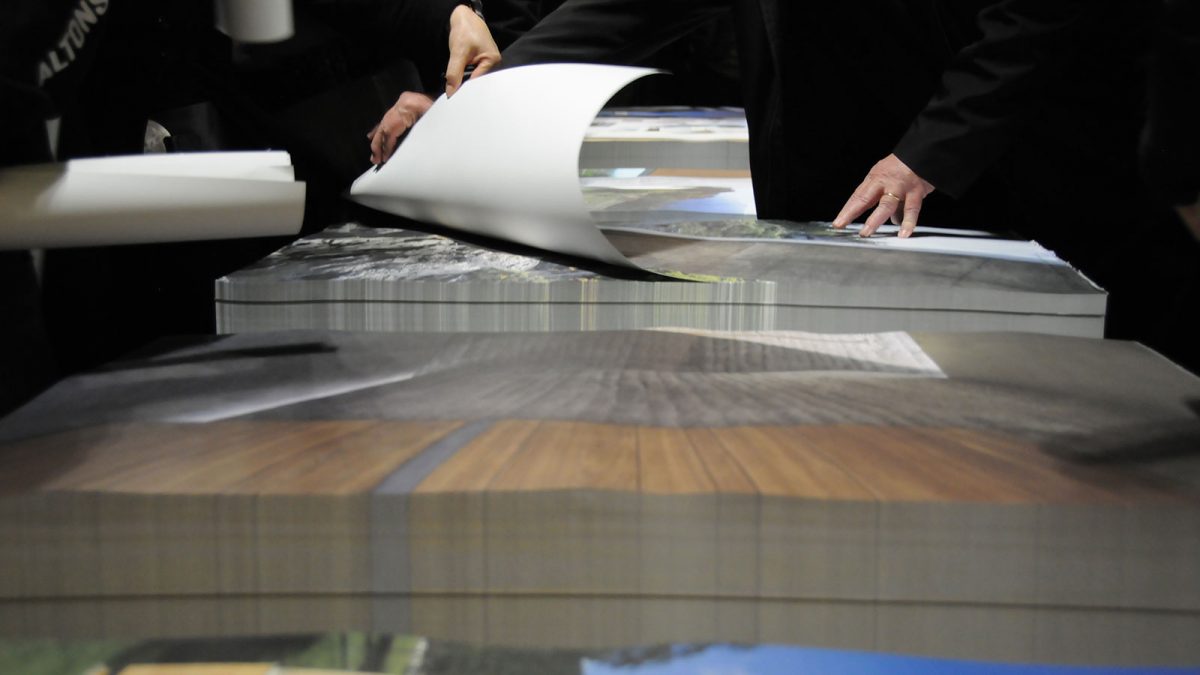
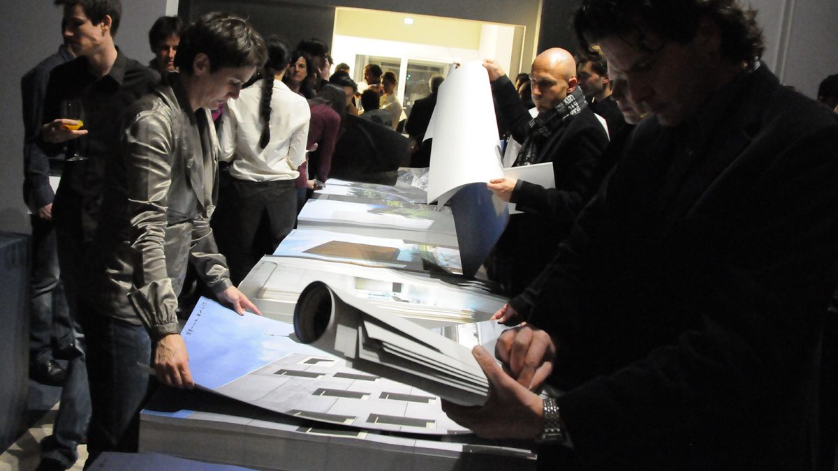
Two years after this book appeared we used the block in a new way as a scenographic exhibit in a show. In their first monographic show of work the Architekturforum Aedes am Pfefferberg in Berlin presented Marte.Marte Architekten. Key photos of eight buildings were printed in the format 70 × 100 centimeters, the illustrations, which bleed off the edges, were stacked on top of each other and glued together to form blocks. These blocks of posters stood at table height on specially made black pallets, visitors could peel a poster off and take it home with them. Many people made use of this opportunity, the strong poster motifs speak for themselves. The headers with graphically reduced figures of the eight buildings identified the building depicted clearly, while also referring to the other seven projects.