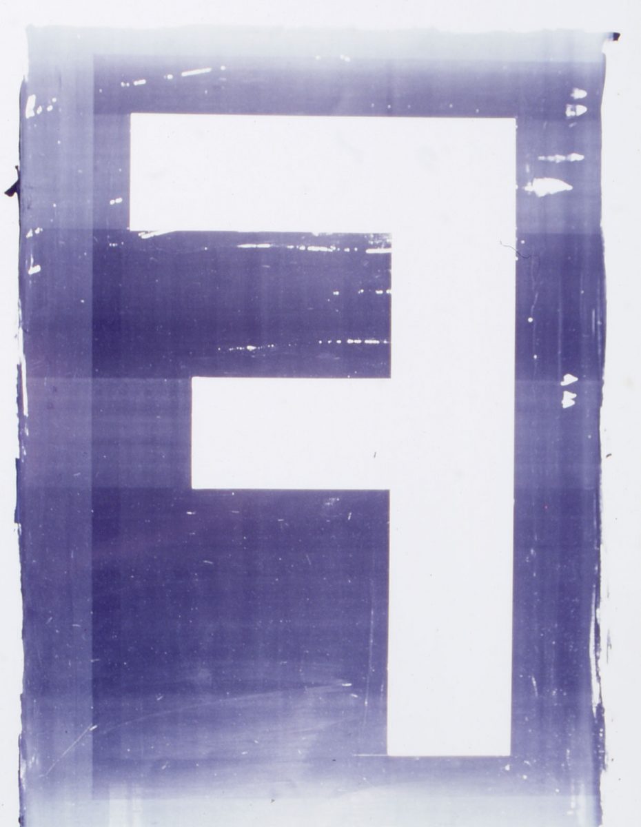
The aesthetic platform of this image is the contrast between traditional and new means of design. The visual elements are the “F”, the colours r-g-b, as well as the Avenir family of fonts designed by Adrian Frutiger. Using printable paints the “F” is applied directly to the offset plate and printed on large sheets in pastels shades of red, green, and blue, one on top of the other. When trimmed to DIN sizes, this produces lithographs with wonderful pictorial compositions. The “F” appears in some form or other in all publications and documents and, as an airy, transparent landscape of colours and forms, creates the background for overprints in black and white. The F form also serves as raw material for visual essays. The complex corporate design program can be developed further by various users in the institution. Without the need for any elaborate form of graphic design monitoring new applications are produced constantly in various programs and systems